14 DAY TRIAL //
 Ever since Windows 8 was officially released to the world on October 26, 2012, everywhere you look there are people criticizing the operating system.
No matter if it’s the Modern UI, the flat look, or the lack of a Start button, some people have made a hobby out of criticism aimed at the Redmond-based tech giant Microsoft, mostly because Windows 8 isn’t quite the operating system they hoped to get a couple of years ago.
That’s why so many users wish that Windows 9, or Windows 8.2, whichever comes first, fixed things a little bit and turned Microsoft’s operating system into a much friendlier environment for both gaming and working.
Jay Machalani didn’t want to wait for Microsoft’s future Windows releases and decided to create his very own interpretation of Windows 8.2, the next major update for the core Windows 8. He redesigned most parts of the operating system, including both the desktop and the Modern UI, making it not only more reliable when it comes to work, but also more pleasant to the eye.
It wasn’t easy, he said, although it’s pretty clear that only someone with a lot of experience can create something like this.
“This research project started September 24th 2013. I had access to Windows 8.1 thanks to my dear friends at Microsoft and my main on-the-go general computer was a Dell XPS 12, I replaced it for a Surface Pro 2 right at launch October 25th. My test computers were always high density convertible tablet/laptops; the perfect candidate for the Windows 8 vision,” Machalani explained.
His goal, he adds, was not to change the core of the operating system, but to make some of its features more effective in a way that would eliminate the confusion created when Windows 8 saw daylight.
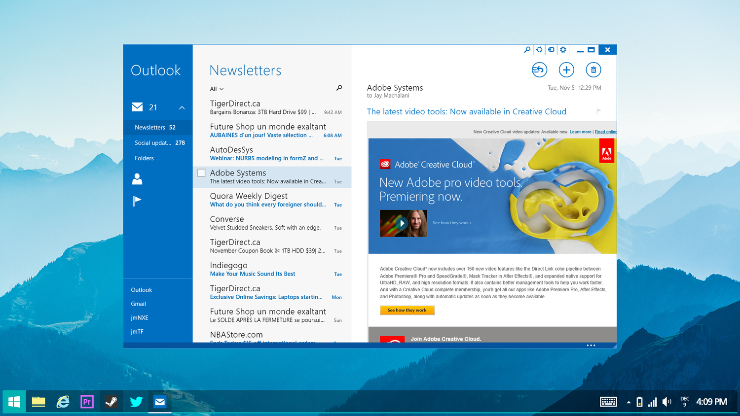
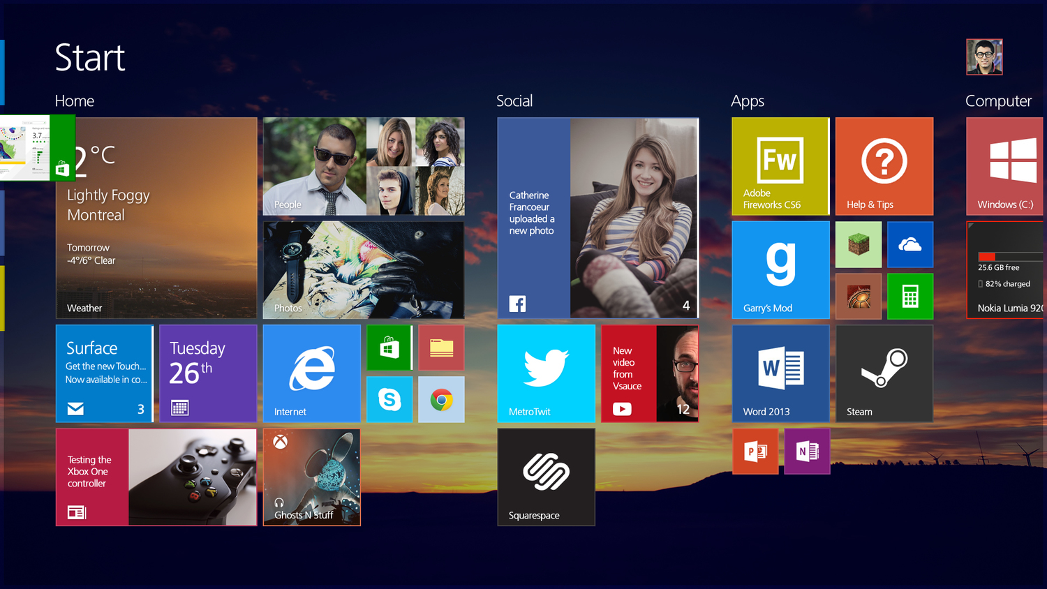
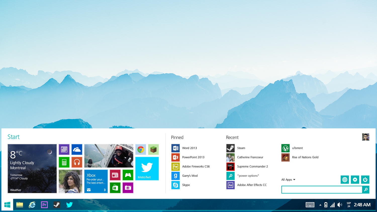
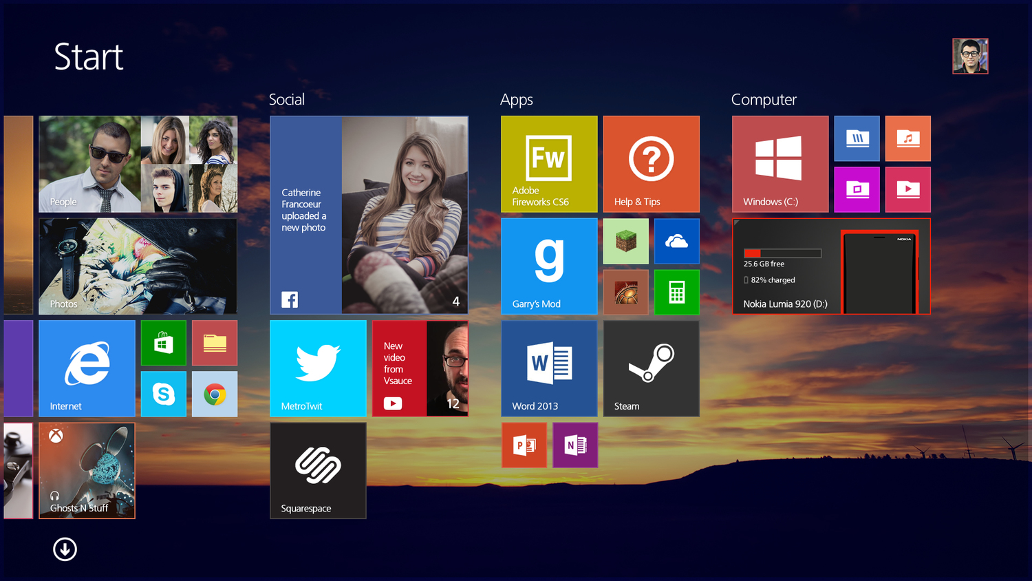
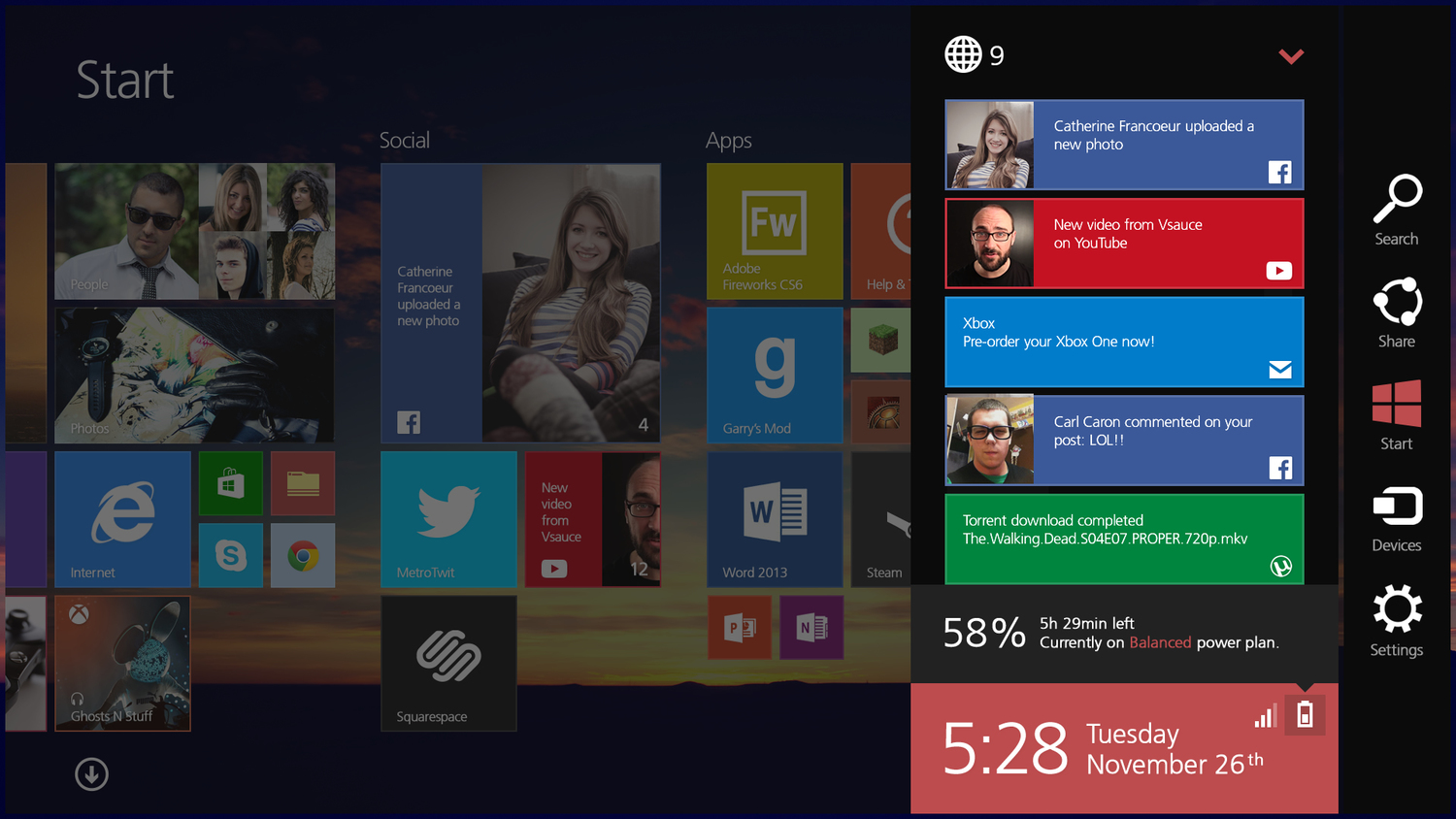
The result is pretty much amazing. His own version of Windows 8.2 comes with everything you’ll ever need from Windows, including a Start Menu, a more intuitive Modern UI, new icons, and an overall eye-candy look that’s clearly much more appealing than the one currently offered to users.
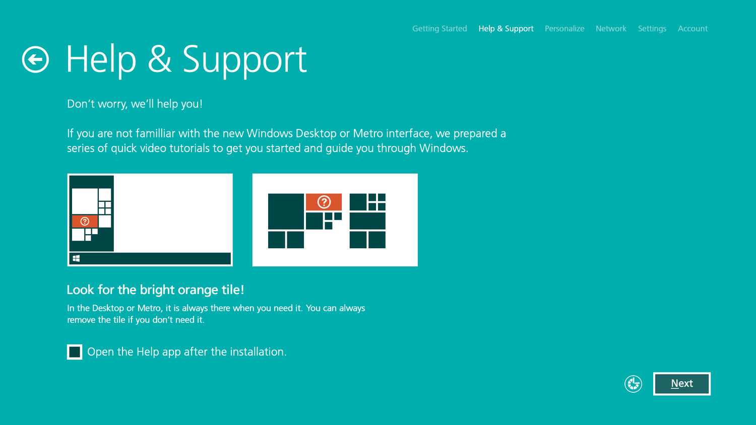
It all starts with a significantly improved help section that provides guidance on all parts of the operating system, including the desktop and the Modern environments.

“It’s important for the users to understand that there’s two environments on their computer and which one is best for them. Simple examples, illustrations and put the best one by default if it’s a tablet or a laptop/PC,” Machalani continued.
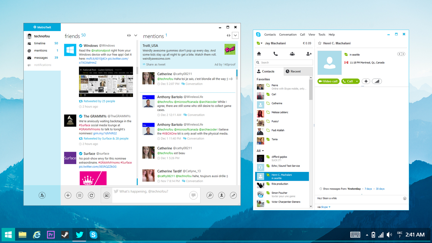
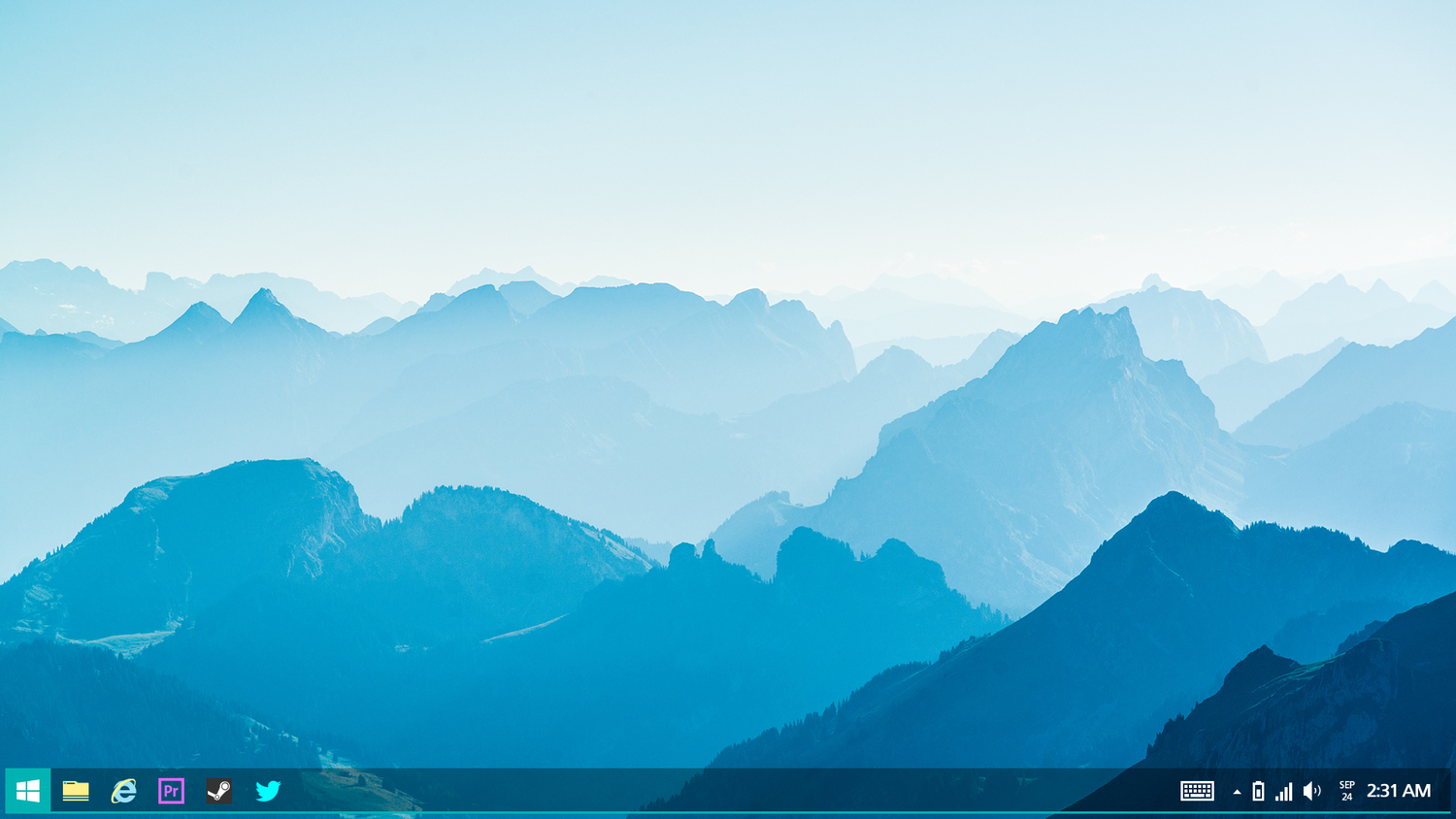
The desktop got improved with bigger date and icons, and you can even pin desktop and Modern apps to the Taskbar using built-in features created in this regard.
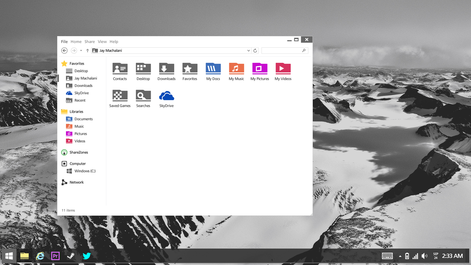
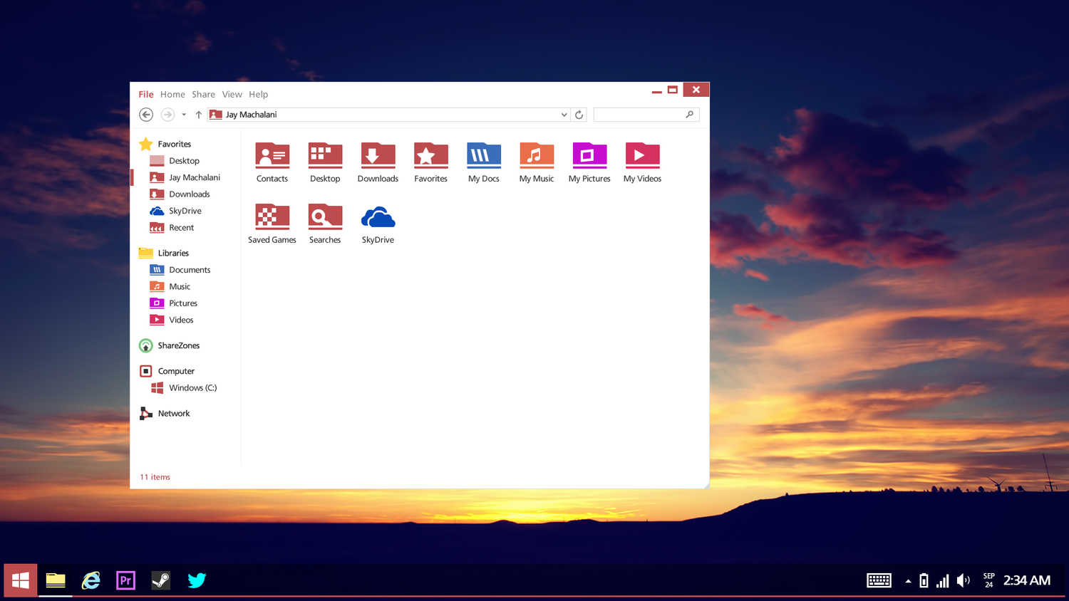
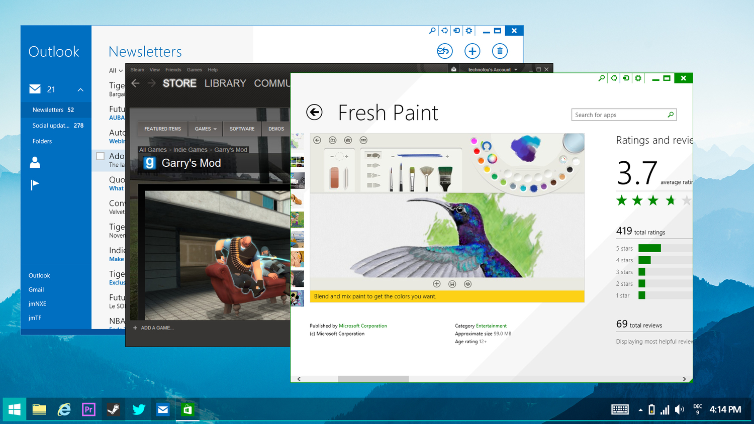
As for File Explorer, this is where Machalani added plenty of improvements because the existing version “looks like [expletive],” he said.
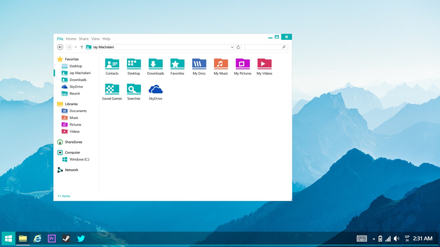
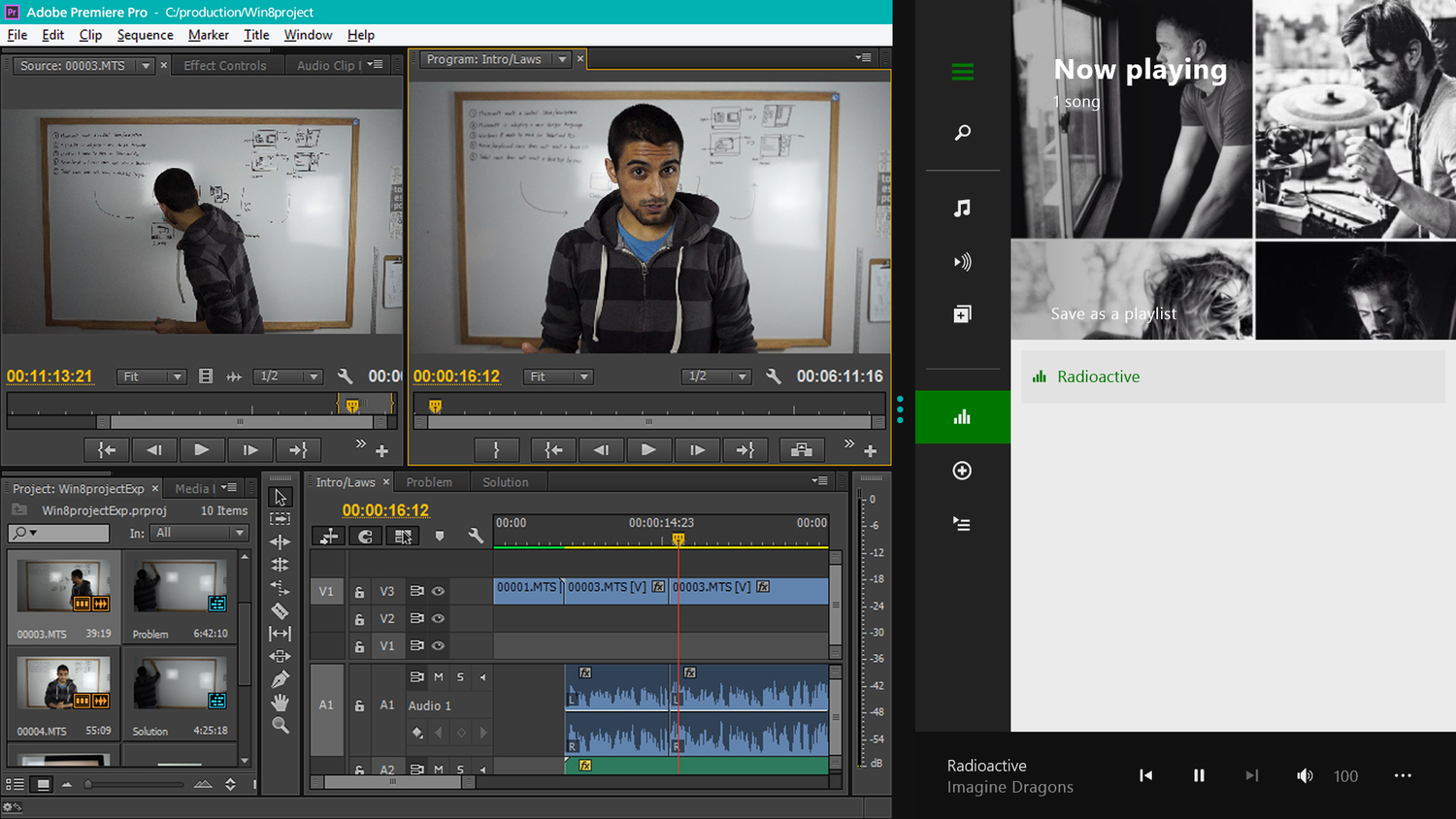
“I’m taking the same app colors you used in the Modern version of the corresponding app and making it standard across the OS. Your Videos folder and Xbox Video app now uses the same color for subtle reconnaissance. Otherwise, it’s the best File Explorer out there and one of the big reason I couldn’t live with OS X,” he explains, while adding that the Ribbon must be closed by default.
The Start Menu is back, along with plenty of customization options. Users would be allowed to pin apps and even live tiles, resize all these items, make icons bigger or smaller, and even create a separate list with desktop programs.
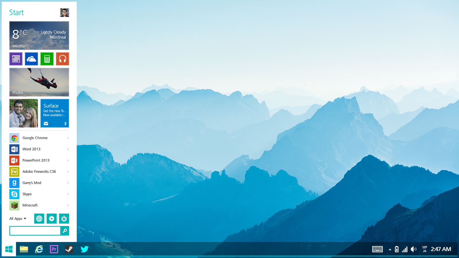
“The new Start Menu would be very flexible. You want it smaller, no problem. You want it to take half of your screen to make sure you get all the information you need through Live Tiles goodness like a dozen of stock market Tiles, no problem,” the designer notes.
“You want the thing to be horizontal and give you all the recent thing you used on Windows like apps, people or search queries, no problem. Microsoft killed the Start menu because it wasn’t flexible enough and didn’t play nice with the new Modern vision. Why kill it when you can adapt it!”
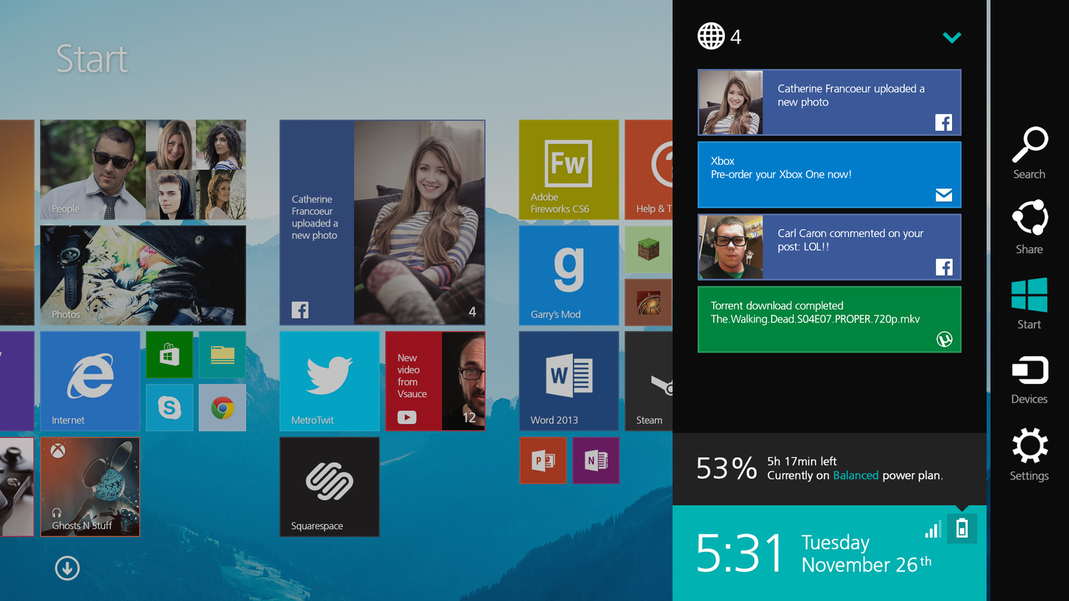
The Start screen, which is the only door to the Modern UI, comes with its very own file manager, putting users in full control over the locally-stored items because “Metro must be independent of the desktop.” A new Charms bar, plenty of customization options with transparency, more colors, and lot of other setting would also be offered.
Overall, there’s a gazillion improvements in this concept, but you should check the photo gallery below or head over to the official website to see them all.
If there’s one thing that we’d love to see happening after viewing this concept is Microsoft coming out and saying that everything seems to be so cool that it might make its next OS release look just like that. Unfortunately, that’s not going to happen. Not in this century, at least.