14 DAY TRIAL //
 Mozilla is always looking at ways it can improve Firefox and has not shied away from experimentation. However, with the new rapid release cycle, we may start seeing the results of these experiments a lot sooner than before.
One example is a proposed UI revamp, which is only in mockup form now, but which already looks promising.
The aim of the revamp seems to be simplifying the few remaining UI elements, the tab bar in particular.
Some of the notable changes include the removal of the dedicated search bar and the rounded tab corners, similar in a way to Chrome.
In fact, there are a lot of elements that look similar to Chrome's, but it's not really a rip-off, the proposed Firefox UI has a lot of details and elements that put it ahead of Chrome in terms of functionality and especially looks (although the latter isn't saying much, Chrome has never been much of a looker).
"The UI mock-ups shown on these pages were part of a meeting, and were for discussion purposes, and to explore different design directions. Some of them are already out of date," Mozilla explained.
"Mozilla works in the open, and the way to get the latest in UI improvements to Firefox is to download the UX channel build for your OS, which will auto-update every night with various design experiments we're looking at," it said.
Be warned that the mockups are by no means guaranteed to end up in Firefox in this exact form or even at all. But at least several elements should and the design direction will give you an idea of what future Firefox versions, perhaps Firefox 9 or 10, could look like.
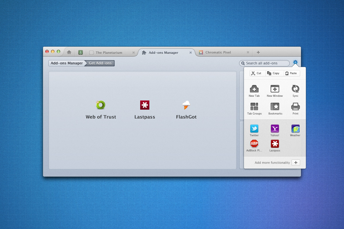
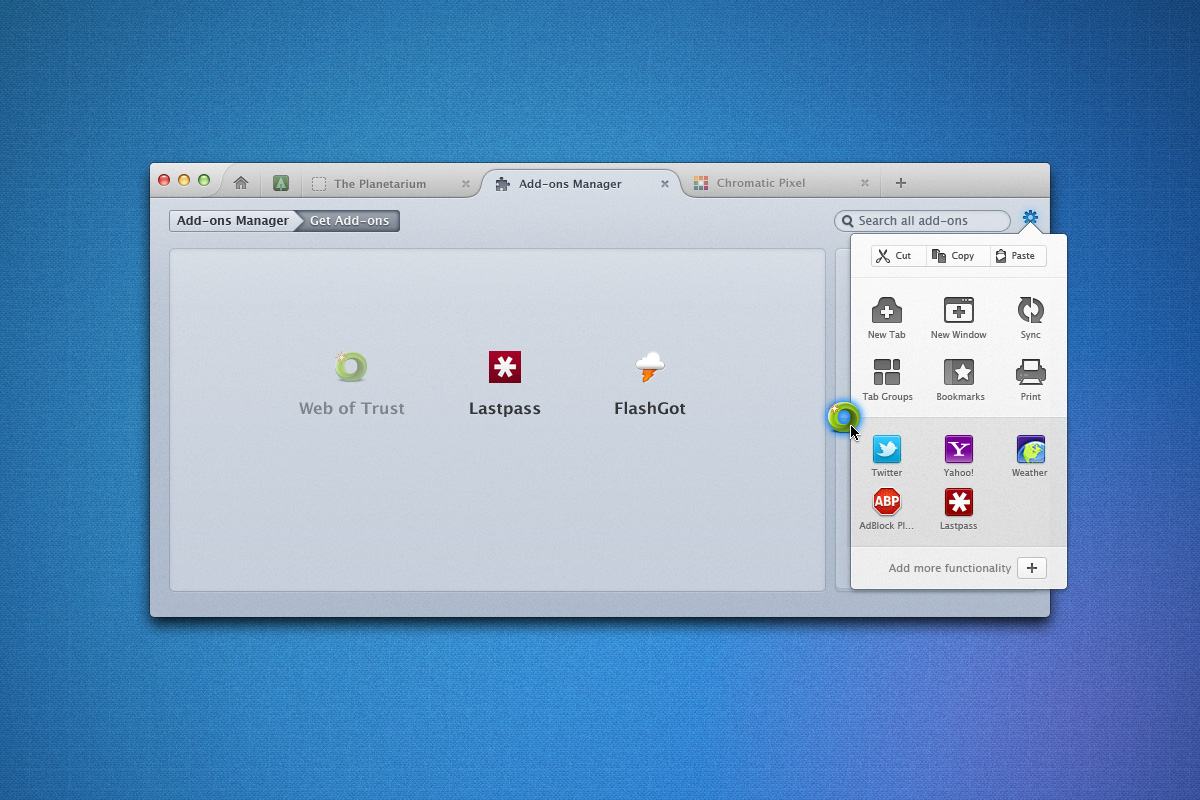
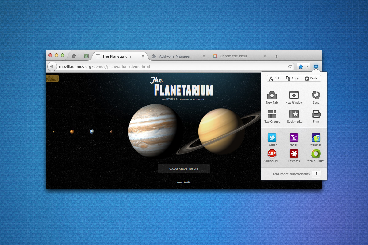
The new tab bar is probably the first thing you'll notice and it's looking great. The currently focused tab has a trapezoidal form, like in Chrome, but the rounded corners give it a lot more style than Google's approach.
The rest of the tabs though fade into the background, making it much easier to spot the tab you're on at the moment. The tab bar also integrates the home button, if you still use one, as well as possible extension icons.
But there's more, the options menu gets a huge revamp, making it a lot more visually pleasing and a lot easier to use on a touchscreen device. In fact, most of the elements seem to be designed with touch input in mind as well.
The search box is gone, integrated into the AwesomeBar. There is also a new full screen mode, which moves the AwesomeBar inside the tab bar, IE9-style.