Microsoft tried to tweak Windows 10 in such a way that it would be capable of offering a fresh feeling everywhere you look, so the company redesigned the key features of the operating system, seeking the modern interface that everyone seems to like.
But in its struggle for a more modern look, Microsoft indirectly caused a high level of inconsistency across the operating system, and living proof is none other than the traditional context menu.
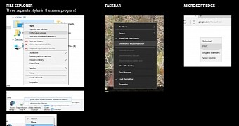
The screenshot you see here was posted on reddit, and perfectly illustrate the fact that Microsoft seems to have a context menu problem, as the design is different in almost every single part of the OS.
For example, in File Explorer alone, Microsoft uses three different context menu styles, while on the taskbar and in the Start menu, the company introduced the new dark theme look.
A different context menu is also being used in Edge browser, so depending on where you right-click, you might see a very different look.
Microsoft still experimenting
The latest Windows 10 preview builds have shown that Microsoft is still trying to find a better look for the context menu, and the company has rolled out improvements to the original design with every new release.
The versions you see right now are very likely to be improved even further in the coming Windows 10 builds, but just as always, everything will be tested with help from insiders before eventually being released to those who decided to stick with the stable version of the OS.
Now that Threshold 2 is already available, Microsoft's getting ready to ship builds that will be part of the Redstone branch, so maybe this could bring changes in terms of context menus as well. Of course, Microsoft's always keeping an eye on feedback channels, so context menus are very likely to be improved sooner or later.

 14 DAY TRIAL //