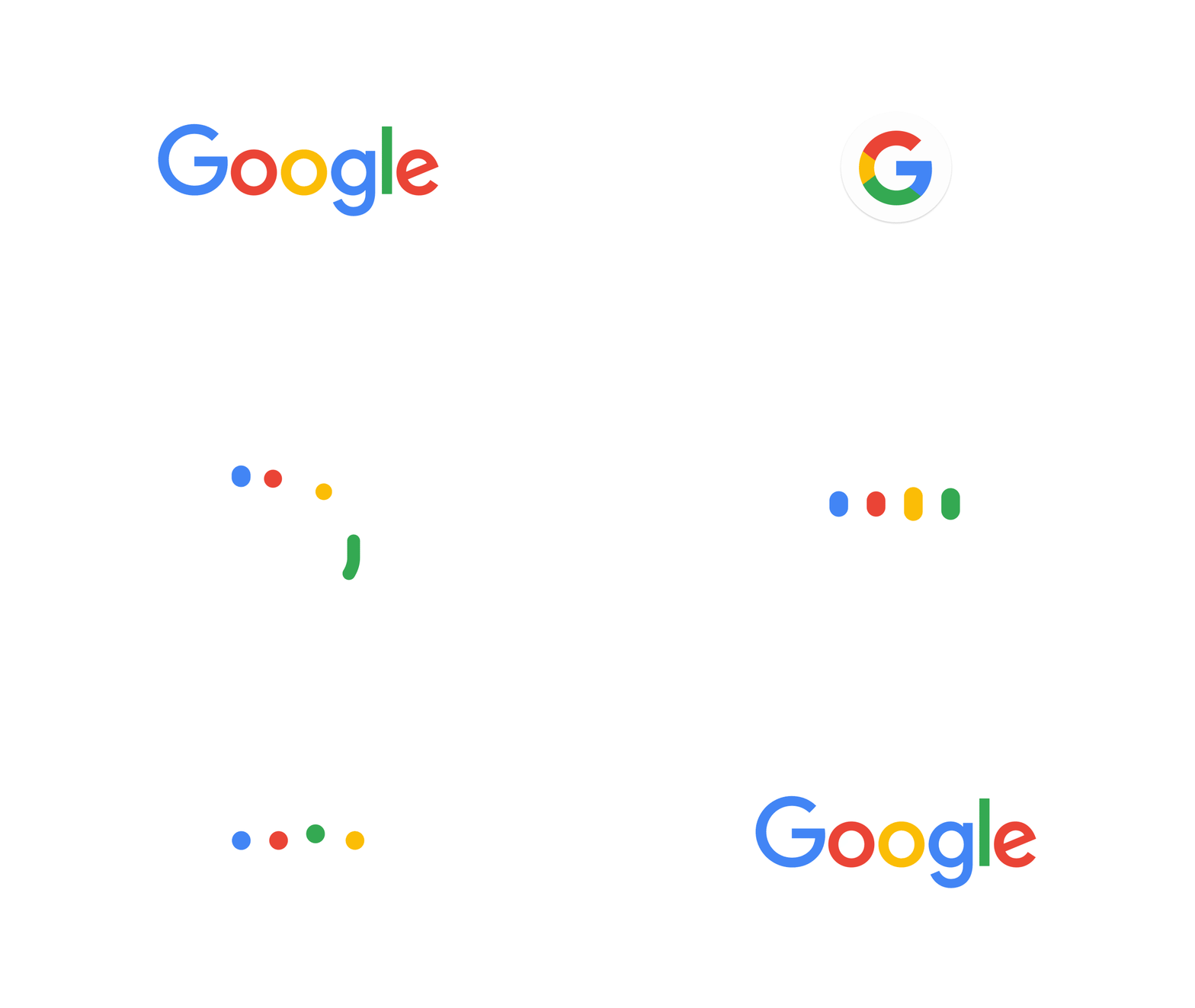
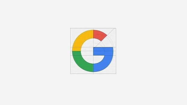
Google recently released a new logo, which features a new, playful typeface, and a pretty cool new G icon. While most people online seem to have a positive reaction to it, most of them have no idea why this is so. In our short editorial, we'll explain why the new Google logo is a lesson in modern design, all based on proven design theories.
We'll also be quoting the company's famous Design team, the very same fellows responsible for the remarkable and beautiful Material Design guidelines, used today by most Android developers.
In crafting the new logo, the designers had a series of goals in mind.
The new logo needed to represent all products, not just the search engine
First and foremost, what motivated the company to change its logo was the feeling that all products stemmed from the search engine. This new train of thought inside Google offices is no surprise, since the search giant heavily restructured almost a month ago, moving Google and all affiliated Web products inside a larger company called Alphabet.
The new logo comes only to reinforce this notion of change, one which Google would like you to recognize and take notice that the company is more than a search bar these days.
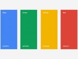
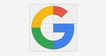
The same blue, green, yellow, and red colors are used, the logo still spells out Google, and the G icon, even if different from past versions, heavily utilizes the unmistakable four Google colors, so you'll automatically think of a Google product even if you weren't aware of the logo change.
The company did not make the monumental mistake of changing its logo too much, a mistake that many other companies made in the past, confusing their users with regular branding updates that were as different as day and night. I'am looking at you Bing! I still don't know what's your current logo unless I go to your website. Shame on you, Microsoft design team! Shame on you!
A new font that renders better on small screens
Secondly, the new logo needed to be scalable so it would not give the impression that it was forced inside small screens.
This was happening because of the previous font family, a "serif" typeface called Catull, which had tiny lines, also called serifs, finishing off the main strokes of a letter.
When the logo was minimized to fit on mobile devices, these serifs would barely be visible, appearing as tiny specs of dust near the logo's margins.
For this, the company's designers created their own in-house font, a geometric sans-serif typeface which they appropriately dubbed Product Sans.
This new typeface will also accompany all of the Google promotional materials, and we hope it will also be available via Google's Fonts service.
"The [ProductSans] character set is complete with numerals, punctuation, accent and alternate characters, fractions, symbols, and supports extended Latin, Greek, and Cyrillic," says the Google team.
As a side effect of this font family update, Google designers are also bragging now that the new logo is much smaller, coming as a special full-color variant that weighs only 305 bytes. This is a far cry from Google's previous logo, which weighed over 14,000 bytes.
"The old logo, with its intricate serifs and larger file size, required that we serve a text-based approximation of the logo for low bandwidth connections," explained the team of Alex Cook, Jonathan Jarvis, and Jonathan Lee.
Using the new lighter version of the logo, Google engineers will now be able to ship the same type of logo, even in low-bandwidth Internet connections.
The new logo can be animated much more easily
With the prevalence of animation techniques in modern design, the new logo will be a lot easier to animate in videos and GIFs.
Because the previous typeface had the square serifs ending all glyphs (letters), it was very hard to animate using Google's Material Design strict guidelines.
But let's not be so cruel to call it unanimationable (it's not a word, I know). It could be animated, but the logo's letters needed intermediary transitions before you could morph it into a more malleable shape.
This is not the case with the new typeface which, as stated above, uses a more geometric look, utilizing very round shapes that are extremely easy to shape into almost anything you want.
As you can see yourself from Google's large collection of promotional material about its new logo, the letters seamlessly shift from one form into the another without looking out of place for one single second.
The new Google logo branding also introduces the "Google dots," which the company plans to use in its voice-powered services as a way to interact with users.
Our humble conclusion
The new logo, even if it came out of the blue for some, is the visual confirmation that the company is dead serious about its Alphabet direction.
Google's new branding, with its round corners and lovable colors, reflects its aspiration for the upcoming future, a future in which it will try to enter your daily life not only using search results, maps, and email, but also with cars, home management systems, medical products, and even new city-wide tech.
The design team's choices regarding the implementation of form friendliness, color choice, whitespace usage, and overall brand consistency should be taught in marketing classes and design schools across the globe.
 14 DAY TRIAL //
