14 DAY TRIAL //
 If there’s one thing everyone can agree Apple messes up on a regular basis - and I literally mean everyone, including Windows users - it’s iTunes. Anyone who isn’t annoyed by iTunes is either in love with Apple to the point of denial, or simply ignorant.
Some people hate it simply because of Apple’s politics, which makes "syncing" the status quo of file transfers between iDevices and the computer. It’s a major pain in the neck, but I’m not here to talk about that. You can’t change what Apple simply doesn’t want to change. What I want to talk about is the impossibly difficult learning curve associated with every new iTunes release.
It just can’t decide what it wants to be
Generally speaking, Apple gets it right most of the time. The hardware designs are impeccable, the software is intuitive and attractive, and the overall experience of using the iOS & OS X ecosystem is rewarding. But there are exceptions. And one of them has endured the test of time more than any other.
iTunes is about 14 years old now. Once every few years, Apple comes up with a new design for this cash cow. Normally, the retooling of such an important part of the business requires the utmost attention to even the smallest details. It’s something Apple knows and acts on. But not when it comes to iTunes. For one reason or another, Apple refuses to apply this level of care to the product that glues the iOS ecosystem together.
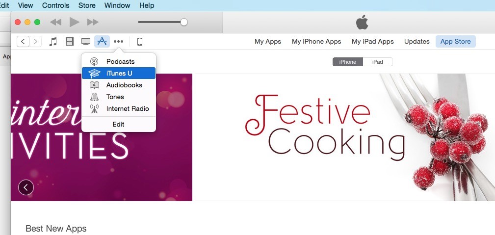
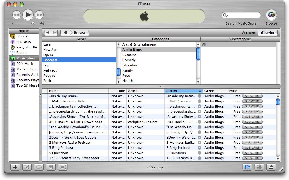
Think of iTunes as a cord that branches out into every iPhone and iPad out there. It’s the place where you can download apps, books, movies, songs, podcasts, listen to the radio, get ringtones, and even access courses if you’re a student. The evolution of Apple’s business meant that all these things needed a hub where people could go to and get their fix. Only problem is each and every iTunes redesign makes it a chore to find your way around the GUI.
The tabs at the top keep changing all the time, the services pane on the left appears and disappears at will, you never know if the Apps button you’re clicking on takes you to your own apps library or the App Store, and the list goes on. Plus, there are some serious consistency problems between the web interface of the App Store and the iTunes interface of the App Store.
Ironically, iTunes looks awesome. It’s a mystery why they simply can’t get it right. But the solution has always been there, waiting to be implemented.

Break it down
The main reason why Apple, with all its design prowess, messes up iTunes with every major release is because it simply crams too much stuff in there. Why not just let iTunes be a media player and a digital storefront for music, like it used to be? The name ‘iTunes’ doesn’t speak to me anymore. “Tunes” have nothing to do with apps, books, movies, education material, or even podcasts for that matter. Tunes are songs. And that’s what iTunes should be all about.
A suggestion made by countless tech journalists covering Apple, including yours truly, has been to break iTunes down into multiple apps / services that can better represent the content they’re hosting. The iBooks Mac app is a good first step in that direction. Thank God I never have to see book listings in iTunes ever again.
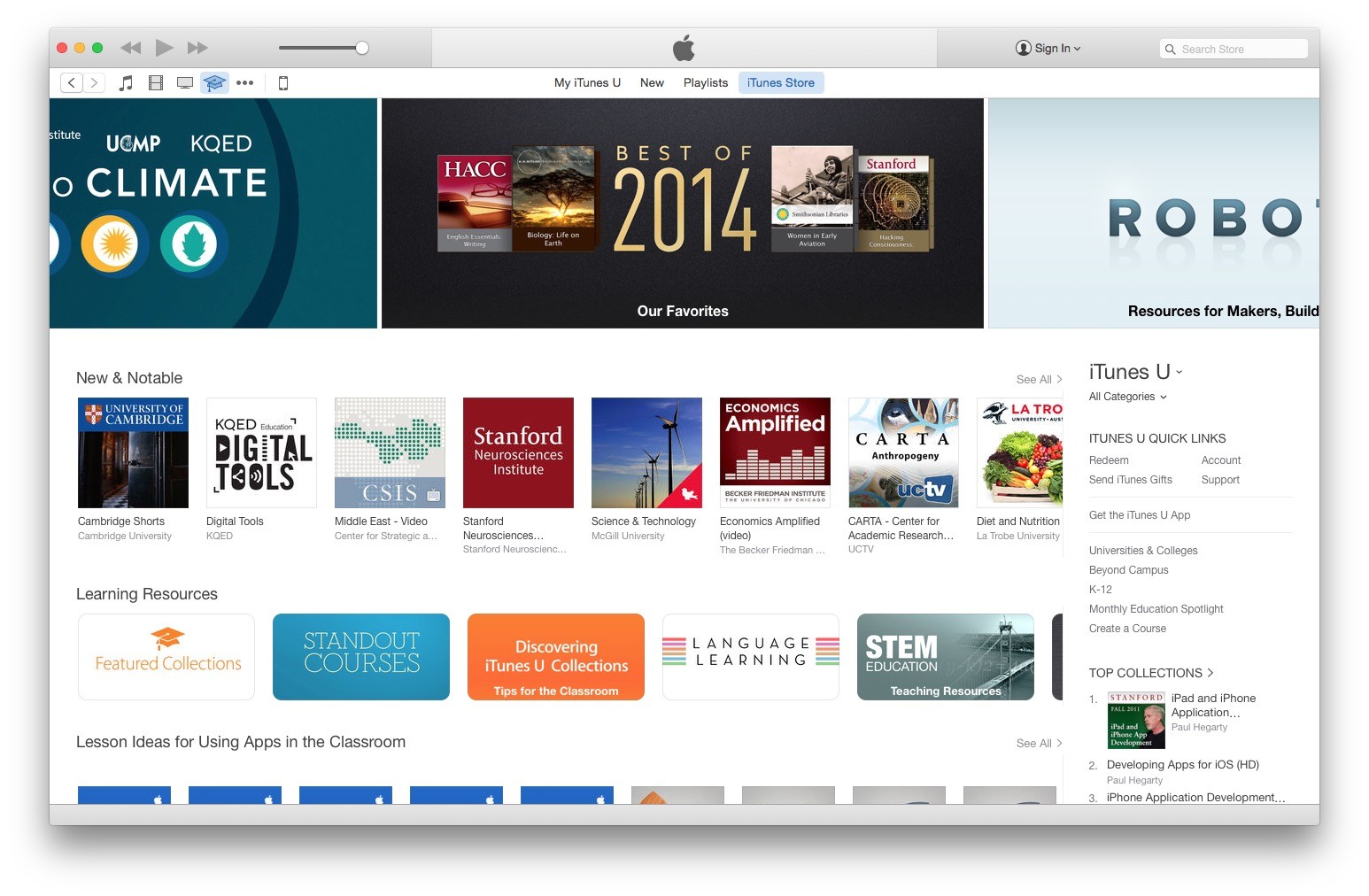
But the same thing should be applied to everything else. iTunes U is something only a fraction of the user base accesses to download content, which makes it obvious that it doesn’t need to bother everyone else with its presence, which means it needs its own app (evidently under a different name). Podcasts should also get a Podcasts app. iOS has one, so why not the Mac? The iOS App Store - for the love of God - should have its own app, just like the Mac App Store has its own app. It’s not rocket science.
And for anyone concerned that this would clutter their dock with app icons, here’s an even simpler answer that doesn’t even involve breaking down the app: a two-pane interface that sacrifices an inch of your screen real estate to display all these different iTunes “Stores” in a permanent panel that you can choose to have displayed or not. As it stands, iTunes looks and feels like a product even Apple doesn't fully understand.

Disclaimer
This is a Personal Thoughts piece reflecting the author’s personal opinion on matters relating to Apple and / or the products associated with the Apple brand. This article should not be taken as the official stance of Softpedia on Apple-related matters.