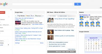
More and more sites are picking up the new Google design. The company vowed to give all of its products a unified look, a daunting task considering how many it has. But it's been working on it for the past few months and the latest to get the new clothes is iGoogle, the personalized homepage.
You've probably spotted the new design on countless Google sites by now, so the main elements should be familiar.
The color scheme is evident throughout the site, the big buttons replacing links, the large, in this case unnecessarily so, header are all common elements across many Google sites now.
Among what you'll notice with the new iGoogle is the left sidebar which is used for managing gadgets and the chat plugin.
It aims to replicate the look most Google sites have, including the search engine, but, thankfully, the sidebar can be hidden completely, leaving only your gadgets to fill up the entire screen.
This is actually a new option, as the old sidebar was permanent. Granted, the new one does seem more prominent, but it may be so because of the more spaced-out elements.
Another change is that the menu button for each individual gadget only shows up when you hover over it. This too contributes to the cleaner look Google is trying to give to all of its sites.
It's a shame that this space-saving approach wasn't applied to the header which features a huge search bar, the familiar blue search button and nothing else.
Granted, the iGoogle header has always been quite large, but the new version removes the links to the advanced search page and to the language tools. The I'm feeling lucky button is also gone.
Visually, it's a welcomed update since iGoogle has been quite neglected, but it is likely that Google will eventually tweak the new design, on other sites too, to make up for some of the shortcomings. [via Google OS]

 14 DAY TRIAL //