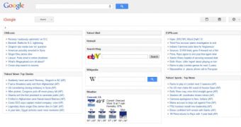
Google is now testing an updated iGoogle homepage. The customizable homepage has already seen an update last year, bringing its design up to date with the rest of Google websites.
But Google is not done yet, it seems, it is now testing an updated design that further integrates some of the new ideas, like the unified header, in an effort to bring the customizable homepage even more in line with other Google products, for better or for worse.
The changes should feel familiar by now as several Google products have introduced the unified header, even if Google seems to be having some second thoughts on that.
The main header holds the regular Google logo rather than the iGoogle one that the site has been sporting since birth. There's also a default search box, moved from its centered location to the left and that's about it.
If Google switches to this design as well and drops the top navbar entirely, this header will also include Google+ notifications, the share box and the account and profile settings menus.
The app-specific section of the header includes the 'iGoogle' name, in the same vein as all other Google products do like Docs or Gmail, though the similarity of the name to the regular Google logo, which sits on top, has been a matter of some criticism from users.
As for iGoogle-specific functionality, tabs have been moved and are available as a drop-down menu in the header sub-section. The left sidebar is now occupied solely by the chat box. Other than that, the page itself isn't seeing too many changes or updates, the big ones came with the major redesign of last summer.
Google seems to be going forward with its redesign plans, more and more products being included. While common design elements and even sections are a good idea, the move sometimes seems to the detriment of individual features of the products it is applied to.

 14 DAY TRIAL //