Last week, Google unveiled a new logo that’s supposed to be living proof of the company’s continuous evolution, as Google no longer stands just for a search engine but a wider array of services that connect people across the world.
To create this new logo, Google turned to a new font called Product Sans, and it obviously used its very own Material Design and the traditional four colors, namely blue, green, yellow, and red.
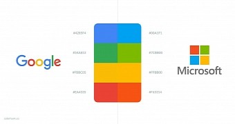
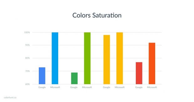
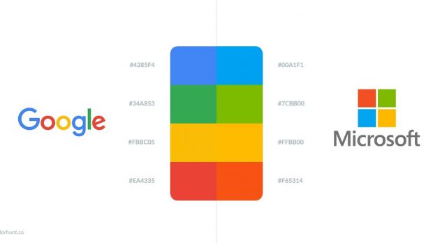
But as far as colors are concerned, ColorHunt noticed something that’s as interesting as it is unexpected: Google used almost the same colors as Microsoft for its new logo. Does this mean that Google copied Microsoft’s logo? Obviously not, but ColorHunt explains that Microsoft’s colors are more saturated because it went for a different approach than Google.
Google is more about the world
As you can see in the color comparison chart above, the blue, green, and red colors look similar but are not entirely the same, while the yellow tint is almost identical.
As ColorHunt explains, this has to do with the company’s different strategy, as Google and its Material Design bet more on reality, so its colors, which aren’t as saturated as Microsoft's, are supposed to be more appropriate for the real world.
Microsoft’s, on the other hand, fit better on a computer screen, hence the saturation.
“Microsoft, which is also a digital brand, uses much brighter and saturated colors that may be more related to the digital world and the computer screen than the ‘real world.’ It seems like Microsoft used the colors from the digital world, and Google is pushing ‘real life’ colors into the digital world,” ColorHunt points out.
As for Microsoft’s logo, the current version was announced in August 2012, before the release of Windows 8. Microsoft uses the Segoe font, which is the same the company uses for its product logos, as the squares of color are there to “express the diverse portfolio of products.”

 14 DAY TRIAL //

