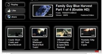
YouTube is continuing the visual revamp introduced with the major redesign launched several months ago. The latest update is a new ‘end of video’ screen which makes it easier to share the video as well as find new ones
The new end of video screen is not available to everyone just yet, it’s currently in testing, but it should become the default sooner rather than later. YouTube, like Google, regularly tests new features and changes with a small audience before introducing them globally.
On the left side of the new screen, you can access most of the actions related to the video, the share tools, a new like button and the option to replay it. In the lower part, you’ll see suggested videos related to the one you just watched. There are four suggested videos in the updated screen as opposed to just two in the current version.
The new end of video screen will likely be available only with the revamped video player which still hasn’t completely replaced the older one. Commercial videos as well as embedded ones still feature the older player.
The updated end of video screen contains most of the elements the current one has, but has a different layout. The biggest change is the addition of a box highlighting the next video in a playlist, something that’s not available today.
YouTube has been emphasizing playlists recently, in an effort to make people spend more time on the site. The idea is that, if you can make it easier for them to find interesting new videos and easier to get to them, users will have fewer reasons and opportunities to leave the site.
A very recent addition has been the Playlist Bar which now shows up at the bottom of any YouTube page when a playlist is active. The playlist may be user created, a quick list or a saved one, or it could be an automatically generated one. [via TNW]

 14 DAY TRIAL //