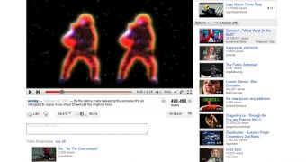
The grand YouTube redesign has now gone live for everyone, like expected. By now, most people have probably already seen it, YouTube is one of the biggest sites on the Internet after all, and by the looks of it, the drastic changes are getting their fair share of critics. It was inevitable that some people wouldn't like the changes, it happens to Facebook every time the social network makes even the slightest tweak to the site, but we'll have to wait and see what the general reaction is going to be.
"We first unveiled the new video page two months ago and checked in four weeks later to tell you about the latest set of changes. Truth is, we've been thinking about this for a long time: what you see is the result of eight months' worth of user research, feedback and data analysis. Now, after a few more additions based on your latest feedback, we are rolling it out to 100% of YouTube users," YouTube announced.
The redesign is perhaps the first major redesign of the YouTube video page in the five years the site has existed. There are plenty of changes but the common theme is simplicity and speed, two words Google is very, very fond of. Plenty of elements got shuffled around and probably even more have been dropped altogether. YouTube says the focus should be on the videos not on everything that goes on around them.
One thing you'll notice right away is the modularity of the new design. There is very little information displayed by default yet most things are easier to get to than before. For example, all the additional info about a video, the description, tags, date added and so on, is now grouped together under the video, taking up very little space.
By default, you just see a couple of lines of text. But click on the expander button (the one with the two arrows) and you get a lot more data without having to leave the page. This is true for every other element on the page. Expanding the view counts section reveals a plethora of analytics data like the number of views over time and the geographical location of the viewers.
Another big feature is the new playlist which is now 'glued' to the video box. The playlist gets a rather innocuous addition, an Autoplay switch, which doesn't really seem like that big of a deal. Yet this small feature is going to get people watching more videos, stay on the site for longer and, ultimately, bring Google more money.
Other features seeing big changes, most likely for the better, are the star system and the comments. The five-star rating system, which has been around ever since YouTube was launched, is now gone, replaced by simple "like/dislike" buttons. YouTube says people were already using the old star system like this, giving the videos they liked five stars, the ones they hated one star and very rarely anything in between.
Finally, the comments, long time one of YouTube's major weaknesses, have gotten an overhaul. The idea is simple, YouTube will try to surface the most relevant comments rather than just displaying thousands of pages of comments in chronological order. It sounds good in theory, but we'll have to wait to see how it performs in practice for a final judgment.
There are plenty of other changes, but, even so, it looks like YouTube is not about to stop here. Several features which were tested haven't made it in the final redesign. Chief among them is the revamped search page which allowed users to continue to watch a video while they were searching for others to add to the cue. It may be that YouTube wasn't satisfied with the results of this particular test, but maybe it will make its way onto the site in one form or another in the not-so-distant future.

 14 DAY TRIAL //