Yahoo seems to have remembered that it has a search engine because it looks like they’re finally toying with some new interface elements.
According to All Google Testing, Yahoo’s search engine interface has been going through some transformations, but the changes aren’t visible to everyone just yet, which means the company is still playing around, looking for bugs and user opinions.
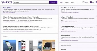
First off, at the top of the screen, you’ll notice that the search box is much more defined, with purple shades (to match the new search button and the logo) on the left and bottom edges.
Then, you’ll notice that on the right side of the search bar, there are now several filtering options. Instead of displaying these in a left-hand panel, Yahoo now offers you a quicker and more intuitive way to search for something in particular on the web or through images. Alternatively, from the “More” dropdown menu, you can choose to look through videos, news, maps and others.
Another important change that you’ll surely notice is the way the search results are displayed. Instead of the flat interface the company had accustomed us with, you’ll notice a much more interactive design.
When you move your mouse over the various search results, the entire area will turn from white to a light shade of purple, basically highlighting the whole entry.
After the first few entries, the search engine will offer you a few images to browse through, which also serve as a shortcut to the Image search.
The right hand panel hosts a bunch of ads related to your query, which you can ignore just like you always do. Below, you’ll also notice a box where you can choose whether to check out ads for other related searches.
The search results page expands further with more links, as well as a “related videos” panel, although this may vary from one query to another. Underneath, you’ll see even more ads, which gives us a hint about how desperate Yahoo has become for more ad money. Of course, a series of ads is already available in the regular interface as well.
The page ends with a “Next” button to take you to the following page of search results and another search bar. When you’re on the first page of the search results list, you will only see the aforementioned button and not the numbered links for the next pages.
If Yahoo decides to move forward with this design, it will likely take a little bit longer before everyone can test it out.

 14 DAY TRIAL //