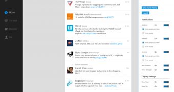
Twitter officially rolled out its Windows 8 client today, bringing a rather basic set of features and a very clean design supposed to appeal to all user categories.
Windows 8 adopters, on the other hand, have different opinions on the new Twitter app, according to the very first reviews posted in the Windows Store.
While some applaud Twitter for rolling out such a clean and intuitive design, others blast the company for introducing only a limited number of features, while essential options are completely missing from the package.
“The app in full screen mode looks awful. It’s empty, devoid of any content when looked at horizontally. Some decoration (what about your Twitter theme?) would have been nice,” one user wrote.
“This is why I don’t recommend this app: auto-complete in search is poor and no auto-complete for mentions. Also, RTL is handled poorly. This, I can’t scroll with my touchpad, hence the app is not usable at all,” another one continued.
As for those who like the new app, most are pleased with the clean design and the overall stability and performance of the Twitter client.
“Working great, finally, I’ve been waiting for a long time,” a pleased user said. “Worth the wait. “Excellent, good-looking, fast and stable,” another Windows 8 adopter noted.
Truth is, the official Twitter client does lack some important features, such as URL shortening, but this is only the first release, so major improvements are very likely to be introduced in the upcoming versions.
On the good side, it works like a charm on all Windows 8 devices, so you can use it on your Windows RT too. Thanks to Windows 8 integration, the Search and the Share Charms work flawlessly whenever you wish to look for Twitter content or share tweets with your friends.

 14 DAY TRIAL //