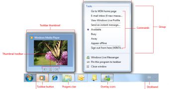
Forget about the Superbar, Windows 8 needs an Uberbar. Think about it in the lines of the Windows 7 Superbar, but on steroids. The new Windows 7 taskbar made the first appearance in May 2008, in a demonstration offered by Julie Larson-Green, Corporate Vice President, Windows Experience.
At that time, the small detail at the bottom of the screen in the preview version of Windows 7 from Larson-Green’s demo caused a bit of a stir, but Microsoft wasn’t in any way ready to share details of what was referred to internally as the Superbar.
It was only in Build 7000, the Beta development milestone of Windows 7 delivered in early 2009 that the Superbar become available for testing, even though it had already been baked into the operating system, but kept hidden even in M3, in late 2008.
As Microsoft is cooking the next generation of Windows, the evolution is bound to impact multiple areas of the platform, both under-the-hood and on the surface.
A wish list poll for the Windows 8 feature set started making the rounds on various websites recently, with one of the options being related to the overhauling of the graphical user interface.
But ahead of addressing the possibility of an overall UI redesign for Windows 8, the Taskbar certainly deserves some time in the spotlight, as is at the core of the platform’s user interface.
While I don’t see the software giant revamping the Taskbar to a level which would match the evolution from Windows Vista to Windows 7, there is certainly a chance that Microsoft could provide users with an Uberbar.
In this regard, the Redmond company could simply fine tune a “winning formula,” so to speak. This because, although Windows 7’s Superbar is indeed a leap forward in terms of increased productivity, flexibility and overall UX, fact is that it could be better.
Eye candy It goes without saying that the Windows 8 taskbar will need a face lift, however small. After all, the Taskbar is one of the first things that users come across after operating system startup, and it needs to scream Windows 8.
In this sense, Windows 8’s taskbar needs to be quite different from what is available in Windows 7.
Not that different that customers would feel lost, but sufficiently so to make them realize instantly that they’re looking at a new Windows release.
And if this isn’t an excellent opportunity to deliver some extra eye candy, I don’t know what it is.
Look to the Start button. If you ever had the feeling that the detail could do with more effects, you’re not the only one.
You can never have enough customization
I will always make it a point to as for as much customization options as possible. With the advent of Windows 7, and with the success of all articles related to the personalization of the operating system, in terms of the volume of readers they attract, it is clear that default is not enough.
There are some options in the Taskbar and Start Menu Properties, related to appearance, location, buttons, notification area and Aero Peek, but there should be more.
Microsoft should make it easier for customers that are missing the Quick Launch area to bring it back.
The company should also allow users to easily change the image used for the Start Menu, offer additional designs, as well as a way to quickly revert back to the default.
Taskbar Toolbars should deliver an integrated experience with pinned applications, featuring their own icons, rather than just a text label.
The Jumplists should also evolve to be more like the Start Menu, in the sense of the customization options available to users, and should get an extra area, allowing for a two-tiered menu.
Windows 8 should also enable users to easily change the size of the Taskbar Thumbnails for scenarios in which they deal with more opened instances of the same application.
The Show Desktop button should not have a fixed position, but rather allow users to move it around to wherever it makes more sense to them.
Also, the list that the Taskbar Thumbnails transforms into if e very large number of app instances are opened needs to evolve.
Try and navigate a list for let’s say 60 opened tabs in Internet Explorer 8 in Windows 7. The process is downright painful.
Users need to scroll items one by one, and the scrolling mechanism is primitive at best, not sure about the list either.
Taskbar Search
This is one detail that I would personally love to see added to the Taskbar in Windows 8.
Users can search a folder right from Windows Explorer, and they can also perform a search from the Start menu.
So why should they not be able to search through the instances of opened applications?
In a scenario in which users have over 100 IE tabs opened, wouldn’t it come in handy to have a Search feature to quickly allow them to identify a specific website?
If multiple Word documents are opened simultaneously, wouldn’t it be as simple as possible for the Office search to integrate with the Taskbar Search and allow customers to find a piece of information in one of the docs right from the Desktop? Extra features and functionality
In order to improve productivity even more, Microsoft needs to build Window Candy in Windows 8, per the Tab Candy model in Firefox 4.0.
It’s rather simple, managing over 100 opened windows, tabs, etc. in Windows is extremely difficult. The Redmond company needs to consider a new system, which integrates the Taskbar, Aero Flip 3D and Alt-Tab.
As far as I’m concerned, I always found Aero Flip 3D all but useless. Sure, it’s cute in the sense of “look at what my Windows does,” but having to scroll through multiple apps one by one in order to get to a specific application is absolutely no fun at all, at least not for me.
Window Candy should be about functionality and not about eye candy. It should allow users to see grouped instances of the same applications, collections of tabs in the case of IE, or sets of Office documents, and in combination with Aero Peek, enable them to easily make their way to a specific item on the desktop.
In this regard, Grouping needs to be enable for Taskbar Thumbnails as well as for windows. Aero Snap was introduced to make it simpler for users to work in two windows side by side.
Why not allow users to group windows, in collections of two or four, and access them right from the Taskbar as a set, rather than individual items?
At the same time, Windows 8 should feature intelligent sub-window taskbar buttons. Opening multiple instances of the same application always results in a group.
Even if the option Never Combine is enabled, the buttons still crowd together, like they are glued to each other. This should not be the case.
Users should be able to take any app instance button and move it anywhere on the Taskbar, independent of the rest of the buttons/instances of the same app.
At the same time, even when Taskbar Buttons are configured to combine, they should allow customers to strip some of them off the group, and access them individually.
Of course, these are just a few of my ideas on the evolution of the taskbar in Windows 8. Please share your thoughts via the comment section bellow or through Twitter.
What is your Windows 8 feature set wish list?

 14 DAY TRIAL //