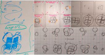
The sketch on the left is a primitive representation of the Windows 7 boot loader, as “primitive” as the paper that acted as the support for the sketches. Users and testers that have been running Windows 7 since pre-beta milestones, but also Beta builds and pre-Release Candidate versions, are certainly familiar with the new boot animation of Windows 7. Undoubtedly, the new animated boot screen is a consistent step forward from what is available in Windows Vista. Karen Wong, a program manager on the Core User Experience feature team, revealed that the boot animation was meant to capture the personality of Windows 7 and inherently connect emotionally with end users. Wong emphasized that Microsoft needed to step up its game and go beyond the visuals offered in Vista, in order to showcase Windows 7's light and energy.
“From a design perspective, we know that the visual presentation of a feature plays a key role in the user’s perception of performance and quality. Our objective was to make Windows boot beautiful and was inspired by our Windows 7 personality of light and energy; and the way these forms reveal themselves in nature became our design palette. Words such as “bioluminescence”, “organic”, “humble beauty”, and “atmosphere” came up frequently in our brainstorming sessions. We know that in isolation these might sound a bit corny, but this is all part of the overall goals of Windows 7,” Wong stated.
At the bottom of this article you will be able to find two embedded videos, one featuring the boot animation of Windows Vista while the other that of Windows 7. Wong indicated that Microsoft put together over a couple of dozen boot sequence designs. Following the review and user experience tests, the Redmond company went with the animation that is currently available in Windows 7 Beta Build 7000 and later.
“Designs varied in the saturation and/or brightness of color, the complexity of motion, and lighting effects,” Wong added. “The final design in Windows 7 shows energy approaching from four directions, that join to form a light that projects through a window (of course it is no coincidence that the Windows logo resembles a window!). A subtle pulse indicates progress thereafter; another design detail that reinforces the liveliness of Windows 7’s personality.”

 14 DAY TRIAL //