14 DAY TRIAL //
 With each major OS release from Apple and Microsoft, comparison write-ups are bound to ensue. More often than not, someone copied something and the editor is none too happy about it.
We’re tired of it. Despite their tumultuous history, the two OSes today are very distinct and quite unique in many areas. Both visually and functionally.
Task View and Mission Control
I’ve read at least five stories on this topic since Windows 10 was announced. People somehow find the two very similar. Sure, if you mean that they both expose your running apps, they are. But other than that, Task View and Mission Control are two very different animals.
You can’t say Microsoft borrowed this from Apple. While Apple had it before Linux, Ubuntu has been boasting this capability for a while, and we can’t be sure who borrowed from whom anymore. Windows 3.0 first introduced a window switcher of sorts in the early 90s. Using Alt+Tab, users would enter a flattened view of all their open windows. Point is, the thing works to the user’s benefit regardless of the platform, and every version has its ups and downs.
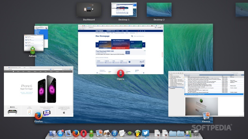
Less fluent on Windows, more cluttered on OS X
Task View is something that Windows 10 desperately needed. It’s clear that Microsoft saw its potential in OS X and Ubuntu and decided to no longer deprive its users of such a useful tool. But it looks and works differently in Windows.
For instance, it doesn’t kick in with such graphical oomph as it does on the Mac. It keeps the desktop background intact, only adding some translucency to the whole shebang, whereas OS X shrinks the wallpaper and displays everything atop of a gray background, giving you a feeling that you’ve entered another dimension.
Apps can be closed in this view on both Windows and Linux. Not on the Mac. Multiple desktops are displayed at the top in OS X. Windows 10 puts these at the bottom, and depending on what apps are open in what desktop, some discrepancies can be found here as well.
Take the good with the bad
Both Windows and OS X show the running apps’ icons in the vicinity of the open window. Apple chose to cram the icon halfway inside the app’s window, whereas Microsoft decided to place it atop the app’s window, with its name displayed nice and big. Apple’s approach makes Mission Control look a bit messy.
Furthermore, in OS X the windows seem to be arranged randomly (though they’re not), which further makes Mission Control look cluttered, especially when the user is running more than 7 different apps. On the good side, Mac users can minimize some apps’ windows in the Dock, which causes them to no longer appear in Mission Control. This offers a higher degree of control than Windows 10.