14 DAY TRIAL //
 Twitter, in all of its forms, is undergoing a massive revamp. A new design has been molded for the site, the mobile version, the mobile apps and even TweetDeck.
The big theme with this new design is unification, the sites and even the mobile apps look very similar and have many common elements.
The only one standing out is TweetDeck, which Twitter acquired earlier this year. Aimed more at professionals or hardcore Twitter users, the app has been a favorite since its launch.
But the latest incarnation is a major upgrade, not only visually and feature wise, but technically as well. It's built entirely on HTML5, but it looks and feels very much like an app rather than a website.
"Built with HTML5, the web version of TweetDeck syncs your accounts, columns, layout and settings whenever and wherever you sign in. And, TweetDeck now reflects the overall design of Twitter with Profile and Tweet box pop-ups," Twitter explained.
"Whether you are listening to conversations about a topic that impacts your business, or a journalist covering breaking news, TweetDeck on the web gives you an even simpler way to filter content," it said.
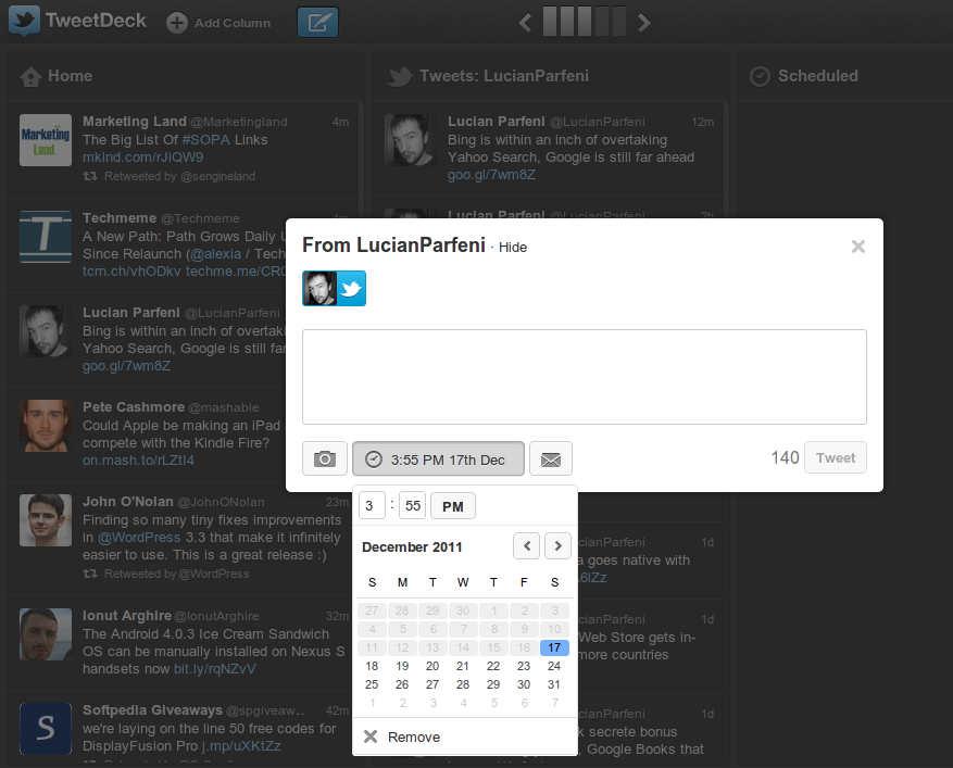
What's more, because of the new underpinnings, the web version of TweetDeck has made its debut. Those using the Chrome app version will find it very familiar. In fact, the new web version is identical to the Chrome app.
All of the functionality is still there, but the design is a bit more elegant. That said, it's still more TweetDeck than Twitter, with the dark background, content columns and so on.
Thankfully, the compose box has gotten a big upgrade and is significantly less buggy than the previous one. The schedule feature, for example, is a lot more usable, if only because you can actually type the time you want the tweet to be published at.