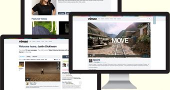
Vimeo has just unveiled its first redesign since launch, almost five years ago. It's a major revamp, the site has been rewritten from the ground up and everything about it is new, though there's plenty of the old design being used as inspiration.
The new Vimeo isn't yet available to everyone, it's still in testing, but you can put your name on a list to get the new design, as soon as you're deemed worthy.
"If your reaction to this news is, 'But wait!!! I love the old Vimeo!!!' we totally understand. In fact, we’re happy you feel that way, because we love the old Vimeo, too," Vimeo wrote.
"However, within our unconditional love there lies another sentiment: the burning desire to make Vimeo better. So, that’s what we did. We tore Vimeo down, thought hard about every aspect of it, and created the new Vimeo from scratch," it said.
Vimeo says it has three big goals with the new redesign. The first, and one you're sure to notice, is the much bigger focus on videos, quite literally. Videos on video pages are now a lot bigger than before. Everything else on the page has been pushed to the background.
Another big goal was to streamline everything and make it faster. That has been achieved both technically and design wise. Page elements, comments and so on, load on demand, as you scroll down.
The team put to good use all of the latest web technologies and standards. At the same time, the new Vimeo continues with the minimalist look of the old (current) one.
The homepage/dashboard has been redesigned as well, it's now dubbed the feed, for good reason. Videos from the people and channels you follow are now ordered chronologically in a single feed.
There's more to like about the new Vimeo, but you can see for yourself as the new site gets rolled out to all users in the next few weeks. To make sure you're among the first, you can sign up to get it faster.

 14 DAY TRIAL //