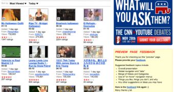
Following the recent preview of the new YouTube interface rolled out by the video sharing service, the fans of the product sent out some interesting feedback messages which underlined the good and the bad parts of the new feature. Certainly, YouTube read all these comments and today it officially rolled out a new preview, this time concerning the 'Videos' tab. As you can see for yourself, there's no more red on the page, a color which was pretty annoying. Moreover, YouTube adjusted the font size and modified the drop-down menus' behavior to show the categories once you get your cursor over the black triangle near them.
Getting back to the users' feedback messages, the consumers were sure that the red tab menu color would be replaced by any other color. And YouTube understood it and replaced it with gray which seems to look pretty fine on the new YouTube preview.
The YouTube team tried to underline the importance of the users' messages and wrote some of them on the official blog of the video sharing technology. "When the new layout loaded, i literally jerked away from the screen because of how unattractive it is! I then thought it might be a hacker's joke," one user wrote while another considered that the previous interface was also annoying: "The preview is about as ugly as your present look, which I always assumed was designed by a room full of engineers without access to Photoshop."
Now read the funniest message received by YouTube's engineers who posted them on their official blog: "Wow, doesn't that look like crap...that color red absolutely sucks. Who thought blood read would be good when someone comes home from work and wants to veg out at some stupid meager web videos and find this vibrant blood red that shocks the eyes into a panic attack resulting in a deadly heart attack. To all the YouTube CEOs, talk to a psychiatrist, they can tell you what calm and soothing colors are."

 14 DAY TRIAL //