|
|
|
|
|
Ubuntu 9.04's New ThemesDust, Dust Sand and New Wave |
|
| |
Well, here we go again... it appears the Canonical just uploaded some new and very nice desktop themes for the upcoming Ubuntu 9.04 (Jaunty Jackalope) operating system, in order to please their devoted users. Softpedia is once again the first website to offer you a preview of the new artwork, which will probably be present in the final release of Ubuntu 9.04. 
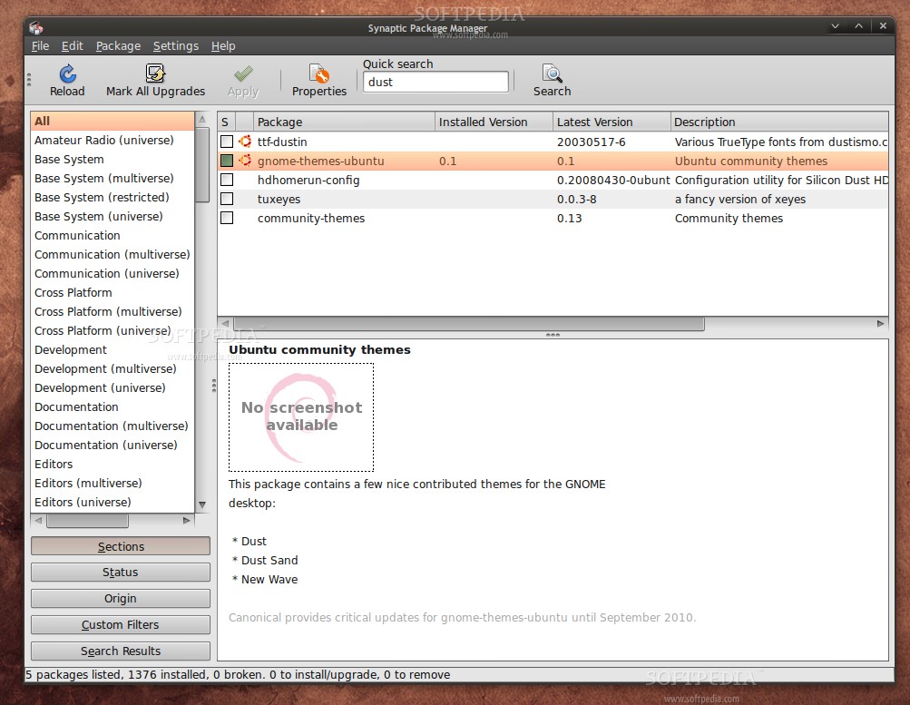
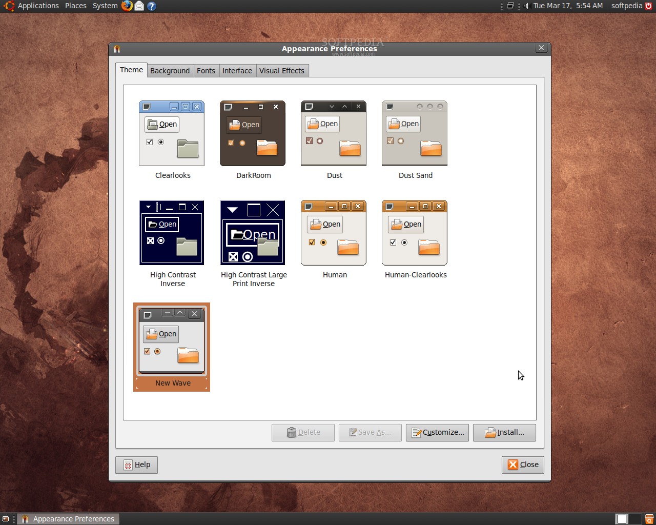
OK, so... long story short, it looks like there's a new package (see the end notes for details) named gnome-themes-ubuntu, which contains three of the most popular, community created GNOME themes: Dust, Dust Sand and New Wave. However, none of the new themes is set as default... yet! Without further introduction, here are the new themes... | Ubuntu 9.04 Daily Build 03172009 with the New Wave theme | | Ubuntu 9.04 Daily Build 03172009 with the Dust theme | | Ubuntu 9.04 Daily Build 03172009 with the Dust Sand theme |
What else can we tell you?... the new themes look and feel great! Once again, we would like to mention the fact that the above themes are created by third-party authors: New Wave is created by Anton Kerezov, Dust and Dust Sand are created by Rico Sta. Cruz and Kido Mariano. And, now that we have a new login screen, new notifications and three new nice themes... all we need is a breathtaking wallpaper. Among other new features in Ubuntu 9.04 is the famous GNOME 2.26 desktop environment, which brings lots and lots of improvements in many areas, such as Evolution, GNOME Control Center, GNOME Media, GNOME Power Manager, etc. Ubuntu 9.04's kernel will be based on the latest version of Linux kernel 2.6.28, which will offer support for many new devices (wireless, webcams, etc). Moreover, applications such as OpenOffice.org 3.0.1, The GIMP 2.6.6, Mozilla Firefox 3.0.7, Mozilla Thunderbird 2.0.0.21, Transmission 1.51 or Pidgin 2.5.5 will also be present in the final version of Ubuntu 9.04 (Jaunty Jackalope), due for release on April 23rd. Don't forget to visit our website next Friday for the Ubuntu 9.04 Beta Screenshot Tour, where we will unveil more of Jaunty's new features! Later edit: We discovered that the themes will be present in Ubuntu 9.04 and they are all in an official package, named "gnome-themes-ubuntu". Please see the screenshot below for more details. | Ubuntu 9.04 Daily Build 03172009 - The gnome-themes-ubuntu package in Synaptic |
|
|
| Article rating: |
|
Very Good (4.1/5) |
39 vote(s) |
|

|
|
|
User opinions: |
| Comment #1 by: rico on 17 Mar 2009, 11:58 GMT | reply to this comment | nice themes, are they working for gtk1 apps like synaptics?
i just regret the fact that you don't see anymore at first glance which window is in focus, they all look alike the unfocused one is just i tiny bit faded.. I like the fact that in human theme focused and unfocused windows have very distinct window title bars. |
| Comment #2 by: Marius Nestor on 17 Mar 2009, 13:52 GMT | reply to this comment | But of course... here's a shot:
http://news.softpedia.com/images/extra/LINUX/large/jauntynewartwork-large_004.jpg |
| Comment #2.1 by: Aaron on 17 Mar 2009, 16:12 GMT | I've always wondered why the people who make these themes feel the need to have the X in the top right corner to turn red when it gets moused over or pressed.
It just puts off a "Windows vibe". Not only that it tends not to go to well with the default theme in Ubuntu, which is heavy on the browns and oranges.
Just my 2 cents. |
| Comment #3 by: Mohan on 17 Mar 2009, 16:09 GMT | reply to this comment | Those are some awesome looking themes! |
| Comment #4 by: Phil on 17 Mar 2009, 17:43 GMT | reply to this comment | GREAT!!!
I just ran across these themes about a month ago and I like them all. I use Dust on my laptop and desktop. One of these should be the default theme. |
| Comment #5 by: littlenoodles on 17 Mar 2009, 18:19 GMT | reply to this comment | Nice, but why does GNOME always have to have so much extra vertical spacing in their toolbars.
The Dust themes, in using the same color for the titlebar and other toolbars, really make this stand out. It's an awful lot of brown up there... |
| Comment #5.1 by: Josh on 25 Mar 2009, 07:25 GMT | If you take a look at the images instead of just skimming the page, you'll see the themes themselves are not very brown at all, they are dark, but not really brown - the default background from Intrepid however, very, very brown. |
| Comment #6 by: Ollie on 17 Mar 2009, 18:26 GMT | reply to this comment | these themes are f*** ugly!. canonical needs to higher some real artists. They have excellent programmers, but sorry, when it comes to HCI, we still have a long way to go to catch up with the likes of Apple and M$ |
| Comment #6.1 by: james on 18 Mar 2009, 15:54 GMT | -spelling error: CHECK
-using a $ for the S in MS: CHECK
-still wasting oxygen: CHECK |
| Comment #6.2 by: Jonathan on 18 Mar 2009, 23:27 GMT | In addition to what my good friend (that I'm meeting for the first time) James has to say about you, you're also absolutely incorrect in the "canonical needs to higher some real artists." as these are all community generated themes, not created by Canonical. So, basically what you're saying here is that you think that the people who, on their own initiative, took the time to edit & re-code these themes for free for anyone to use need to be better designers, right? So...where's the link to all the themes that you've worked on, again? |
| Comment #6.3 by: Wagro on 20 Mar 2009, 03:24 GMT | LOL!! Absolutely in agreement with James and Jonathan on this.. I, for one, have spent hours and hours contributing artwork so that others may use it for their open desktops. I and countless others enjoy being able to contribute in this way. Though constructive criticism is always welcome, downright negativity and ignorant comments are just--well, you really don't need people to point out that it makes you look tacky, uneducated and infantile - right? |
| Comment #7 by: pff on 17 Mar 2009, 19:05 GMT | reply to this comment | They are just communauty themes, nothin to do with official work. |
| Comment #8 by: Gus on 17 Mar 2009, 20:29 GMT | reply to this comment | With a new set of icons life could be wonderful. Maybe for 9.10 |
| Comment #9 by: manny on 18 Mar 2009, 00:55 GMT | reply to this comment | "three new nice themes... all we need is a breathtaking wallpaper."
actually we also need new Icons to go with the new themes! |
| Comment #10 by: bubuzzz on 18 Mar 2009, 02:06 GMT | reply to this comment | Why is it always dark and brown? Why don't make something more colorful and brighter ? |
| Comment #10.1 by: John on 27 Apr 2009, 00:47 GMT | Saying "enough with brown" is like asking redmond to change from blue and Apple to stop using burnished silver and grey. The advantage of linux though is it is trivial to change to something else. OS X and Windows requrie third-party products to do anything with theirs.. The default desktops and themes on my PCs usually only stay in the guest account. My normal desktop will be changed after about an hour of playing with the new system 8)
However, really would like to have the scrollbars on the left. When using my tablet, my hand obsured the screen, (I'm left handed) I already move the window widgets over to the left (OS X style) |
| Comment #11 by: Mike on 18 Mar 2009, 03:13 GMT | reply to this comment | Frelling hell...
Nobody's said it yet (on this post) but I just can't help myself: *enough with the brown*!!!
Ubuntu, I know you're trying to be all warm and human-y and inspired-by-African-sensibilities-ish ... but enough with the brown. It's a drab, boring colour and looks terrible. |
| Comment #11.1 by: silicond on 19 Mar 2009, 11:53 GMT | Totally agree. The brown theme has had its day. Considering user interface improvements were supposed to be a key goal of this release I can't really say I'm that impressed. Apple isn't exactly going to be quaking in their boots, which is a real shame. |
| Comment #12 by: Chris Schulz on 18 Mar 2009, 06:28 GMT | reply to this comment | ummm... ive been using dust for ages... in 8.04 / 10 |
| Comment #13 by: Adam on 18 Mar 2009, 07:48 GMT | reply to this comment | Dust and New Wave are already included in Intrepid in the community-themes package, it's just not installed by default. |
| Comment #13.1 by: Marius Nestor on 18 Mar 2009, 08:21 GMT | Hi Adam, yes they are... but the versions in that package are very old and they are not the same with the one above (different Metacity, color scheme, etc). Moreover... "Canonical does not provide updates for community-themes. Some updates may be provided by the Ubuntu community."
On the other hand, the new "gnome-themes-ubuntu" package is supported by Canonical until 2010 (as you can see from the last screenshot above). |
| Comment #14 by: Zac on 18 Mar 2009, 08:34 GMT | reply to this comment | Nice theme, the dust sand and wave one are nice - very easy on the eyes.
I for one have grown to like the brown. It is easy on the eye and it is unique, and it is great advertising, it immediately says I am not using Microsoft Windows. I am tired of blues and greens. Just because you have used a blue them for the last 10 years, it doesn't mean you have to use it for the next 20 years. Try something different. |
| Comment #15 by: AnibalOjeda on 18 Mar 2009, 14:04 GMT | reply to this comment | New unsplash theme have been released on a new update.. im following since alpha 5
really nice unspalsh theme!
everyone update their alpha installations! |
| Comment #15.1 by: Marius Nestor on 18 Mar 2009, 19:52 GMT | We know... it was released earlier today... it took us a little more to publish it, but here it is: http://news.softpedia.com/news/Ubuntu-9-04-039-s-New-Boot-Splash-107165.shtml
Enjoy! |
| Comment #16 by: Budda Magoo on 18 Mar 2009, 15:42 GMT | reply to this comment | OMG, more ghastly brown tones. It was almost predictable before I even clicked on the link. It's makes Ubuntu the saddest, drabbest linux version on the face of the planet. I'll stick with something either blue or green, thank you. |
| Comment #17 by: Fred Clown on 18 Mar 2009, 15:47 GMT | reply to this comment | These are themes? They just like the same OS with different colors. Hardly what I would call a "theme". Seriously Ubuntu needs to figure out what a theme is, and simply changing the background image and colors of the toolbars and windows doesn't cut it. |
| Comment #18 by: hypatia of alexandria on 18 Mar 2009, 16:00 GMT | reply to this comment | I really like the brown. Blue/grey have been dominant since my TI99-4 and C-64.
I also agree with the comment about wasted vertical space, my laptop has a small but wide screen. Having 33% of widow a wasted on menus and icons is really frustrating. |
| Comment #19 by: Don on 18 Mar 2009, 18:19 GMT | reply to this comment | These themes seem to be based on the basic OS X theme, especially Dust! |
| Comment #20 by: jj on 18 Mar 2009, 18:25 GMT | reply to this comment | Looks like the same old, dingy, crap to me. |
| Comment #21 by: Pez on 18 Mar 2009, 18:55 GMT | reply to this comment | Please! Please! PLEASE! Give us something to choose over turd brown. |
| Comment #22 by: Greg on 18 Mar 2009, 19:13 GMT | reply to this comment | How is this theme different from Intrepid Ibex? All I see are differently colored title bars. Compix has more to offer in themeing. |
| Comment #23 by: Demontrout on 18 Mar 2009, 20:14 GMT | reply to this comment | Argh! What's the point? Grey, very dark grey or feeble sand? Who gives a crap? The problem with the interface is highlighted by that first batch of pics. How much of that explorer window is taken up with navigation, menus and ugly icons?
It needs streamlining. |
| Comment #24 by: Daniel on 18 Mar 2009, 22:13 GMT | reply to this comment | The Dust theme is very nice, I don't like the others. I agree with the menu thing, it is incredible big, I'm also really really sick of the brown/orange, I've been using Ubuntu since Feisty. |
| Comment #25 by: George Fragos on 18 Mar 2009, 22:29 GMT | reply to this comment | The themes are nice but what's really special is how easy it is tweak and change the themes to create a personal look. Don't like brown -- change it. |
| Comment #26 by: anonymous on 19 Mar 2009, 10:54 GMT | reply to this comment | No more brown/orange/gold please, seriously they need to hire Mac OS X team for the GUI. |
| Comment #27 by: bruno on 19 Mar 2009, 19:13 GMT | reply to this comment | Agree with bubuzzz: why not more color and bright? And another thing, +1 with u Mike for removing brown.. it sux!
Gnome icons and toolbars also need to be reduced. Let's wait for 9.10 |
| Comment #28 by: garyc on 19 Mar 2009, 19:40 GMT | reply to this comment | Hmmm NOT more brown :(
i think it would be nice to have nice fresh blue theme
I think Ill stick with my Moomex theme and tobacco sky wallpaper |
| Comment #29 by: Rambling Johnny on 20 Mar 2009, 02:31 GMT | reply to this comment | I never use the standard theme anyway and has for the wallpaper. I just use the wallpaper tray a nice app that let me change at random my wallpaper every 10 minutes. |
| Comment #30 by: aaron on 20 Mar 2009, 20:08 GMT | reply to this comment | These are the best community made themes. but I'd like to see some official ones. |
| Comment #30.1 by: Marius Nestor on 20 Mar 2009, 23:00 GMT | You will.... in Ubuntu 9.10 ... the new designers hired by Canonical are working hard on the new look of Ubuntu :) |
| Comment #31 by: Spazzie on 21 Mar 2009, 01:08 GMT | reply to this comment | Remember KDE 3.x gave users a choice of theme's when it first booted ..why can't UBUNTU do likewise ..ie brown African Scheme, Australian Scheme, USA scheme etc |
| Comment #32 by: Ronny Boesiger on 28 Mar 2009, 15:27 GMT | reply to this comment | The theme looks in my opinion quite fashionable. I have to admit though that I hope for a brighter theme.
The current iconset does not fit that well to the new theme too |
| Comment #33 by: guido on 31 Mar 2009, 08:19 GMT | reply to this comment | The look & feel seems great...
but I think that in default themes there is too much wasted space...
buttons, menus, etc are too big...
I want to use my desktop pixels for my data, not for the GUI...
the "Clearlooks Compact" theme is a first solution...
but is not enough, compared to the free space in Windows desktops, it does not allow color customizations etc...
In my opinion... the road for a "useful desktop" is still long... |
| Comment #34 by: Robbie Litchfield on 19 Apr 2009, 06:14 GMT | reply to this comment | Is it me,
or do they all remind me of Mac OSX Leopard |
| Comment #35 by: Michael on 28 Apr 2009, 16:41 GMT | reply to this comment | Good article...thanks. What fonts are used in those screenshots? |
| Comment #35.1 by: Marius Nestor on 02 May 2009, 11:48 GMT | The default font in Ubuntu 9.04 :) They are not tweaked or anything... |
| Comment #36 by: polax on 25 May 2009, 08:50 GMT | reply to this comment | I could be missing something here, but when i tried installing 75111-UBUNTU LEAF and 54834-Ubuntu3D-GDM-2.0, ubuntu theme manager complained that there were invalid themes.
Ubuntu professional v2 installed though - so have the others been able to installed the afore mentioned themes? |
| Comment #37 by: ravi routhu on 03 Aug 2009, 17:24 GMT | reply to this comment | i am very glad to hear about this ubuntu i love this os |
|
|
|