Google Maps has made it possible to visit every corner of the Earth, see Street View or satellite images of it, get distances and directions and so on. Yet, for all the technology and advances, Maps still has one big problem like every other map before it, it's not accurate.
The Earth is (almost) a sphere, but most maps are flat. To peel off the surface of a sphere and present it as a flat surface means stretching that surface, mathematically, you can't actually display a round surface onto a flat one.
This is why all flat maps are approximations, or projections, of the round Earth. There are many, many projections, some better than others, some built with a specific purpose in mind.
Cartography fans (yes, they exist) argue about which is the best, worse than Apple and Android fanboys argue in YouTube comments.
But there's one thing they agree on, the Mercator projection is the worst. Ironically, it's also the most popular and the one most people are familiar with.
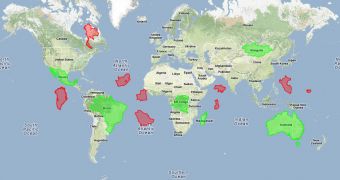
So much so that when they see another one, it looks wrong. To give you an idea of just how inaccurate the Mercator projection, or as Google calls it "Boy Do We Love Greenland," one Googler created the Mercator puzzle on top of Google Maps.
It's a fun little puzzle, you just have to match the country outlines to the country it belongs to but because of the distortion, it's a lot harder than it looks and you'll certainly have quite a few surprises. Among them, yes, Greenland really isn't as big as it looks, but it's still bigger than you may expect.
There's a practical side to the game though, Luke Mahe, its creator, put it together to show off the new draggable polygons feature in the Google Maps API. It's safe to say he succeeded in doing just that.

 14 DAY TRIAL //