")
 14 DAY TRIAL //
 I’ve had this on the tip of my tongue for a week now, but I just couldn’t get myself to write down these words. Until now, that is. Having seen so much disappointment about the iPad, I’m guessing few Apple fanboys will be offended by the allegation that the iPad is not all that great from a design standpoint either.
Before you jump on the comments, I have a few arguments to back up these claims. First off, it’s my personal opinion, which means I can pretty much say the iPad looks like a Mexican dish, if that’s how it strikes me. Naturally, it doesn’t. I’m just trying to make a point.
Second of all, I’m talking about Apple’s own (self-imposed) standards here. If we were to compare Apple’s device to other vendors’ products, I’d be giving points to the iPad like throwing handfulls of grain to a flock of hungry pidgeons.
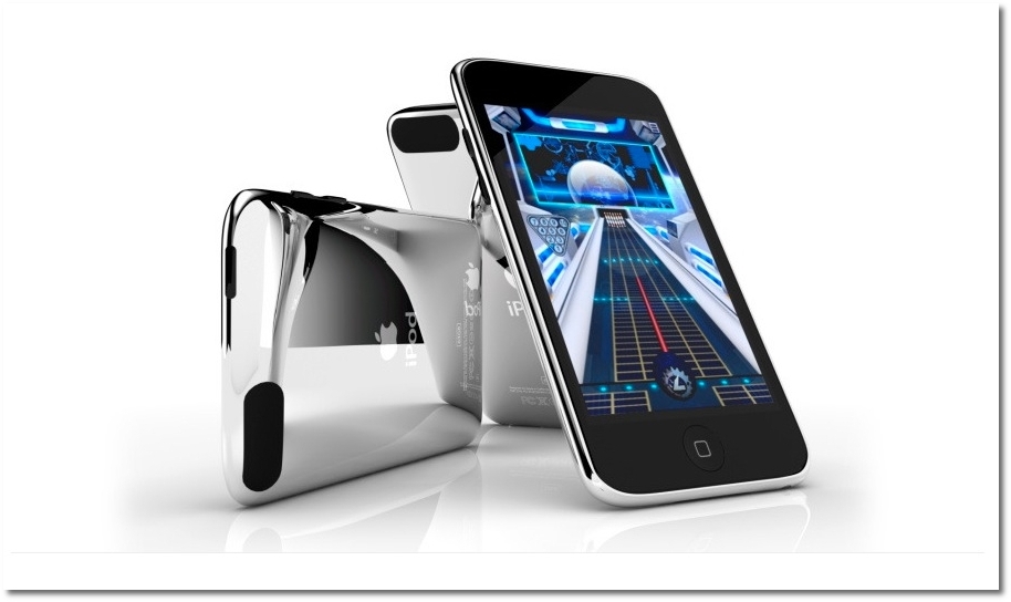
BUT. I really think all the Apple-tablet hype should have materialized in more than just an oversized iPod touch. In fact, the iPad doesn’t even retain some of those key design elements that make the iPod touch stand out so well.
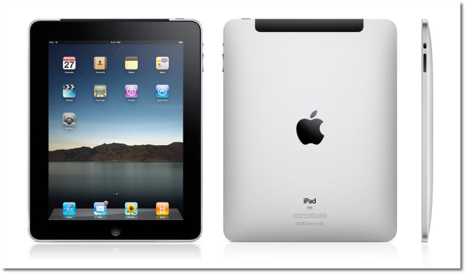
The iPad’s black bezel, if you would be so kind as to observe, is equally wide on every side of the screen (up, down, left, right). This makes it look fat and wide, even when held vertically. The iPod touch, on the other hand (just like the iPhone), does away with that useless space on the sides, making the device look taller, and more elegant.
Apple has this nasty habit of denying folks certain cool features that would very well go with the initial version of a product, just to make customers long for them and crave for the second, much-improved device. It’s also a strategy to ensure that Apple perpetuates the cult surrounding its products. Remember how people started throwing their hats in the air when Apple finally confirmed copy-paste for the iPhone OS? That feature should have been there since day one, but no... Why give them everything at once, when you can divide these cool features into smaller increments, charging money with each release? Eh...
Continuing to dig my own hole here, I’d also have to say those sharp edges don’t exactly do it for me either. They just don’t capture that tablet look I was expecting. I’m thinking: If you’re going to make it just a big iPod touch, you might as well go all the way. Instead, Apple decided to simply shape it like the bottom side of a MacBook Pro. But that side hardly ever shows, does it?
Whatever the reasoning behind the iPad’s design, I’m sure Apple has everything thought out. I’m sticking to my theory that V2.0 of the Apple tablet will be a much sleeker slate-shaped device, with an even more advanced OS to boot. How else will it sell if it doesn’t make the old one look old, right?
Since I’m sure not that many people agree with this take on the matter, why would you say the iPad is, in fact, a great looking device? Those who agree may jump in too, but are advised to quickly swim back to shore, with Apple fanboys sharks just waiting to take a bite at them.
UPDATE: I would like to add a bit of clarification, before readers get the wrong impresion about my stance on the iPad's looks. I wasn't suggesting the iPad needs to lose the right and left sides of the bezel altogether. Simply put, those sides should have been made a tad more narrow, for a more appealing look.