Windows 8, the next-generation desktop client from Microsoft, is gearing up to reach the Consumer Preview milestone, after being released as a Developer Preview in September last year.
With the new platform, Microsoft announced a new approach to the computer market, through offering touch enhancements and a brand new user interface, called Metro.
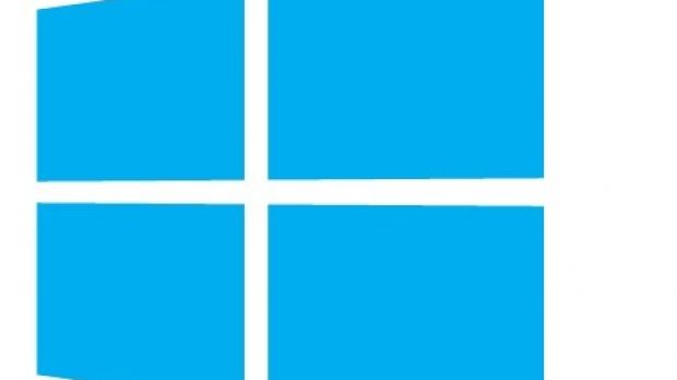
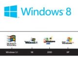
In line with all these changes, the company decided to make some changes to the Windows logo as well, so as to show that Windows 8 is indeed a complete reimagination of the Windows operating system.
“Nothing has been left unexplored, including the Windows logo, to evaluate how it held up to modern PC sensibilities,” Sam Moreau, principal director of User Experience for Windows, explains in a recent blog post.
“The Windows logo is a strong and widely recognized mark but when we stepped back and analyzed it, we realized an evolution of our logo would better reflect our Metro style design principles and we also felt there was an opportunity to reconnect with some of the powerful characteristics of previous incarnations.”
It all started in the early development cycle for Windows 8, and involved a team that included Paula Scher, Michael Beirut and Daniel Weil from Pentagram, along with designers and marketing leaders from Windows and other Microsoft businesses.
With the new Windows 8 logo, Microsoft is going back to the roots. The logo was originally intended to be a window, and this is exactly what it represents in Windows 8.
Here’s what Sam Moreau notes on the goals Microsoft had in mind when redesigning the new logo:
1. We wanted the new logo to be both modern and classic by echoing the International Typographic Style (or Swiss design) that has been a great influence on our Metro style design philosophy. Using bold flat colors and clean lines and shapes, the new logo has the characteristics of way-finding design systems seen in airports and subways.
2. It was important that the new logo carries our Metro principle of being “Authentically Digital”. By that, we mean it does not try to emulate faux-industrial design characteristics such as materiality (glass, wood, plastic, etc.). It has motion – aligning with the fast and fluid style you’ll find throughout Windows 8.
3. Our final goal was for the new logo to be humble, yet confident. Welcoming you in with a slight tilt in perspective and when you change your color, the logo changes to reflect you. It is a “Personal” Computer after all.
Not only was the new logo designed with respects to the Metro UI in Windows 8, but it was also meant to bring some simplicity into the mix. As Microsoft stresses out, the re-imagined Windows 8 logo is just what it was initially meant to be, a window.

 14 DAY TRIAL //

