14 DAY TRIAL //
 Softpedia has been around for nearly 13 years, during which it has gone through a lot of changes, including a rebranding. It was high time for a full redesign, to bring it up to speed with the times and to offer Softpedians a much nicer place to be in.
Softpedia remains the place where you can find trustworthy downloads for Windows, Mac, Linux and Mobiles, as well as the latest news about your favorite tech topics and beyond. Starting today, it’s wrapped in a better-looking package that we hope you’ll love as much as we do.
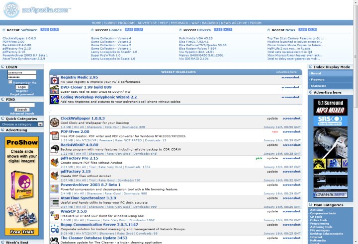
The new home page
On our new home page, you’ll be able to find the most recent reviews, as well as a nifty wheel that will take you through the most popular downloads of the past few days.
Below, you’ll notice the latest news our team wrote, as well as the editorials we put much thought into. The Software of the Day feature is right below, alongside the freshest deal we offer visitors who are interested in various useful pieces of software.
Our mobile devices database comes up next with the just-released phones and tablets, as well as a few of the latest reviews for such devices. Lower still, you can also see the most read news articles on Softpedia, and the up-to-date software available for download. The download hubs can be found at the bottom of the screen.
Easy navigation
We’ve made reaching all areas of the site that much easier by making the top menu bar stick around as you scroll down the pages. Also included is the all-familiar “hamburger button,” which we’ll leave for you to discover.
You will find it is extremely easy to access all areas of our site from there by choosing the platform you’re interested in – desktop (Windows, games, drivers, Mac and Linux) or Mobile (Phones, Tablets and Handheld Apps). From the same area, you can access Web-related tools, such as webscripts and web browsers or the news section.
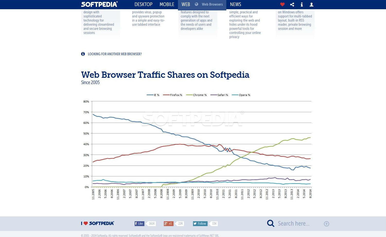
On the web browser section, you can find the most popular browsers in the world – Chrome, Firefox, Internet Explorer, Opera and Safari, along with the download buttons, Softpedia reviews and ratings. A bit lower we included a cool graph so you can see just what browsers Softpedia visitors use and how their popularity has shifted over the years.
Still the best place to download software
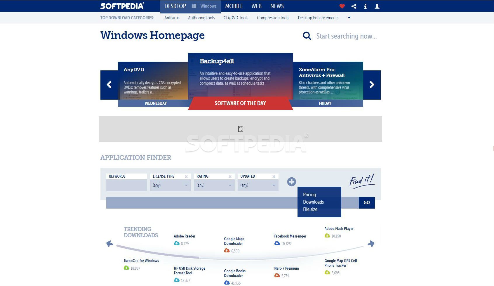
Softpedia continues to bring you the newest software out there and the latest updates, without any added modifications, “installers,” bundles or fishy third-party components . The pages dedicated to the apps for each platform start off with the software of the day. Unlike the option on the homepage, you’ll be able to scroll through over a week’s worth of daily picks.
Lower still, you can use our revamped application finder that allows you to check for keywords, pick a license type, the app’s rating, the time frame for the last update, pricing, file size ranges and the number of downloads. You can add any of these from the big plus sign on the menu or nix any of them by clicking the “x” button on their corner. These should all help you filter your search.
To make things easier for everyone, we’ve also streamlined the download process. Instead of having to go through multiple pages, we’ve moved everything into a new window. You’ll be able to choose the server from which to download, see the file type and its size. For those apps that can be purchased, you’ll also see the buy button.
Stay informed
The News Center has also been completely revamped. At the top of the page, you’ll notice the main domains you can read news about, and with the help of the little arrow on the right, you can expand this to check out all the areas we cover if you want to find out the latest news on a certain topic.
If you choose one of these, you can then click on the plus sign next to the domain’s name to see various subdomains for further filtering.
There are two ways to browse the Softpedia News Center now. You can either choose the list view, in which case you’ll notice the hottest topics at the top of the page and then the news feed in the order of their posting.
Alternatively, you can choose the grid view, which makes them all pop out. In this mode, articles are shown in color coded groups equivalent to a screen-by-screen navigation.
As you scroll down the page, you’ll notice that more groups appear. Since infinite scrolling has its good sides and its bad sides, we’ve decided to load five scrolls worth of news before suggesting that maybe going to our archive is the best choice. Alternatively, you can click on the other arrow and let us randomly pick a category you might be interested in.
We’ve also revamped the article pages for you. You get to have access to all the information in an easy-to-read interface. Galleries can be checked out either by clicking on the images below the articles or by clicking on the one found at the top of the screen, beside the news text. You won’t be taken to a new page anymore as the images will load in a lightbox and you’ll be able to move from one picture to the next with the help of the arrows on the screen or the arrow buttons on your keyboard.
Overall
We’ve made a lot of changes to our site and there are more to come, both to the interface and the way the site works as a whole. We’ve already made it load faster so you don’t have to wait around forever, regardless of your Internet speed.
In the next few weeks, we’ll be rolling out a revamped mobile site that will offer users most of the functionality of the desktop site. Tablet users can already take advantage of the desktop version, as it has been designed with ease of use and touch interactions in mind.
In the coming months, we’ll also be moving to HTTPS to offer users some added protection while visiting Softpedia.
We’re always open to suggestions, so we’re eager to hear your thoughts on the new site so be sure to hit our feedback buttons on the side or leave a comment.