A very interesting interview by Philipp Lenssen was posted on blogoscoped.com, that of Ruth Kedar, the design teacher at Stanford University in 1999, the time of the logo's birth. The question was asked via mail and the answer came the same way, but despite not having the flavor of the personally taken interview, it gives information that few people are aware of.
Ruth was introduced to Larry Page and Sergey Brin by a mutual friend at Stanford after they had previously admired her work and thus decided to hire her. The idea behind the logo was for it to be unique and differentiate the company from the others on the market (like Yahoo!, Excite, HotBot, LookSmart and Lycos) as well as to embody their unique vision. The main difference between the sites mentioned above was that they were commercial portals at first and later on search engines, something Google wanted to make clear it was not the case.
"Google wanted to convey that it was as a search provider first and foremost. It offered fast, comprehensive, and above all trustworthy search results. It was innovative, algorithmically complex yet incredibly simple to use. Furthermore, Google as a brand should repudiate all things corporate, conventional or complacent," Ruth Kedar wrote in the response to Philipp Lenssen.
There were several meetings between her and the (now) Mountain View based company's founders, each reconciling the vision and the expression that lead to the final design.
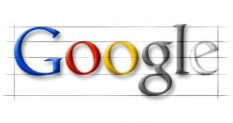
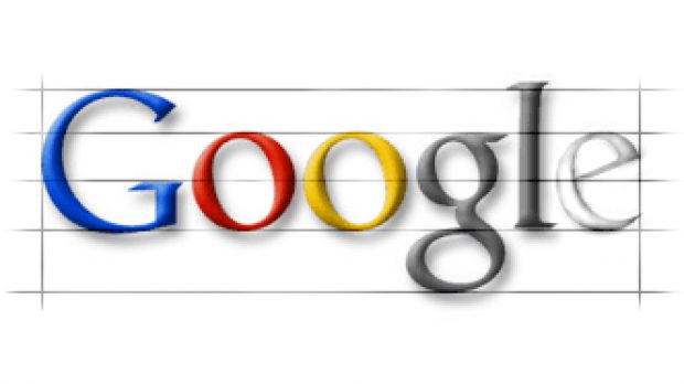
They decided on the design we still see on the homepage because it hit several of the main points that the (now) multi-billionaire duo set ahead of her. Most of all, it was playful and its simplicity swayed them, no effort was needed for reading it and the colors "evoke memories of child play, but deftly stray from the color wheel strictures so as to hint to the inherent element of serendipity creeping into any search results page and the irreverence and boldness of the "I am feeling lucky" link." The shading was well thought of, giving the letters both weight and lightness: "It is solid but there is also an ethereal quality to it," as Ruth said.
The font was very carefully considered as well, in order not to place it on the same level as the other logos: Times New Roman was the Internet font of choice back then, so she went for that of the printed world: Sans-Serif. The typeface had to be subtly sophisticated, but it also had to include some humor and irreverence, so the obvious decision was to go for Catull, which "borrows elements from traditional writing instruments such as the quill and the chisel with a modern twist. Search, by nature, is an activity that requires we look into the past. Therefore Catull's historical ties seemed appropriate, as did the bridging between the old analog world and the new emerging digital era."
Visually, the logo was the baby bred from the two dominant schools of thought at the time, a m?lange between the emulating of conventional printed giants such as Sun and SGI and the irreverence of Yahoo!'s non-designed approach.
She ends the interview with acknowledging what Google has become in the pastime: it is "a much more complex entity - it has evolved and grown beyond our wildest imagination - who knew that it would become one of the most ubiquitous and recognized brands worldwide and that Google would be a noun and a verb?"
By the way, how many of you have noticed that the two "o"s in Google are slightly tilted to the left?

 14 DAY TRIAL //

