|
|
|
|
|
The New Artwork in Ubuntu 9.10The Karmic Koala Chronicles |
|
| |
Today, September 11th, we decided to post for our readers, especially Ubuntu users, some of the community themes and icons that will be present in the upcoming Ubuntu 9.10 (Karmic Koala) operating system, due for release on October 29th. If they will not be installed by default, the following themes can be easily added by accessing the Synaptic Package Manager and search for
the community-themes package, which is already available in the daily builds. Without further ado, here are the themes: 
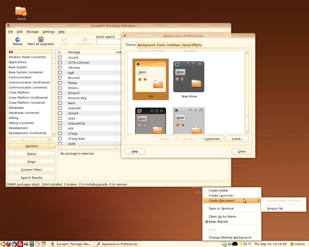
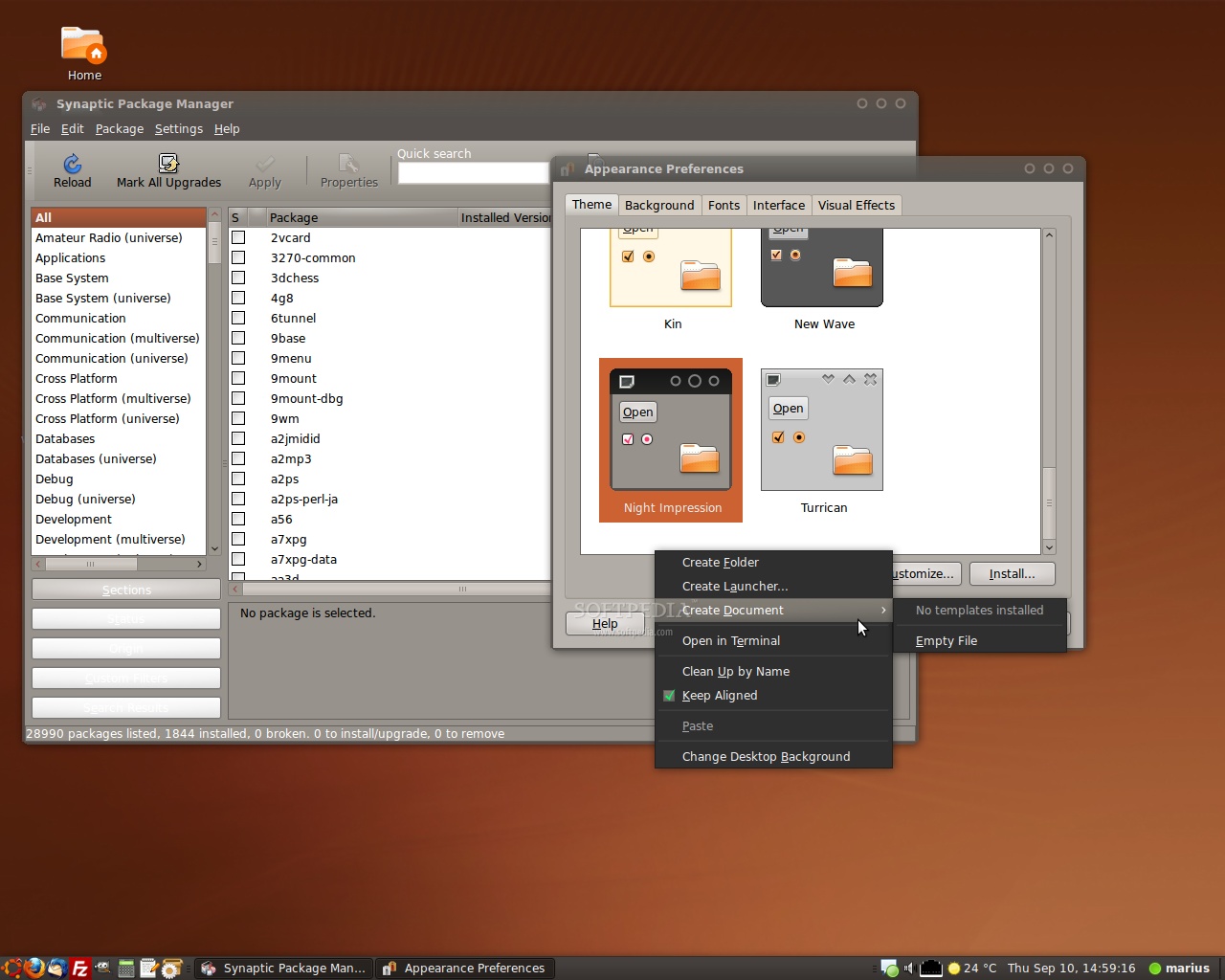
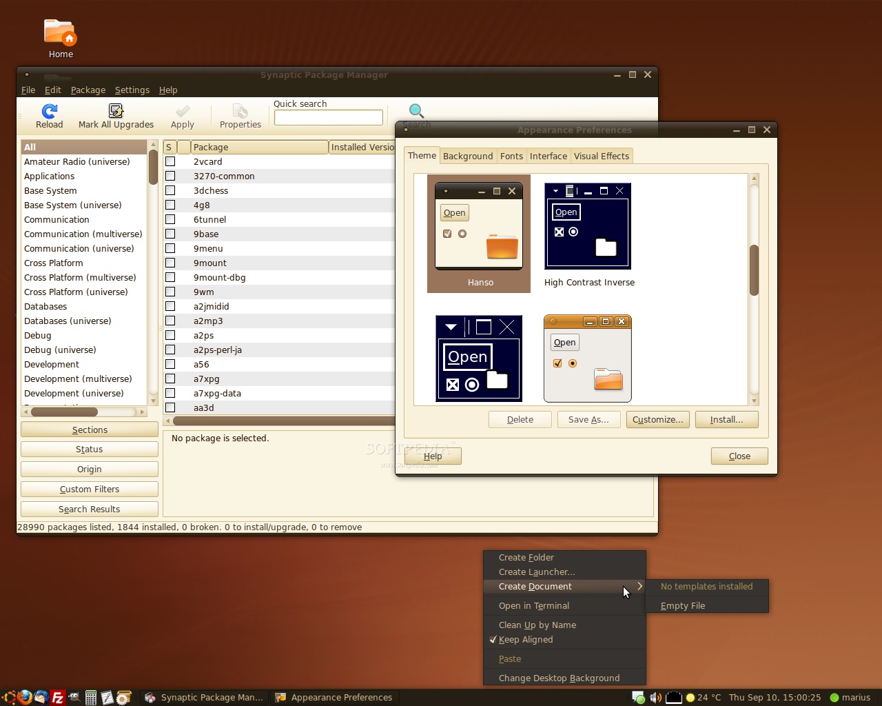
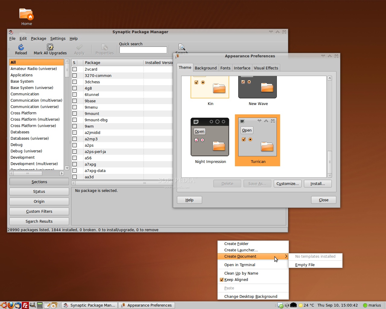
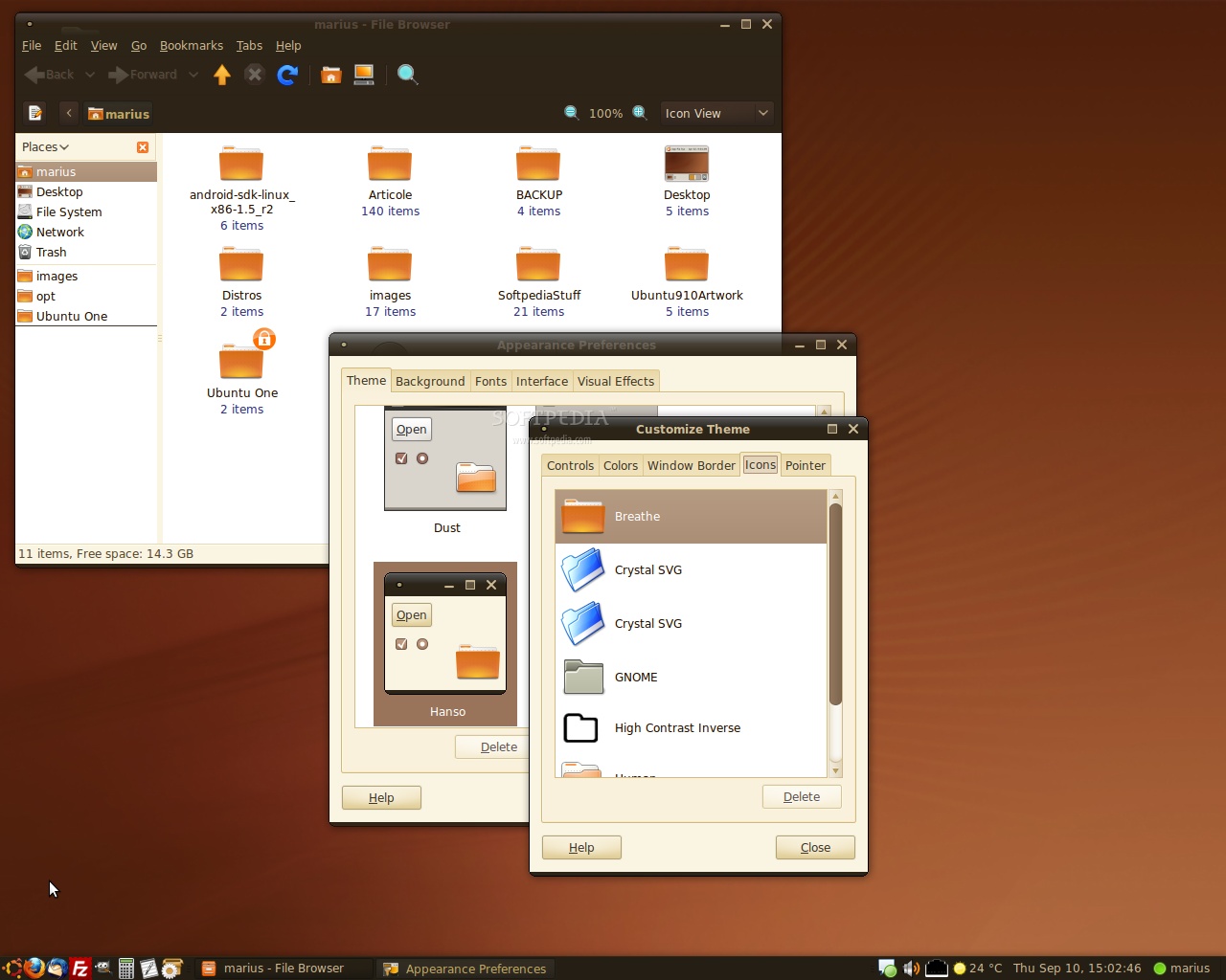
1. The Kin theme, originally designed for Ubuntu 8.10, is a slab-based GTK theme developed by Ken Vermette. 2. The Night Impression theme tries to apply balance and harmony (but with dark colors) to the GNOME desktop and it is developed by John Baer. 3. The Impression theme tries to apply balance and harmony to the GNOME desktop and it is developed by John Baer. 4. The Hanso theme is a new, refreshing hybrid GTK theme with deep, rich, brown colors and modern appeal, while retaining usability. It is developed by James Schriver. 5. The Turrican theme offers a clean and easy-on-the-eyes GTK theme for the Ubuntu desktop. It is developed by Luca Forina. 6. The Breathe icon theme is a refresh to the old Human icon set. It is developed by Cory Kontros. Remember that this is not the official artwork for the next Ubuntu release, these are third-party themes developed by the community members. Oh... and don't forget that you can freely combine these themes to create your own Ubuntu desktop experience! | The Night Impression theme | On October 29th, Ubuntu 9.10 (Karmic Koala) will become the 11th release of the Ubuntu operating system. Among some of the interesting features that will be present in Ubuntu 9.10 (Karmic Koala), we can mention the lightweight and powerful GNOME 2.28 desktop environment, which brings lots and lots of improvements in many areas, such as Empathy, Evolution, GNOME Control Center, GNOME Media, GNOME Power Manager, and many more. Karmic's kernel packages will be based on the latest version of the newly released Linux kernel 2.6.31, which will offer improved support for webcam or wireless devices, new filesystems, USB 3.0 support, etc. Moreover, applications such as OpenOffice.org 3.1.1, The GIMP 2.6, Mozilla Firefox 3.5, Mozilla Thunderbird 2, Transmission 1.7 or Pidgin 2.6 (not as default IM client) will also be present in the final version of Ubuntu 9.10 (Karmic Koala), due for release in late October this year! Don't forget to visit our website next Thursday (September 17th) for a detailed report on the Ubuntu 9.10 Alpha 6 release, where we will unveil more of Karmic's new features!
|
|
|
| Article rating: |
|
Very Good (4.5/5) |
45 vote(s) |
|

|
|
|
User opinions: |
| Comment #1 by: Reginaldo Maciel on 11 Sep 2009, 11:57 GMT | reply to this comment | Sou usuario do Ubuntu, adoro Linux, mas esse temas continuam "MUITO FEIOS"! O pessoal tem um mal gosto!! Pelo amor de Deus!! Melhorem esses temas!! Icones!! Desse jeito nunca vai chegar aos pés do Mac OS, ou qualquer outro Sistemas Operacional!! PELO AMOR DE DEUS!!! ESSES TEMAS PRA FICAREM RUINS PRECISA MELHORAR MUITO!! DIGO ISSO PORQUE AMOR LINUX E QUERO VER ESSE SISTEMA BOM E BONITO!! |
| Comment #2 by: Reginaldo Maciel on 11 Sep 2009, 11:59 GMT | reply to this comment | 'm Ubuntu user, I love Linux, but the issues remain "ugly"! The staff has a bad taste! For God's sake! Improve these issues! Icons! That way you'll never arrive at the foot of the Mac OS, or any other operating system! FOR GOD'S SAKE! PRA THESE ISSUES NEED TO IMPROVE BLADE VERY BAD! SAY THIS BECAUSE LOVE LINUX AND WANT TO SEE THIS SYSTEM GOOD AND BEAUTIFUL! |
| Comment #2.1 by: HURR on 11 Sep 2009, 12:27 GMT | Then make a theme you like and submit it in time for the next artwork drop. |
| Comment #2.2 by: Treefingers on 17 Sep 2009, 21:17 GMT | Easier said than done, HURR. Metacity markup is pretty simple, but GTK code is ridiculously cryptic, not to mention the workarounds necessary for a complete theme. I've tried it myself and, despite being an accomplished XHTML/PHP coder, I get stumped every time.
And no, the fact that it's difficult does not give these themes a pass. They are years (nearly a decade) behind when this level of work would be acceptable, and are still (at best) comparable to the original Windows XP theme in terms of visual quality. |
| Comment #3 by: AstRo on 11 Sep 2009, 12:36 GMT | reply to this comment | I agree. Ubuntu is ugly. It should not be difficult to make it prettier given that there are dozens of good themes available. The makers of Ubuntu just don't think that looks are important to an OS. |
| Comment #4 by: r4wmunt34q on 11 Sep 2009, 13:29 GMT | reply to this comment | Thanks for the article, the first Kin theme looks very sexy IMO...
And Reginaldo... What if you tried to make your Linux distribution... Do you think you would be able to match everybody's taste with default appearance that would probably match your taste?
Everyone is free to customize their Ubuntu operating system to their (esthetic) needs, so please... You can make Ubuntu look like Windows Vista (or 7) or MacOS with very little effort, so I think you are quite wrong :) |
| Comment #4.1 by: Marius Nestor on 11 Sep 2009, 14:07 GMT | Yes, I agree... Kin looks nice :) |
| Comment #4.2 by: bubuzzz on 11 Sep 2009, 17:19 GMT | I agree with Reginaldo. We are already linux users, so we knew that how to configure a theme. But how about a new user who do not know anything about linux? What should we introduce to him about ubuntu? You can not say that it 's nice, stable, blabla bla... Of course, what he wants to have is something easy to use and BEAUTIFUL, something which contains everything, so he doesn't need to change anything. Excuse me, somebody even cannot install software in window, now you ask them to configure the theme in linux :(... i think it' s too much. With me, i am very satisfied with the current default theme but the theme should be improved to attract more new users (who don't know anything about IT), because with them, the ugliest is the worst. Of course, nothing can match everybody's taste, but at least, make it more shinny or bling-bling ... coz that 's most of the normal people like
Kim theme looks nice, btw |
| Comment #4.3 by: Treefingers on 17 Sep 2009, 21:38 GMT | Yes, most themes out there cater to a specific taste. But every decent graphic designer knows how to get a visual style that, if not loved by everyone, is hated by only the most ridiculous troll types. The internet is full of examples of clean, simple, and beautiful interfaces that are exactly the sort of thing a default OS theme needs to be.
Frankly, the problem with Ubuntu is in the GTK theme code (markup, scripting, whatever it's called). It's so incredibly cryptic and unintuitive that you'll never find a good graphic designer who can put together a complete theme. Only GTK programmers seem to understand it, and they seem to all feel that doing nothing but code while the designer does all the "fun" artwork is somehow demeaning. So they work on their own, trusting in their hackish visual sense. Like the designers featured here, they end up wasting their time on very substandard artwork. One of the first things I'll do on a 9.10 install will be to hunt these down and delete them.
You want good themes, Ubuntu? Find a way to get GTK programmers to work with real artists and you'll have them in no time. |
| Comment #5 by: Mel on 11 Sep 2009, 14:39 GMT | reply to this comment | Ugly, ugly, ugly. None of these themes feel finished and they are not very functional or professional.
Please! Ubuntu needs to look good out of the box!!!! Brown and orange don't mix well.
A light grey with some orange touches would look better.
http://gnome-look.org/content/show.php/kde4-oxygen-rmx-orange?content=103320
This is a nice example, there are lots and lots of other great grey/orange themes that go well with Ubuntu and ae functional and can be used day after day, after day. |
| Comment #7 by: Marvin on 11 Sep 2009, 18:02 GMT | reply to this comment | Mr. Shuttleworth is so keen on keeping bug# 1 where it is now, that he wouldn't allow anyone in his team to change the ugly theme. May be he has toomuch of microsoft and apple shares, who knows!!
Mark, we thank you for the os, its a job well done, but we will use windows or mac or something else till you fire all your geek designers and hire some Microsoft or Apple UI guys to fix the interface. |
| Comment #8 by: Linux ubuntu on 11 Sep 2009, 20:15 GMT | reply to this comment | I think that Turrican theme it the best from all there, because is so clear, and beautiful, and i love new icons, also i love New wave theme from 9.04. Kin theme is nice but doesn't look like professional theme for ubuntu (i don't like waves in window borders) !!! and i like to see a variations of colours for every theme (blue, green, red, pink,... rainbow colours) that will make ubuntu unique, and professional. i love that feature in windows 7, but i think that ubuntu should look something like os x (no copy - paste, but with similar concept). |
| Comment #9 by: nf3 on 11 Sep 2009, 21:09 GMT | reply to this comment | I agree with y Reginaldo the default theme of ubuntu is "ugly". we need something professional like the mac theme (not a clone of it ).
sorry for my English :-) |
| Comment #10 by: on 11 Sep 2009, 23:14 GMT | reply to this comment | very bad artwork at all
i think they must use gnome-colors themes by default instead of these ugly themes
gnome colors themes , icons , login screens awesome and if they use it ubuntu will be more modern and attractive |
| Comment #11 by: gutterslob on 11 Sep 2009, 23:14 GMT | reply to this comment | Kin and Night Impression look alright, but they're not that special compared to what's out there.
If you use Ubuntu, I would suggest downloading the Ubuntu Studio theme from the repositories.... or maybe try to do a Google search for "Eyecandy themes Ubuntu". |
| Comment #12 by: ardhi wijayanto on 12 Sep 2009, 00:58 GMT | reply to this comment | i'm not interesting in ubuntu's new theme, i just want ubuntu next release can become more "power save" in laptop mode because i think ubuntu's power management is too bad |
| Comment #13 by: Arab Najjar on 12 Sep 2009, 17:32 GMT | reply to this comment | why they aren't use gnome-color artwork instead of this ugly sits |
| Comment #14 by: abraham on 13 Sep 2009, 01:59 GMT | reply to this comment | i do not like breathe icons, i mean they are not made for gnome |
| Comment #15 by: SunnyDrake on 13 Sep 2009, 02:06 GMT | reply to this comment | I like default Ubuntu theme/icons it's just as good as it should be for default setup. There is no need for race to be like some OS theme - the theme should suit most users and not satisfy all their cravings. Wanna something more? Tune up yourself :) I have a custom mix of OSX/other themes that suit me most. |
| Comment #16 by: Angel on 13 Sep 2009, 05:23 GMT | reply to this comment | I can't wait for the new themes woot :) |
| Comment #17 by: gaurav singh on 13 Sep 2009, 06:47 GMT | reply to this comment | i do use linux and i prefer it has many advantagous option n want a advance knowlwdge in linux and i want to become a programmer in linux because its a uniqe things that does in linux |
| Comment #18 by: Vipan on 13 Sep 2009, 15:10 GMT | reply to this comment | I must say these themes arent really impresive. If ubuntu wish to compete with the comercial OSs like Windows and Mac they need to make more nice looks. I mean its very easy for someone to change appearance, but many ppl are to lazy to learn how to. In Windows you just need to install one application to easily change Loginscreen and many other goodies. I my self want a good looking OS that doesnt drain my computer. Right now im testing MoonOS 3, its not very stable and i think i will install Ubuntu 9.10 with Enlightement DR17. I think its really beautiful and it runs faster than Gnome(On my computer). |
| Comment #19 by: chessboxing on 13 Sep 2009, 16:32 GMT | reply to this comment | I actually love the ubuntu gnome themes. These are even better! Its very warm and comfortable. Unfortunately I don't like ubuntu the best :), I prefer a more efficient and puristic distro like archlinux.
And by the way, for those who still doesn't get what distro's are, its gnome you find ugly not ubuntu.
If you like macs, there are themes made to imitate mac looks, you know. Gsus. |
| Comment #20 by: bruno on 14 Sep 2009, 01:14 GMT | reply to this comment | Have to agree with Reginaldo. Ubuntu artwork sucks and have the impression that nothing is being done to address this (big) issue. I'd like it to have an identity (and not look like as OSX or Win7 as some said above). And please don't ask me to design a new GUI 'cos am not a GUI designer but a programmer. Cannonical has loads of money to hire someone with PhD on that area.
BTW, thanks: I know I can configure it the way i like but doubt that half of newbie win users know about that. |
| Comment #21 by: Spackie on 14 Sep 2009, 10:06 GMT | reply to this comment | What a steaming pile of 1990's crap. Where is the innovation away from 20th century 2D GUI's Amateurish at best. |
| Comment #22 by: rahux on 14 Sep 2009, 10:45 GMT | reply to this comment | Many won't agree but I think some of the most beautiful defaults lie with the KDE distros including Pardus and the latest karmic beta of Kubuntu (though for both I think Lancelot makes for a more pleasant experience, so perhaps this comment is unfair). IMO these distros trump OS X & Win7 in design.
Just 2 days ago asked for my opinion on whether he should try Linux and what he should look for - so I gave him a brief run-down on a bunch of things, including desktop environments and sent a few links and his comment after seeing the various links was "kde looks slick"
My .02 |
| Comment #23 by: choupique on 14 Sep 2009, 11:55 GMT | reply to this comment | Ubuntu's "brown" desktop is of great value. It is easily identifiable in one glance and its consistency has been a strength, not a weakness. I know when I have my laptop at conferences, I often have "Using Ubuntu?" spoken over my shoulder.
BTW, I am running "Dust" theme with Jaunty. |
| Comment #24 by: gs on 14 Sep 2009, 15:55 GMT | reply to this comment | choupique, if a highly recognisable ugly default theme is valuable for ubuntu, imagine how much more valuable a highly recognisable beautiful theme would be.
The goal with ubuntu is surely to maximise the adoption rate. The current appearance does not contribute toward this vision. Right now Shuttleworth is grabbing defeat from the jaws of victory. So sad. |
| Comment #25 by: Alex Góes Fuhrmann on 14 Sep 2009, 19:22 GMT | reply to this comment | O Ubuntu aprendeu com o erro das outras distribuições e os evitou desde o princípio. A aparência não é prioridade, e também não é tudo. O tema Human é bonito.
Olhem para o Mandriva; até hoje não vi Gnome mais bonito! E é o Mandriva a distro mais popular? Quase lá...
--------------------------------------------------------------------
Ubuntu learned the error of other distributions and the avoided from the beginning. The appearance is not a priority, and it's not all. The Human theme is beautiful.
Look for Mandriva, so far not seen Gnome more beautiful! And Mandriva is the most popular distro? Almost there ... |
| Comment #26 by: kiwisoup on 14 Sep 2009, 19:27 GMT | reply to this comment | The theme is always the first part I changed when I USED to use Ubuntu. Not I just wait for the Linux Mint release, because it looks and functions better although it is still Ubuntu underneath.
It's a shame though, I really like the Human icons. It's a very appealing and complete iconset, but it still includes the orange. Some alternate colors of the iconset would be great! |
| Comment #27 by: dcc on 14 Sep 2009, 19:35 GMT | reply to this comment | one word to describe the color scheme, the color associations, and my reaction to it: dung. |
| Comment #28 by: art4med on 14 Sep 2009, 22:14 GMT | reply to this comment | Why must these themes all look alike?
Still, not bad IMO--- just improveable.
MUCH less important than how it works, of course. :')
Cheers to the Team!! |
| Comment #29 by: Garry on 15 Sep 2009, 02:29 GMT | reply to this comment | I am an Ubuntu user. And it is true that the first thing I do is to change the theme.
The Orange just get uglier and now with a dominance of funeral black and gray. Among the screenshots, the "high contrast" theme is still there. Besides the Ubuntu Team, show me WHO use this crazy high contrast theme?
We don't need more themes from the Ubuntu Art Team. We need them to have some psychiatric care, and leave the job to other people who knows what art is about. |
| Comment #30 by: Shea7993 on 15 Sep 2009, 13:28 GMT | reply to this comment | agreed, ubuntu looks horrible from first impression, and first impression is everything to a new user whos a wingdoze fan.... However, ive found a site that supplies a repo with rather nice themes, its nothing snazzy, its very much general as the preinstalled themes that come with ubuntu, however its ptrettier and more pleasing to the eye, the balanzan would be a great replacement for the standard human clearlooks theme, and wildshine is my favourite though... but canonical should seriously change the standard them to be more apealing |
| Comment #31 by: Edward on 15 Sep 2009, 17:19 GMT | reply to this comment | Many users don't find default themes of Ubuntu very pleasing. I don't know why people find appearances in an OS very important that even a distro was made to make ubuntu look nice. a bit superficial. or a bit lazy to find new themes.
tons of themes in gnome-look and ubuntu-look to match your favorite taste! |
| Comment #32 by: Erik Elsom on 17 Sep 2009, 16:58 GMT | reply to this comment | Geez you guys. If you don't like the way it looks, quit being noobs and realize that Linux is 100 times more customizable than any other OS. All you have to do is change it however you want. Try changing the menu bars in Windows... Or if you don't like your X close button, change it... don't know of any other OS you can get that detailed in...
Also, I've never been into gnome in general.
So if you still don't like it-
USE KDE... kindof a no-brainer... Kubuntu for the win... hands down, for looks and cusomizaility... KDE4.3 is completely fine by now and should not be a difficult adoption at all... definitely more customizable than gnome in just about every facet. |
| Comment #33 by: moeen on 17 Sep 2009, 17:28 GMT | reply to this comment | I do think that better theems should be added to ubuntu. All the above themes are not good at all and are no way up to the standard of Appearance that Microsoft has got to offer.
I really love The New Wave theme in ubuntu Jaunty beacuse it is slick....
And I would really love to see a black theme in ubuntu that does not suck....Gnome-look.org has many black themes but none of them is good..
So I wish colonical does add some good themes to that are atttractive! |
| Comment #34 by: YohanesMC on 18 Sep 2009, 17:53 GMT | reply to this comment | Guys, please. Stop COMPLAINING and start MAKING A CHANGE! Ubuntu is a community driven Operating System. Everything depends on the community. If the community is just like you guys, no wonder there's not so much improvement on the GUI. Complaining doesn't make the bling-bling comes out from your screen. If you can have some design ability, go make a theme! If you're more of a non-aesthetic-guy, you can participate by proposing the idea in brainstorm! We are the community, so Ubuntu depends on us! Mark is just like our facilitator, the man who elaborate all of our ideas. This simply is not the place to propose an idea for ubuntu. Go to brainstorm if you want to and make yourself useful. |
| Comment #35 by: Siylence on 19 Sep 2009, 17:06 GMT | reply to this comment | Ubuntu's themes may not be "shiny" or "glossy" but gnome is all about simplicity and modern operating systems have seemed to forgotten about simplicity. I would like to potentially see an option that allows you to change the colors of the themes to more appropriately fit whatever the user is looking for, but for now... users can just download from gnome-look.org |
| Comment #36 by: Siwalaze on 20 Sep 2009, 09:08 GMT | reply to this comment | All the users who say looks ubuntu looks ugly are not sure of what they are doing!!!
if you are able to configure it the way you like,then why complaining???
Nothing comes from no where that is to say new users have to learn the OS first then they will be able to configure it the way they like. |
| Comment #37 by: Spack on 23 Sep 2009, 13:19 GMT | reply to this comment | Yuck! A "modern" 2D GUI straight from the 1990s! Where's the slick Windows 7 or OSX look and feel??? What a let-down |
| Comment #38 by: LS on 24 Sep 2009, 11:40 GMT | reply to this comment | Ubuntu brown themes rock. It looks distinctive and recognisable. This is how you build a brand. Linux uptake needs that. If you aren't for a big increase in Linux adoption than you can disagree. |
| Comment #39 by: carlo on 05 Oct 2009, 14:24 GMT | reply to this comment | i really love ubuntu, but all the themes is always so sad...... |
|
|
|