The redesigned Dropbox.com has been in testing for a few weeks now. If you've been using the latest Android app, you also got access to the new site. Everyone else though had to wait, but the wait is over.
The new Dropbox site is quite an improvement and is probably one of the best looking and the most functional sites of its kind.
It feels very "app-like" and most of the things you'd need in a web-based file manager are there.
"Over the past few weeks, we’ve been quietly rolling out a major redesign of the Dropbox website. Today we turned it up to 11, and anyone who signs into dropbox.com will see a simpler, more powerful, and more beautiful web experience," Dropbox announced.
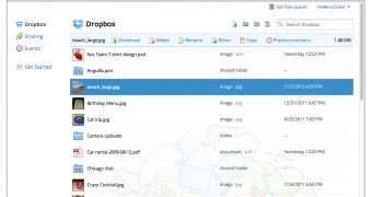
The first thing you'll notice about the new Dropbox site is how much like a regular, desktop file manager it looks. You get a list of files, with some handy details such file type and date of creation and you also get a top bar that either enables you to sort the file list or to copy, delete, rename, download and so on a file that you selected.
A nice touch is the new right-click or context menu which replaces the default one in your browser. This can be rather annoying on other sites, but it makes sense here. The context menu has access to the most common actions you'd want for a file.
The new functionality doesn't stop here, you get more app-like features, like drag and drop, multiple select by click-dragging and so on. There are even keyboard shortcuts if you spend a lot of time on the site and want to move as fast as possible.
The search feature has also been improved, it acts more like a filter now, just start typing your query and the files that match it will be displayed.
Finally, the new site introduces a new lightbox image viewer. It's a simple tool, but it enables you to view and browse your photos on the site, a welcomed addition now that Dropbox is focusing a lot on photos with the automatic sync feature for phones and desktops.

 14 DAY TRIAL //