Google has become one of the best known brands in the world, right up there with Coca Cola and McDonald’s, and a big part of the reason why it’s so easily recognized has to do with its iconic homepage and especially the logo. Google hasn't been completely shy about messing with the homepage but, for the most part, the overall look has remained the same. It also features various doodles on numerous occasions but, again, the logo itself is the same since 1999, shortly after launch. Not for long though, the logo is about to get a major redesign, at least by Google standards, and, from the looks of it, the change is coming soon. The best part is that you've probably already seen it.
The search giant is constantly running experiments, testing out various changes and features ranging from small tweaks to brand new products. The homepage is no exception, and for the past months, it has seen more attention than ever. One of the most radical changes, the fading homepage, has already graduated from experiment to full time feature, marking one of the biggest single changes in the site's history.
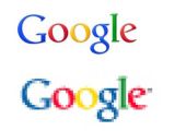
Another experiment that popped up last month promises to go even further and makes some deep changes to the look and feel of the homepage and the search engine. Among the most noticeable are the bright new colors, which make the regular page look positively bland. An interesting part was that the logo also got the same treatment as the rest of the page and was a lot more colorful. Besides the more saturated colors, the embossing and shadowing was mostly removed to give it a bit more punch.
At the time, though, most people didn't venture to say that this was a clear sign Google was moving forward with a major rebranding, mostly because it had been extremely conservative about things like that in the past. Since then, the new logo has started to pop up in other places and on various other products and it now looks almost certain that Google is doing a company-wide rebranding and redesign.
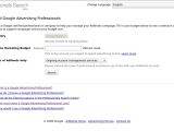
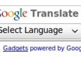
One place where the new logo shows up is on the brand new Google Advertising Professionals Search, now live in beta. The main logo is the regular one but the "AdWords Qualified Company" badge features the new, more colorful, version. The fresh logo is also present on some Google translate widgets that can be embedded on third-party sites. Not all widgets feature it, most don't, but some are sporting the redesigned one.
What's more interesting is that the colors of the Google Translate logo are a bit more subdued than the ones on the experimental homepage or the Professionals Search, which would indicate that Google hasn't settled on a final design yet. This, of course, would be in line with how Google usually goes about doing these things. It's likely that the logo has popped up in other places as well.
From a subjective point of view, it's probably a good thing that Google is trying out variations of the new logo as, once the novelty factor wears off, the colorful logo gets kind of annoying and distracting. The same can be said for the bright blue buttons Google features in one variation of the new homepage and search results page design as the company is also testing a version with silver-colored buttons. In any case, it looks certain that a redesign of both the homepage and the logo is coming and that it's to be expected sometime in early 2010.

 14 DAY TRIAL //


