14 DAY TRIAL //
 It's official, the old black navbar is back. Well, actually a hybrid of the old black bar and the new unified header has been set loose and this is the final version of the Google bar, at least for now, rolling out to everyone in the next few weeks.
The black navbar was introduced about the time Google+ was launched along with the Search redesign.
The black bar was designed to better integrate with the new Google look, applied to more and more products. It also included the Google+ notification box and the share box.
But last fall, Google started experimenting with a new navbar, one that would do away with the old bar, which has been around for a decade or so, and integrate its functionality into the main search header, common to most Google products.
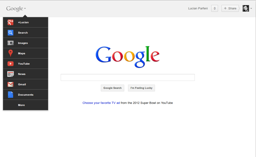
After several tests, that new version started to be rolled out to most if not all users. The items in the top navbar were replaced by a menu integrated into the Google logo. The Google+ share box, the notifications and profile settings were part of the main search header.
While this iteration looked rather snazzy, it suffered from some usability issues, the biggest being that clicking on the Google logo no longer directed users to the homepage of whatever product they were using, rather it opened up the menu, a big and annoying change in functionality.
So annoying in fact that the new bar got a lot of negative feedback, enough for Google to go back to the drawing board and come up with a compromise that satisfied their wishes but also the users.
The new navbar is that compromise. It has been in testing for a while now and it is now rolling out to everyone.
"The new design retains many of the feature changes we made in November that proved popular, including a unified search box and Google+ sharing and notifications across Google. The biggest change is that we’ve replaced the drop-down Google menu with a consistent and expanded set of links running across the top of the page," Google explained.
The tob black bar though is not completely identical to the old one, the menu colors have been changed, the entries are now in black, and the list of Google products has been updated, with an emphasis on newer ones such as Wallet or offers.