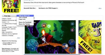
In what is a very welcome change to the iTunes App Store, Apple has modified the layout of its online distribution system for iPhone and iPod touch applications. Changes include at-a-glance descriptions (with the option to see the full scoop as well), new pop-up menus, a more relevant display of example-screenshots, and more.
Acting in a very typical manner, Apple made quite a few changes to the App Store interface this weekend. Although developers have been caught off guard and are now being forced to submit new descriptions for their apps, regular users should be quite happy with the way Apple has decided to advertise apps for the iPhone and iPod touch.
The first thing users notice is the new, big application icon, which now makes it more important for the developer to create a catchy icon. By clicking on it, one can now both open and copy the link. Although the option to open the link is really not necessary, since users have already seen what’s behind it, it can be used to go back to one's initial view (small description view), acting like some form of refresh command.
Next in line is the screenshot layout. By far more appealing and more efficient than the old system, the new method of scrolling through application imagery includes a horizontal scroll-bar (perfect for Apple mouse users), while Apple seems to have left only the most relevant screens in place (for some applications).
A list of details including the app’s version number, developer, localization, used trademarks, rating and requirements can now be found on the left side of the interface, whereas these important details were scattered around the app’s description in the old layout.
As you are reading through an app’s description trying to decide whether you want it or not, a handy drop-down menu allows you to add it to a “wish list,” share it with folks you know on Facebook and Twitter, or simply copy the link.
With the new design, it’s also easier for us editors to get all the details we need to include relevant info about an app and its developer, as well as related content, such as other apps by that company and similar titles that are available in the App Store at the time.
Go ahead and check it out yourselves, then come back and tell us what you think of the new changes.

 14 DAY TRIAL //