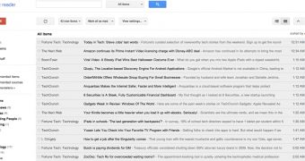
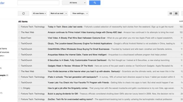
Google has debuted a new version of Google Reader, the first major update in many years. For a product that doesn't see a whole lot of use, any change to Reader sure does seem to stir up people and the last one is no different.
There are two big changes in this new version, the first is the obvious one, the visual redesign which follows Google's new design principles. Considering that the older Google Reader had not received an update in this department for years, it was about time.
The second biggest change though has to do with the native social features, sharing, friends list, which are now gone, replaced by Google+. This is the part that's got most people upset.
"Today we're rolling out the new Reader design, and the Google+ features that we mentioned just over a week ago," Alan Green, Software Engineer at Google, announced.
"Integrating with Google+ also helps us streamline Reader overall. So starting today we'll be turning off friending, following, shared items and comments in favor of similar Google+ functionality," he explained part of the changes.
The visual part is clearly a big improvement. Entries are better spaced out and Reader looks modern and more elegant.
That said, using black for links seems like a bad idea, making them harder to spot. All of the gray and black somehow make it feel heavier, despite the more spaced out elements. Again, this is a case where the one-size fits all design doesn't quite work.
As for the sharing features, people are going to appreciate being able to share stories with their Google+ friends directly from Reader.
And there are a lot more people using Google+ than there are those using Google Reader's social features, a small minority of users from the small number of people using Reader anyway.

 14 DAY TRIAL //
