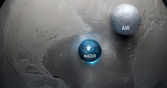
The image above is an accurate rendering of the amount of water and air available on our planet. It shows the Earth as a big gray sphere, devoid of its characteristic blue color. Right in front of it are two bubbles, containing the elements most important for life, water and air.
All of the world's oceans and ice fields – including the five oceans, and the ice sheets over Greenland, the Arctic and Antarctica – fit within the small bubble at the center of the image. It also includes water vapors in the atmosphere, and reveals just how little of this essential stuff we have available.
The other sphere includes the entirety of Earth's atmosphere. Though slightly larger than the water bubble, it still represents just a fraction of the planet's entire volume. For this representation, all the air was depicted at a density of one atmosphere, the value recorded at sea level, Gizmodo reports.
This visualization is based on a concept presented by Adam Nieman at the 2002 Earth Summit in Johannesburg, and was created by Félix Pharand-Deschênes from Globaïa, a non-profit organization founded in Québec, Canada, in 2009.

 14 DAY TRIAL //