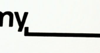
MySpace hasn't been doing much lately, or at least it doesn't look like it's doing much, but it has been working on a redesigned logo. The new logo is "My" followed by a space, which is actually not as bad as it sounds.
The idea is to emphasize the fact that users are the ones that make MySpace their own.
It's a pretty interesting take on the idea, but maybe it's a bit too 'interesting' for a mainstream site that has the scale of MySpace.
It's not live yet, but the site has revealed it at the Warm Gun Design conference and MySpace expanded on the idea explaining that it plans to do some interesting stuff with the blank space in the logo.
“MySpace is a platform for people to be whatever they want, so we’ve decided to give them the space to do it,” MySpace VP of User Experience Mike Macadaan told TechCrunch. And, yes, it uses Helvetica, in case you had doubts.
MySpace plans to fill in the space with user generated content when you hover over the logo, to further drive home the point that MySpace is all about you.
Granted, it's not that hard to do better than the current logo which, while instantly recognizable, isn't exactly the best example of great design.
Of course, that doesn't shield it from the criticism that is sure to pop up once the new logo starts to be rolled out. Like any change with any big site, some people will just not like it and will make sure that everyone else knows that.
Still, MySpace's biggest problem isn't that people might not like it, it's that nobody may be left to see it. The social network still gets an impressive amount of traffic, especially in the US, but it's been declining for more than a year now. This while Facebook grew to 500 million users.

 14 DAY TRIAL //