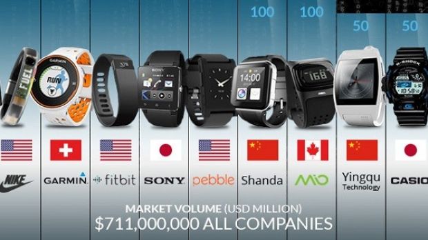
Love smartwatches or at least you’re interested in them? Maybe you’d like to enhance your knowledge of this wearable category a little further and now you can by virtue of a new flashy infographic.
The Smartwatch Group has released the infographic in order to deliver some clear data and statistics related to the device, for those of you who are curious of this kind of thing (via Dream Chrono).
According to them, Samsung hold 34% of the smartwatch market, while Sony comes in at number 2 with 7% hold of the market. Completing the top 3 is Pebble with 6% marketshare.
Interestingly enough, I told you earlier today new research coming from the NPD group proclaimed Samsung as the champion of smartwatch sales in the US, followed by Pebble.
Anyway, going back to our infographic, it also reveals 3 million smartwatches were sold in 2013, which is a noticeable increase from the 0.3 million that shipped out in 2012.
Puzzling enough, among the most popular smartwatch uses we find gaming. On such a tiny screen the gaming experience is greatly diminished, so it’s a little bizarre, to say the least. Other frequent uses include communication and fitness, which is basically what the devices are built for.
The infographic also points out Android Wear is expected to make a big splash, especially with the advent of Moto 360, which is one of the hottest upcoming products from the category.

 14 DAY TRIAL //

