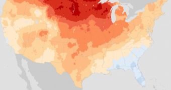
While the fact that the planet is warming is well known, the idea may be a little bit too abstract for some. Now, experts at the US National Oceanic and Atmospheric Administration (NOAA) have just released the new weather “normals” for the country.
These values – which are updated every 10 years – show just how much local summers and winters are colder, warmer, wetter or drier than before. The document confirms the global, general warming trend, and applies it exclusively to the United States.
Though this conclusion was expected, experts found a treasure trove of new information in the fine-grained details that the report contained. In order to understand this, it's important to know that each of the normals reflects average climatological conditions for the past three decades.
In order to conduct the investigation, experts centralized datasets provided by more than 7,500 meteorological stations around the United States. The previous normals covered a period spanning from 1971 to 2000, while the new ones cover 1981 to 2010.
There are numerous factors that are included in the analysis. The most important is obvious the temperature level, but cloud covers, wind speed, dew points and other such measures are also included.
As far as temperatures go, average minimum temperatures in January and average maximum temperatures in July are the most important and relevant, Wired reports. The new report shows that some areas of the US are now slightly warmer during July.
However, the most important discovery was that average temperatures in January are now much higher than indicated by the previous normals set. Northern-central regions of the country warmed by as much as 4 degrees Fahrenheit from baseline levels. This is a massive increase.
“Normals were not designed to be metrics of climate change. In fact, when the widespread practice of computing Normals commenced in the 1930s, the generally-accepted notion of the climate was that underlying long-term averages of climate time series were constant,” a NOAA press release states.
“Changes from one installment of Normals to the next do, nonetheless, provide some evidence of climate change impacts. However, care must be taken when interpreting changes between one Normals period and the other,” the document continues.
“Differences between the reported 1971-2000 Normals and the 1981-2010 Normals may be due to station moves, changes in methodology, changes in instrumentation, etc. that are not reflective of real changes in the underlying climate signal,” it concludes.

 14 DAY TRIAL //