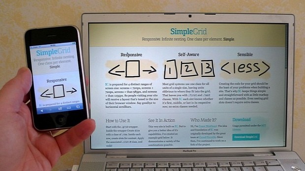
Responsive Web Design, also known as RWD, is still being misunderstood, years after it started being a mainstay trend in the Web development community and after countless of online tutorials, courses, and articles on this topic.
The problem with RWD is not the information's free availability, quality or quantity, but only of personal perception, either from the client or the developer's perspective. Basically, the more you read about Responsive Web Design, the more you truly understand and the more you see how much of an integral part of the new Internet it is.
Responsive Web Design is not Mobile Web Design
This is the main problem with RWD. People think a responsive website is its mobile version, but this cannot be further from the truth.
Responsive Web Design doesn't mean “mobile version,” it refers to the concept of providing a website that shifts and adapts based on the user's device and available viewport (screen) space.
RWD covers situations where the user may be viewing the site from a smartphone, a tablet, or even a giant smartTV plastered on his wall. Responsive Web Desgin doesn't mean a way to shrink your websites down for mobiles, but a way for them to adapt to the device, even if it means to grow bigger as well.
Learning to code responsive sites takes extra time
A wrong opinion spread around by developers who view classic Web Design coding methods and Responsive Web Design methods as separate activities.
If you're someone that learned to code on W3Schools 10 or 15 years ago, you'd probably remember learning about fixed and liquid (fluid) page templates. The basic technology to support a responsive Web page has always been supported, even in the '90s, but nobody needed it back then, and they've always been considered a fun trick to implement with your website.
When mobile traffic started playing a bigger role, all of a sudden, additional technologies started popping up here and there, giving the impression of something that needed extra time to get to implement well.
If you learn to code from scratch, most online courses nowadays have RWD patterns already built-in with their regular teaching materials. Learning to code RWD websites takes about the same time it takes you to document yourself about any new technology or trend. It doesn't take you extra time. You don't learn to code, and then you learn to write RWD code. It's practically the same thing nowadays.
All the site's responsive versions should look the same and show the same content
Why? Do you need hover effects on mobiles? Do they even work? What about that image slider that covers the phone's entire screen? How's that helpful?
This is a problem that's perpetuated by both clients and developers alike, in both situations by a lack of critical and effective thinking. In the case of developers, this happens because of a lack of any type of UX (user experience) knowledge, and in the clients' case by a fixation with flooding the user with information.
This can be counteracted by in-depth UX studies and by reading about other real-life implementations of RWD. Learning what page elements need to be present in all versions of the site comes with time, usually by failing at RWD sites yourself, or by reading about someone else's failures instead.
Because most of the times RWD needs to be supported downward when it comes to screen resolution, developers tend to think that everything needs to stay the same, but smaller.
When they realize that the format of a page element can change its original UI and not be the little baby brother of the previous screen size version, then they'll view Web Design as a creative field once again, and their imagination and creativity will have the same rights of passage as their coding skills.
You need different versions of your site / You need one version of your site
This is a double-edge sword. The correct answer is “it depends.”
It all depends on the type of website you're building. If it's a minimal, 5-page portfolio for your neighbor, then it's OK to create a website that runs from the same codebase on all devices.
If, on the other hand, you're creating a dating portal with thousands of hits per hour, you'll probably have to take into account that responsive websites can be up to four times slower than dedicated mobile sites.
For these situations, splitting your codebase for performance's sake is a must, and even if it means twice or thrice the work, it ensures users will get the better viewing experience and faster loading times.
Responsive websites are slow
They can be if you don't know what you're doing. Putting all your CSS code with all its breakpoints in one stylesheet and sending it to users is a really, really bad idea. This will allow them to resize their browsers and see how the site changes, but is this really necessary?
Why not use a viewport sniffing JavaScript snippet and only deliver CSS files optimized for specific resolutions? Less CSS code sent to the client, optimized for his device, is generally considered by many industry experts as one of the best practices when it comes to RWD.
And if we take into account that most mobile users usually have a low-end connection, optimizing a website for slow Internet speeds is probably the best idea, and this is usually done by cutting down all the code and page assets that don't need to be there in the first place, like 2000px images, CSS code for wide-screen monitors, and so on.
how to spot a web designer: pic.twitter.com/T1jVdro8bN
— Visual Idiot (@idiot) February 18, 2015
SEO won't be affected by the lack of a responsive site
You haven't been keeping up with Google lately, have you? Did you ever hear the term “Mobilegeddon”? If not, just do a quick Google search and come back.
Yes, SEO is affected by the lack of a responsive version for your website, and this is surely going to plummet your traffic and decrease your search rankings if you ignore it.
This wasn't the case before, but recent changes in Google's policy should force you to implement a responsive version of your project with the utmost urgency.
A grid system is all you need
This used to be true a few years back when everybody was implementing responsive grid systems as their way of supporting their websites on mobile devices.
As with everything new in Web Design, developers usually jump into a technology without having properly tested it. But as time went by, the limitations of grid systems came to the surface, and developers learned to properly use them along the way.
Problems with overblown typography, broken layouts for nested elements, and a general disorder on the entire page forced developers to turn their focus from grid systems to responsive frontend frameworks where the grid system is only one of the small components that ensures full website responsiveness.
You need to learn CSS3
You need to learn CSS3 because CSS3 is awesome, not because it contains elements that will help you implement RWD sites. There is so much good stuff in CSS3 that ignoring it can make your life a living hell if you develop sites on a daily basis.
Yes, CSS3 contains media queries that help you control what CSS code gets executed based on the user's viewport size, but this feature isn't supported in older browsers, where a polyfill is usually needed.
You can also implement responsive websites without using CSS3, doing it all in JavaScript, but in the end, you'll probably finish up using both CSS3 and JavaScript. So don't let yourself be trapped inside language boundaries. Good websites usually tend to blend multiple technologies together.
Conclusions
It's generally a good idea to avoid getting your information from tweets or small, easily digestible online articles. Try to find case studies about how RWD websites have been built, where developers will explain in fine points the highs and lows of each approach.
Explore CSS3 frameworks, pure JavaScript implementations, native apps instead of an RWD websites, see performance reports comparing different approaches, and then and only then you'll know what works well in what case, and when each technique for coding RWD websites is useful, and not just a nuisance to your users.

 14 DAY TRIAL //


