14 DAY TRIAL //
 Apple’s next-generation desktop OS may finally mark a major redesign of the software, perhaps something that will deserve a new branch of its own – Mac OS 11.
Andrew Ambrosino, a developer who also has some great design abilities, thinks the same. He believes “OS X 11” should take some cues from iOS 7, including “some good flatness, translucent blurs, and overall streamlining.”
His concept version of OS X is one of the best we’ve seen so far and shows that Apple could make its desktop software much easier on the eyes by simply blowing up iOS 7 to a desktop-size display.
Sure, some elements will work better than others, but the overall idea seems not only doable, but recommended.
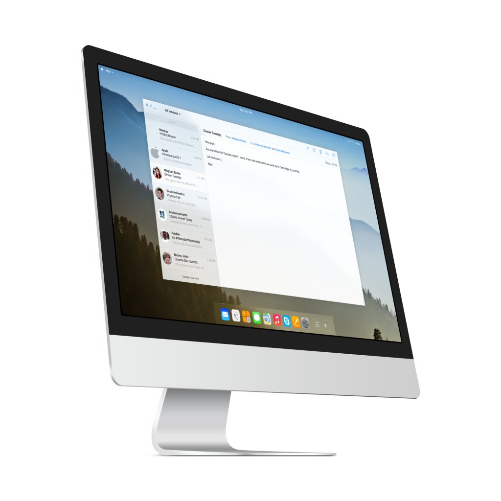
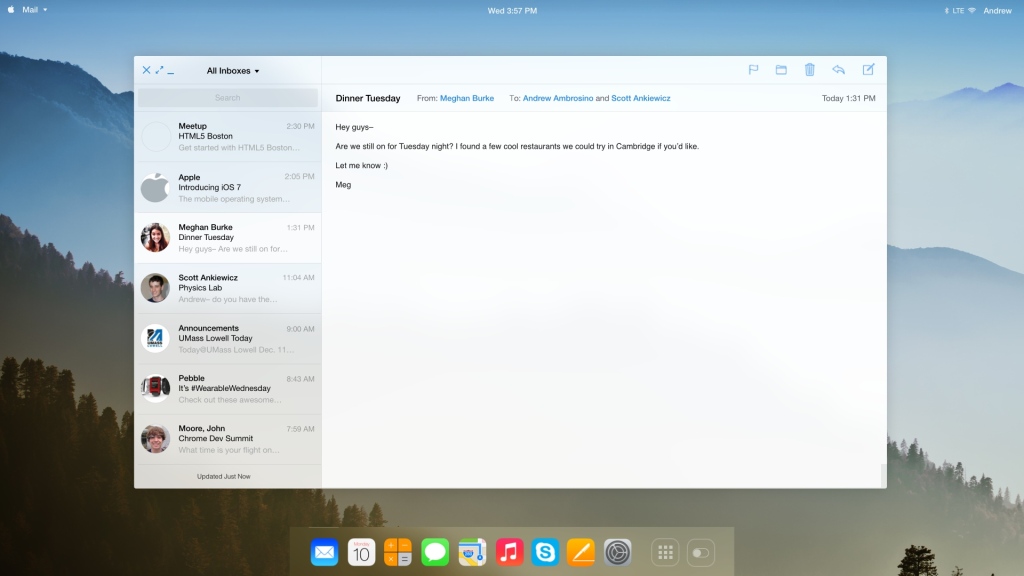
Take for instance the Mail redesign: simple, translucent, with faces in front of the senders’ names, and more intuitive controls.
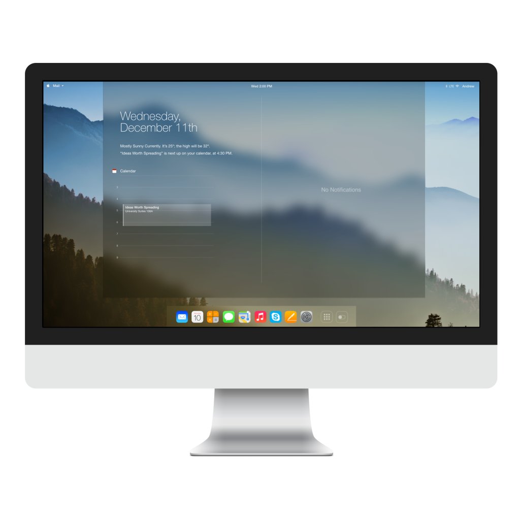
Notification Center is just as gorgeous, though Ambrosino appears to have fallen short of ideas for notifications and events. That’s alright though. We get the idea.
Notice the toggle icon in the right-hand corner below. It looks like the Mac version of Control Center which some of us are dying to see implemented in OS X. Everyone has some handy configuration options that they need to flicker through on a daily basis.
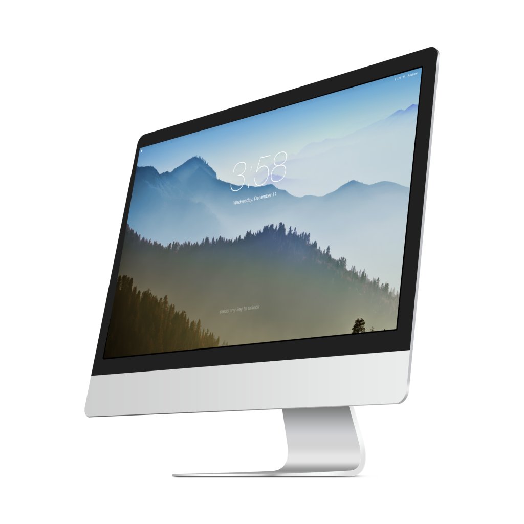
The menubar is almost completely invisible in this concept. Its ongoing presence in this conceptual Mac OS is given away by a number of items in the upper left and right corners, including the iconic Apple menu, and the clock and wireless icons.
For one reason or another, Andrew also believes that future iMacs will be capable of LTE networking, while the dock iconography will be replaced by a standard, rounded-corner square model for all apps.