Earlier this month, the International Energy Agency announced that, according to information at hand, the global energy sector's water usage accounted for 15% of the world's overall consumption of this resource.
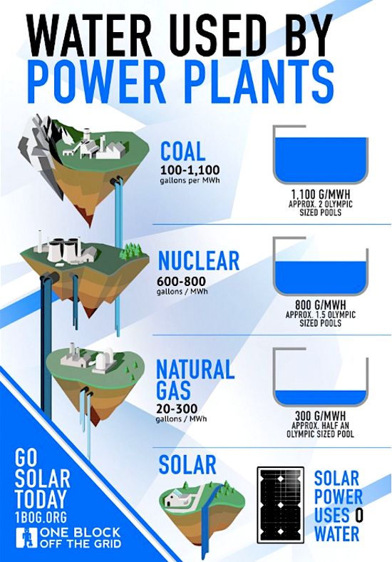
The infographic below, pieced together by the folks at One Block Off the Grid really puts things into perspective. Thus, it documents the average water consumption of various energy sources that human society currently relies on.
Of the energy sources taken into account when making this graph, i.e. coal, nuclear, natural gas, and solar, the first is by far the thirstiest, so to speak.
More precisely, some two Olympic-sized pools worth of water go into rolling out 1.100 G/MGw. Although they do have a fairly impressive ecological footprint in terms of water consumption, nuclear power and natural gas use less of this resource.
Seeing how solar power requires virtually no water, there is little doubt that this energy source is by far the greenest of the bunch.
As Clean Technica points out, freshwater availability is currently an issue in several regions across the world, and, as climate change and global warming progress, droughts are bound to become a fairly common sight.
Consequently, it might be best to preserve what water resources we currently have at our disposal by trying to limit our dependence on traditional energy sources and by switching to renewables instead.

 14 DAY TRIAL //

