14 DAY TRIAL //
 The OS X Yosemite Public Beta is out and just 1 million users can take it for a spin. Apple has made sure that everyone understands: OS X Yosemite is a work in progress and certain features may change.
However, the icons the designers in Cupertino have drawn will stay the same until the final release. Nick Keppol, an expert designer analyzed each line and shade to give you a better understanding of what's new and interesting.
OS X Yosemite features a significant visual change. The metal has been turned into translucent materials with a cleaner look that takes cues from iOS 7. There's also a new system font and updated icons. For the Dock icons, Apple has kept the recommendations in Human Interface Guidelines (HIG). Also, the icons become more consistent and they lose some of the gloss, getting a brighter look. The skeumorphism is not completely gone, like on iOS 7.
Keppol believes that there is a lot more to do with the icons than just a fresh coat of paint – the visual language extends far beyond just the gradients.
Users that will download and run OS 10.10 will first notice the 2D Dock. "The shapes and sizes of the icons have been adjusted to provide a better visual rhythm on screen. I have not seen it published anywhere, but there appears to be a grid system that helps achieve this consistency," Keppol explains.
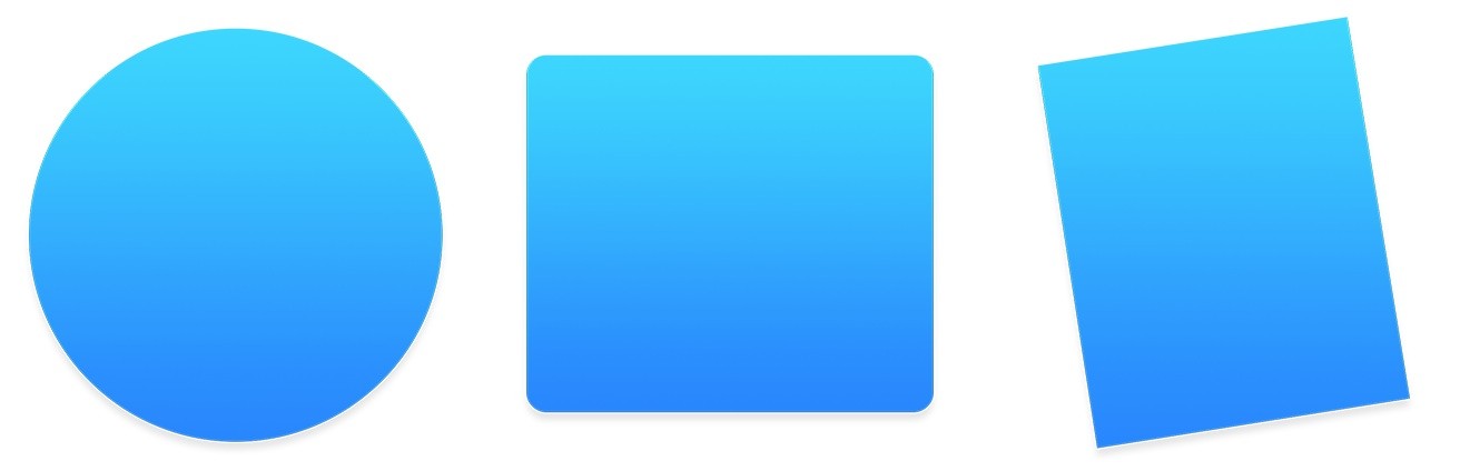
It appears that Apple designers re-wrote the icon system for Yosemite. There are 3 basic shapes: a circle, a square and a tilted rectangle. The designer noticed that the old titled icons line the one for "Address Book" are fully placed in 3D space with natural perspective. On the other hand, the Yosemite icons are a straight-on view. The new icons are much simpler in look and easier for artists to draw.
There seems to be a shape hierarchy with this new visual style. The circle appears to be used for apps. You get that with Safari, iBooks, App Store, Time Machine or iTunes among others. So if a developer wants to create a new app, maybe they should go with a round icon.
The square appears to represent System-related utilities. Finder, Terminal, System Preferences, Activity Monitor fit in this category. The third category is the Tilted Rectangle, the shape used with other elements. For example, the TextEdit icon has a pen, the Maps icon has a compass on top of it, and the Calendar has a cardboard base behind it.
Keppol explains how Apple designers are using Lighting Effects and Materials. Apple has lost the grey scale and changed that to warm and cool tones.
See Keppol's full article and weigh in with your opinions about the new icons in OS X Yosemite.