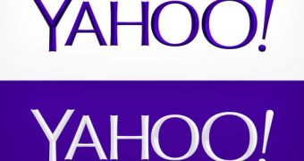
Yahoo’s new logo is finally here, after 30 days of runner-ups.
The new image is nice, it’s a logo that stays true to Yahoo, using both the purple shade and exclamation point that we’re all used to.
Compared to some of the other logos that were displayed in the past month, this one can be considered a “safe bet.”
It’s not too loopy, it’s not too serious; it brings the right balance of newness and familiarity.
“We wanted a logo that stayed true to our roots (whimsical, purple, with an exclamation point) yet embraced the evolution of our products,” the company wrote on the Yahoo Tumblr blog in the announcement post.
“We hadn’t updated our logo in 18 years. Our brand, as represented by the logo, has been valued at as much as ~$10 billion dollars. So, while it was time for a change, it’s not something we could do lightly,” Marissa Mayer wrote in a blog post.
It also seems that Mayer was directly involved in the way the logo looks.
“So, one weekend this summer, I rolled up my sleeves and dove into the trenches with our logo design team: Bob Stohrer, Marc DeBartolomeis, Russ Khaydarov, and our intern Max Ma. We spent the majority of Saturday and Sunday designing the logo from start to finish, and we had a ton of fun weighing every minute detail,” the Yahoo CEO wrote.
She explains how they quickly came to a list of things they wanted about the new logo and things they’d rather avoid.
For instance, she explains, the team didn’t want any straight lines in the logo, since they don’t really exist in the human form and they’re rare in nature. They also wanted to preserve the resemblance to the Yahoo yodel by using two different “O’s” at the end.

 14 DAY TRIAL //