14 DAY TRIAL //
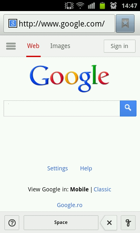
 Google has updated its mobile homepage, to make it more app like and cram more info and functionality into the small screen area. The new homepage is rolling out to all users, but you may not see it yet. It could be part of a wider experiment.
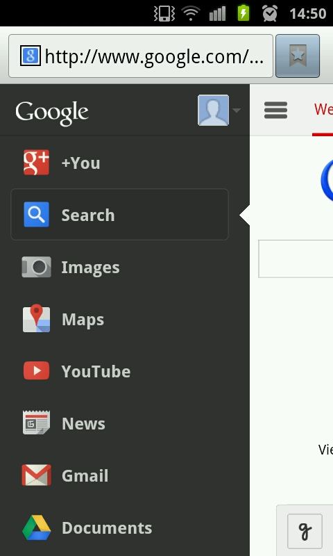
The big change in the new page is the "menu button," very similar to the one used throughout Android apps and, more recently, in Chrome itself.
Now, Google is adapting it for its mobile web pages.
It makes sense too, consistency makes it possible for people to go from a website to a mobile app and then to the desktop app and know how they work "instinctively."
The new menu button is now the only way to access all of Google's other products. By default, you get a Web tab, a Images tab for image search, and the menu button with all the rest.
If you're logged in, you'll also see your avatar and Google+ notifications. The menu itself is very similar to the one used by the new YouTube app for example, the design is identical.
It's fair to say that this is the new mobile design direction at Google and that you'll be seeing this layout, a home screen/feed with a white background, and a dark side menu, hidden by default.
Unlike the native apps, the only way to access the menu is via the button, swiping doesn't work. Still, overall, the update is a positive one.
You can expect more of Google's sites to become more app-like and, more importantly, you can expect Google's mobile apps and mobile websites to start looking and working much more like each other.
This not only has to do with a consistent look, it's also a safeguard in cases where Google isn't able to land a native app, either because it doesn't care, like with Windows Phone, or because it is blocked, like it could happen with a future Google Maps app for Apple devices.