14 DAY TRIAL //
 The new Google design is spreading to every corner of the company, more and more of its products are embracing it, albeit not always for the best. Since the new design will eventually be adopted by all Google services and websites, there should be no surprise that the company is testing it in more and more places.
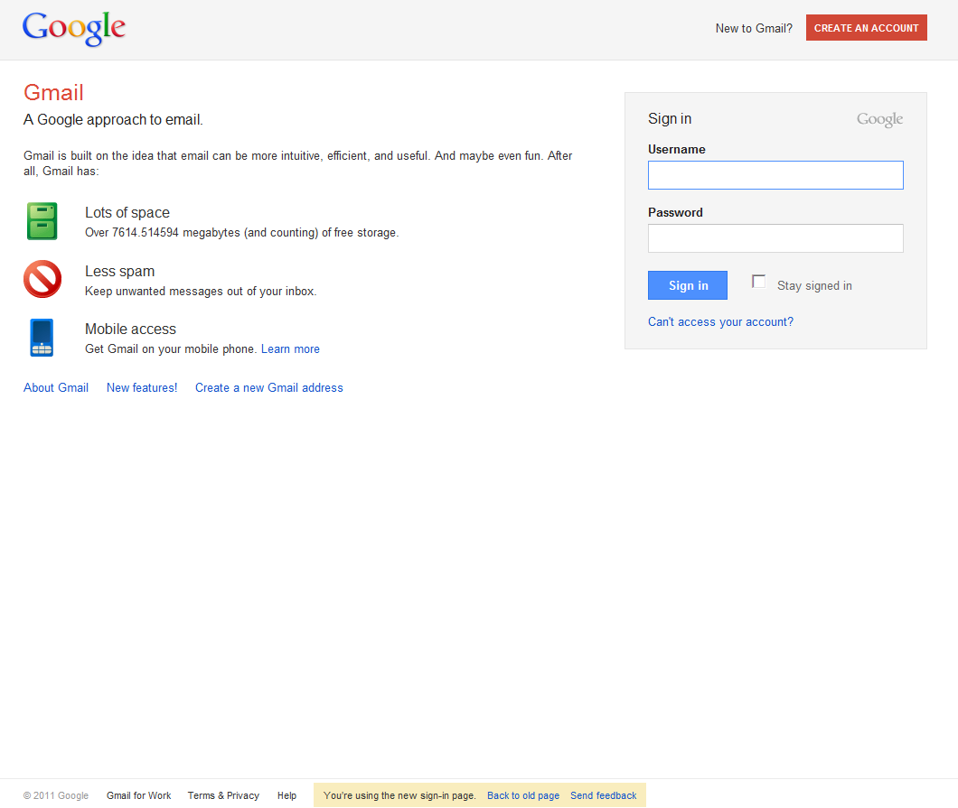
The latest to sport the new clothes is the Google login page for which Google is testing the new layout and look.
Most people won't see it, but if you visit Gmail, for example, without being logged in you may be asked if you want to preview the new version of the page.
If you choose to, the new design will be displayed every time you want to log into your Google account.
"You may have noticed that the pages where you sign in to Google products like Gmail, YouTube, and Google Docs look a bit different. These changes are part of a larger redesign of Google products," Google writes in a help page explaining the changes.
The new login page should feel familiar if you've visited a number of Google websites recently, including Google Search.
It features the same visual elements we've seen before, the gray header, red colored fonts and so on.
Overall, again, it looks a lot fresher and more spaced out than the existing page and should be an improvement.
Unlike some of the Google websites that have adopted the new design, there's no downside to adopting it for the login page, except perhaps familiarity.
Of course, most users rarely see the login page as it is, so you won't be enjoying the new design all that often, most likely.
For now, you can still go back to the current design, if you don't like the new one, but everyone will eventually be updated. [via Google OS]