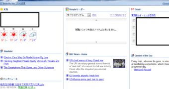
Google is testing a new iGoogle homepage design with some users. The redesign seems mostly cosmetic, but it has been a long time coming as the personalized homepage hasn't gotten an update in the looks department for quite a lot of time, not accounting for the theme packs Google releases from time to time.
One of the changes in the upcoming redesign is the cleaner look of the gadgets. The individual gadgets are no longer so clearly separated. Currently, each gadget has its own rounder border which completely surrounds it.
This separation was designed to emphasize the modularity of the site and to make each gadget easier to spot and manage. However, this also means that iGoogle looks less like a regular website and more like an offspring of web 1.0 portals.
Looking different than most websites is not necessarily a bad thing, but Google apparently wants the personalized homepage to feel more natural so gadgets will now be delimited by simple separation lines.
This way, the content in each gadget is still somewhat isolated but overall, iGoogle looks more cohesive. What's more, the gadget controls are now also hidden by default and only show up when you hover over one.
Again, this should make the site feel less like it's been stitched together from different parts. Another change is that each gadget gets a small icon next to its name.
Other than this, there doesn't seem to be anything different. Google may have other changes planned or some of the new things may not be obvious at first glance, but we'll probably have to wait for the full roll-out to know for sure.
For now, the redesigned homepage is in testing with some users. Google generally live tests all of its new features and changes with a small subset of users. Many of its new projects are tested internally with Google's 23,000 employees, however, changes to existing products are tested with actual users. [via Google OS]

 14 DAY TRIAL //