14 DAY TRIAL //
 Google announced a new update for its search engine that would mark all mobile-friendly websites on the results page, thus trying to help users browsing the web from a smartphone find links that can be properly loaded on their devices.
Browsing the web with a smartphone is pretty much a common thing these days, and it’s a well-known fact that many users land on websites that aren’t really optimized for mobile devices. The result is easy to predict: the layout of the website is really cluttered to fit your screen, text size is automatically reduced, and some pictures are scaled depending on your display size.
While Google can’t really do anything about the mobile version of each site, it can actually help users find the pages that could be correctly loaded on their devices thanks to mobile versions.
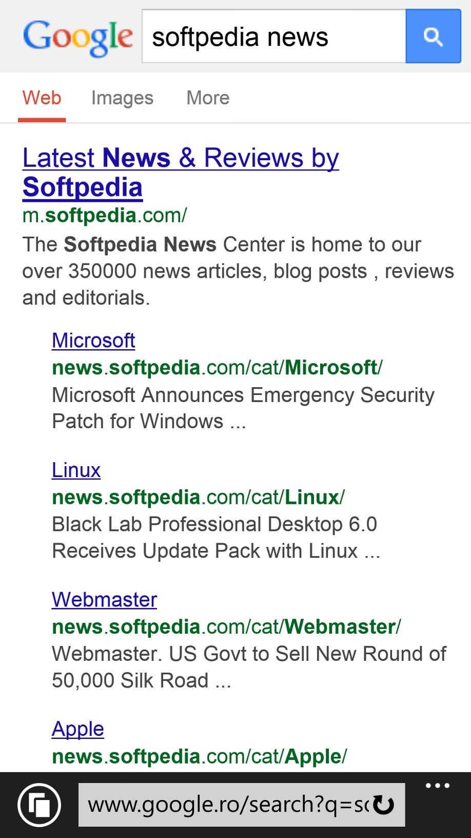
Starting today, Google Search will automatically mark websites that have mobile versions as “mobile-friendly,” so anyone searching the web from a mobile device can choose a site which is more appropriate for their screens.
What mobile-friendly actually means
Google says that pages are automatically marked as “mobile-friendly” when certain requirements are met, so webmasters can look at these criteria to optimize their websites in order to get the new label.
First of all, when scanning the page, Googlebot also searches for software that is not common on mobile devices, such as Flash, and uses text that is readable without zooming. What’s more, if you have a website that automatically resizes the content to fit the screen without having to scroll horizontally or zoom, chances are that you might get the label as well.
At the same time, it’s really important to avoid spamming users with links. Google says that it’s critical for your website to have links far enough from each other in order to be possible for users browsing the web with a smartphone to easily tap on a specific link.
Mobile friendly could become a ranking system
Needless to say, it’s really important for everyone to have a mobile version for their websites, and Google itself admits that, at some point in the future, the mobile-friendly label could help you get a better ranking and thus reach higher on the search results page.
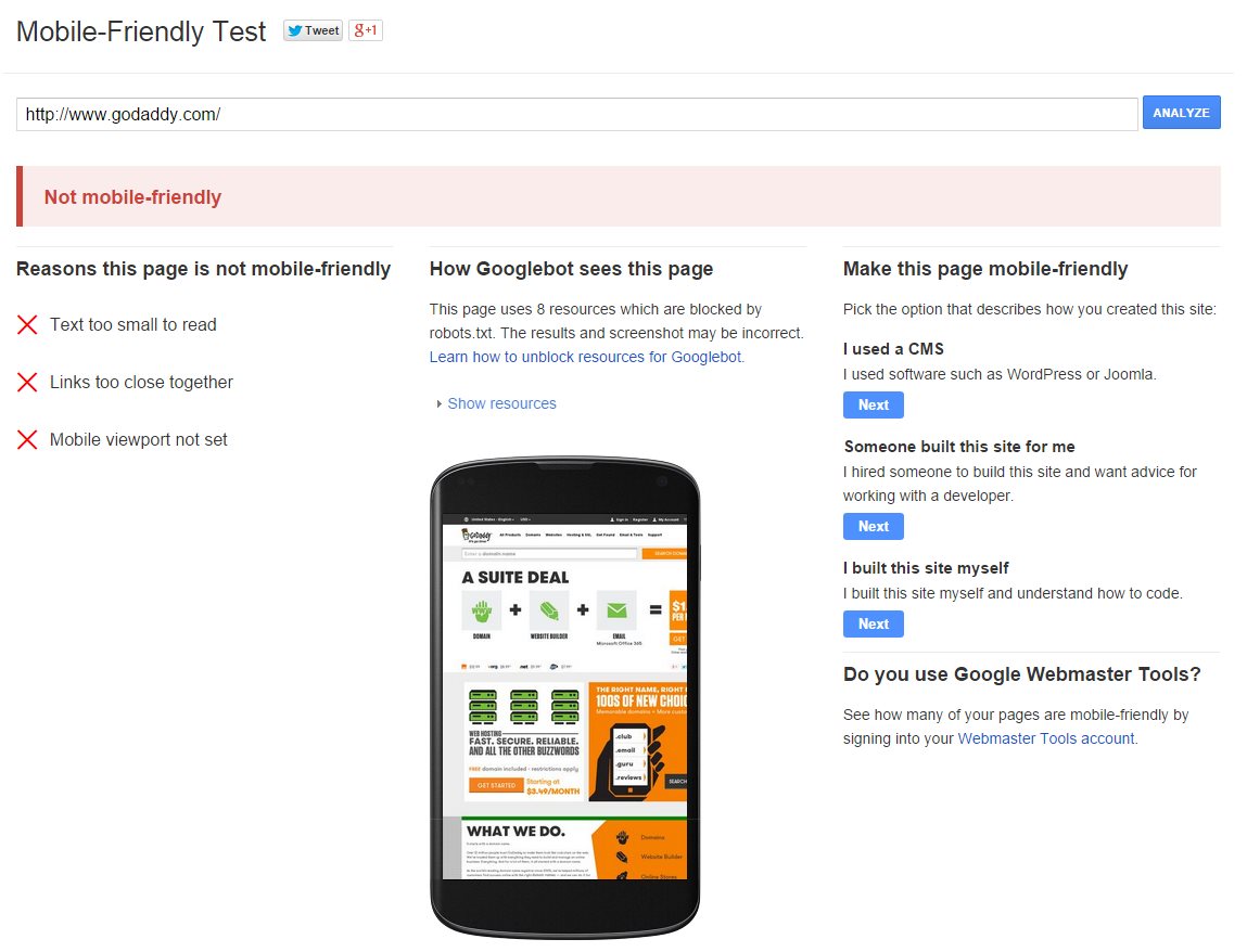
There are many tools that could help you optimize a website for mobile devices, and one of the easiest to use is the so-called “Mobile-Friendly Test,” which analyzes a specific link and provides you with recommendations and more data on how Googlebot sees it.
Google says that this mobile-friendly label should appear on your search results page in the coming weeks, as the update is gradually rolling out to everyone worldwide.