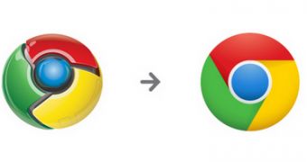
For Google Chrome fans, the new logo shouldn't be much of a surprise, but Google is now touting the redesigned one and explaining a bit about the decision to revamp the logo and the process to arrive at the design that has already landed in developer version of Google Chrome.
"Some of you on Chrome’s early release channels may have noticed our latest tweak to Chrome’s icon," Steve Rura, a designer at Google, wrote.
"Since Chrome is all about making your web experience as easy and clutter-free as possible, we refreshed the Chrome icon to better represent these sentiments. A simpler icon embodies the Chrome spirit — to make the web quicker, lighter, and easier for all," he explained.
Google says that fans had already remixed and re-envisioned the logo quite a bit and even in the official art work, some liberties were taken. Even the official Chrome Web Store logo, introduced last year, looks more like the new Chrome logo rather than the old one.
"Even before this effort, the new version of the Chrome logo was already being conjured up by Googlers and Chrome fans. Numerous creative reinterpretations have organically moved the icon towards simplicity and abstraction, so it felt right to make the icon structure cleaner and easier to recreate," Rura added.
The new logo, as you may have noticed, though resembles the original one, is a simplified version, lending to a more subtle design. That's not to say it's less visible or boring, the team actually worked quite a bit to make sure it's looks great in any size and context.
As you'd expect, Google tested several variations of the new logo to find out not only which one the users like the most, but also which one works the best regardless of size or medium. The new logo should be trickling down to all users as Chrome 11 moves down the channels. The beta version is coming very soon, perhaps as early as next week.

 14 DAY TRIAL //