Google seems to be experimenting with yet another Knowledge Graph-like feature for its search results pages by making use of certain information it finds on news sites.
We spotted the new feature while looking over for some stats regarding the search engines’ market share.
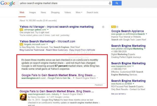
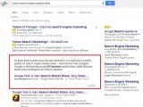
Looking for “Yahoo search engine market share” returned a surprisingly new page. Underneath a couple of ads marked accordingly, Google displayed the first paragraph of an article, which it links to in the box, complete with a headline.
The text in the box has two words in bold, namely “67 percent,” making it easy to spot. There’s only one problem – this isn’t the market share of Yahoo Search. Instead, that number pertains to Google’s own search engine.
The entire purpose of this new box, just like with any other Knowledge Graph, is to quickly deliver information to the user and save them some clicks and perusing through a bunch of articles.While Google has been implementing such features for a while now, they’re actually detrimental to the company’s business, but also to the sites that contain that particular information, since the users no longer click on the articles, which means they don’t generate any ad revenues.
That won’t be the case with the new Knowledge Box that Google introduced this time around, since the need to click on article does not disappear. On the contrary, the feature works so badly that you actually have to go check multiple sources just to make sure you got it right.
The issue with the feature is that while the article may in fact contain all the keywords you looked for, the information might be somewhere lower in the article, as is the case with this particular search.
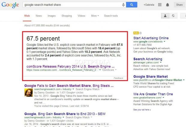
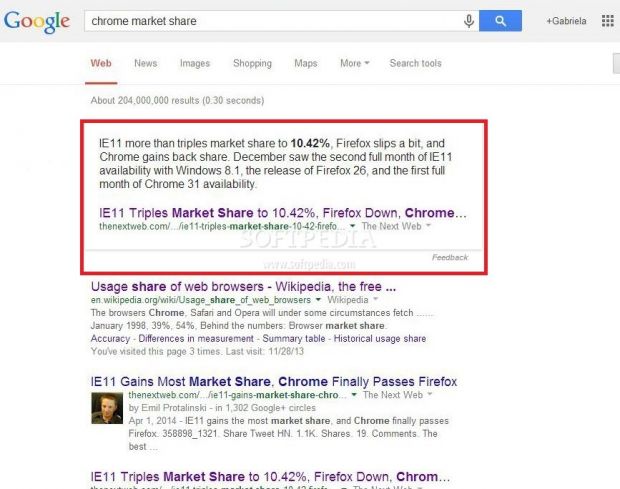
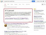
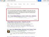
We replicated the same problem with several other searches and encountered the same confusing results. For instance, looking for “Google Search market share” returned a Graph with data from a ComScore report and bolded four different percentages in the text. This one, however, did come with the added benefit of actually displaying the appropriate market share for Google’s search engine – 67.5 percent – at the top of the box.When looking for Chrome’s market share however, the result was as disappointing as the first one since the first paragraph of the article the info came from was about Internet Explorer.
All in all, this new test that Google is running is half good, half bad. The good part is that it has the potential of being a really great feature, while the bad part is that it doesn’t even come close to being relevant in its current form.There’s also the slight issue of playing favorites by choosing the articles that provide the data. The information is not aggregated as it happens in other types of Graphs, but rather comes from a single source, which would generate a lot of traffic for those particular news sites, causing a competition problem. On two of the three tests, the information came from the top result for that particular query.

 14 DAY TRIAL //