Google Chrome OS may be getting all of the attention today, but such a huge company doesn't revolve around just one product. And it's still very much a search company so it can't afford to get too distracted from its main bread winner. In fact it's anything but, Google will be launching a rather significant refresh of its search engine's design later today for limited set of users. The changes go pretty deep and are meant to make the whole experience more consistent.
Google is well known for constantly tweaking and updating its products and its search engine has seen its fair share over the years. Most of the time, those changes are subtle and unnoticeable, but little by little they have contributed to a lot of inconsistencies in the features. Marissa Mayer, Google VP of search and user experience, has had enough and is looking to give the search engine a complete do-over.
“I don’t like jazz, because you never know what’s going to happen next,” Mayer told Search Engine Land comparing the issues with the search engine to the musical style. “I’ve been calling this problem ‘user interface jazz.’ This result looks this way, and that result looks that way [something much different], and it really does slow you down.”
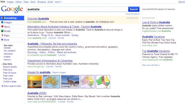
So Google got to work on a thorough redesign and is now satisfied enough with all the internal testing and debating that it's ready to see what the public at large thinks of the changes. Starting today about 1 to 3 percent of the users will start getting a brand new search results page with a radical new design, by Google standards anyway. Visually, the new design looks a little more lively and colorful, the new icons and bright blues must have something to do with that, but surprisingly it looks more tight-knit and clean.
The search options Google introduced in summer are now a permanent feature and always show up on the left. This section has gotten the most attention and it shows. The main search sections, news, video, images, etc., now get their own tabs rather than just a link like they do currently. The “All Results” section has also been renamed to “Everything” to give users a clearer view of what they're getting.
The type of additional searches varies with the query so certain searches might not get a Video tab or a News tab. All of the sections though are available for any search under the “More” tab. The search options which show up under the section tabs also change depending on the type of search you are doing. A completely new addition is the “See also” section which suggests queries which may be related to your initial search.
There are a bunch of other changes, but this is still a test, so some might make it into a final version and others may not. The thing to take away from all this though is that, apart from the many visual and functionality tweaks, the biggest change Google is introducing represents a three panel design, the last of the major search engines to do so. If everything goes according to plan Google is ready to introduce the new design in early 2010.

 14 DAY TRIAL //

