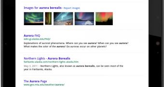
Google has debuted a new search UI for tablet devices. Based on the redesigned Google Search site and the new design elements being rolled out across Google websites, the new tablet UI caters to the specific needs of these devices, buttons are used instead of links and everything is better spaced out and more separated.
"As part of our effort to evolve the Google design and experience, we’ve improved the www.google.com search experience on tablets," Xiaorui Gan, software engineer at Google, announced.
"We’ve simplified the layout of search results pages and increased the size of page contents like text, buttons and other touch targets to make it faster and easier to browse and interact with search results in portrait or landscape view," he said.
The new UI looks familiar, it borrows the common design elements of the new Google, used by the desktop version of Google Search and Google+ for example, but ditches the sidebar in favor of top buttons.
Switching between web search, images, videos and so on, is done via a drop-down menu button. Using filters and search options is done in the same way, with buttons or menus, rather than links.
It's easy to understand why, tablets are designed for touch input and buttons fare much better than links. The search results themselves are more distanced, making them easier to pick.
The Image Search interface also got an update, with the same ideas in mind. The thumbnails are bigger, there is infinite scroll and so on. Choosing between the different image search options is also done via buttons below the search box.
"This improved search experience is rolling out in the coming days to iPad and Android 3.1+ tablets across 36 languages. Give it a try by going to www.google.com in your tablet’s browser," Google added.

 14 DAY TRIAL //