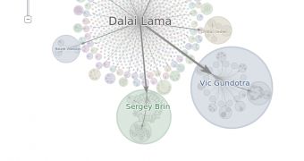
The best thing about social networks is, well, the networking, the way content spreads from one user to another and uses several paths to reach thousands, even millions of people. But, until now, there hasn't been an easy way of visualizing this.
If you had access to the raw data, you could see exactly how things spread and from whom. Or if you were using a third-party service, bit.ly for example, you could have an idea of how links and posts were shared, but it wasn't a complete picture.
This is what Google+ Ripples wants to fix. Ripples is a visualization, a very nice one at that, of how posts get shared and reshared on the social network.
"We want to help people re-live those conversations—both to rekindle that initial excitement, and to learn how posts flow across the network. That’s why we’re launching Google+ Ripples: a visualization tool for public shares and comments," Vic Gundotra, who leads Google+ efforts, wrote.
Very popular posts can be reshared by thousands of people, reaching the streams of a lot more than that.
With Ripples, you can see exactly how a post is shared on Google+, from its original source to the 'dead ends' the people that reshare it but from whom no one else shares the post as well.
"To get started, just find a public post that interests you, and select 'View Ripples.' From there you can replay its activity, zoom in on certain events, identify top contributors and much more. Google+ Ripples is still experimental, so let us know how we can make it more informative and more awesome," he explained.
Since Ripples shows the exact path of how a post or a photo ended up on someone's stream, it's easy to determine who are the influential people and who get the most attention and the largest audience on the site.

 14 DAY TRIAL //