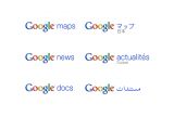
Google has unveiled its new branding for most of its products. The focus is on consistency and all the new logos are very similar, featuring the Google logo followed by the product’s name in blue font. The Mountain View-based company hopes this will make it easier and clearer for users to identify its products. “We hope this design freshens up our look as well as improves consistency and ease of use across our sites.”
The logos are accompanied by a change in design so that now they all look the same and are the same size wherever they may be placed on the site. “Since the logos appear in many different locations and sizes on our websites, our new designs are standardized to be the same size and color wherever they appear. This should make it easier for you to recognize which site you are on and navigate to wherever you want to go. They are also consistent across all our international domains, which is especially helpful for people using right-to-left languages such as Arabic and Hebrew.”
The new branding comes after Google said it would remove the beta tag from some of its services, and logos, mostly the ones targeted at enterprise customers. The company loves the beta tag and more than half of its products are still, apparently, in the beta phase. Considering that Gmail for example was launched 5 years ago and now has almost 150 million users worldwide, it would seem that the beta tag might be a bit of a stretch.
With all that, Google's web browser Chrome was removed from beta only a few months after it was released, with some users of the opinion that, considering the product's overall quality, this move was a bit rushed. The new logos are just in time for some of the products to lose the beta status and should come to most of them in the next few weeks.

 14 DAY TRIAL //
