14 DAY TRIAL //
 The mobile space is hugely important for any web company. Facebook is hurting because of it while mobile-first or mobile-only startups get scooped up for $1 billion. Google knows this very well, it's been banging on the "mobile" drum for years now.
But even so, it took a while to shift focus. The latest developments however seem to show that Google is not only putting mobile in equal terms with the desktop web, it's actually starting to put it first.
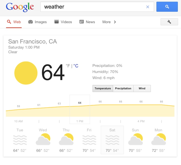
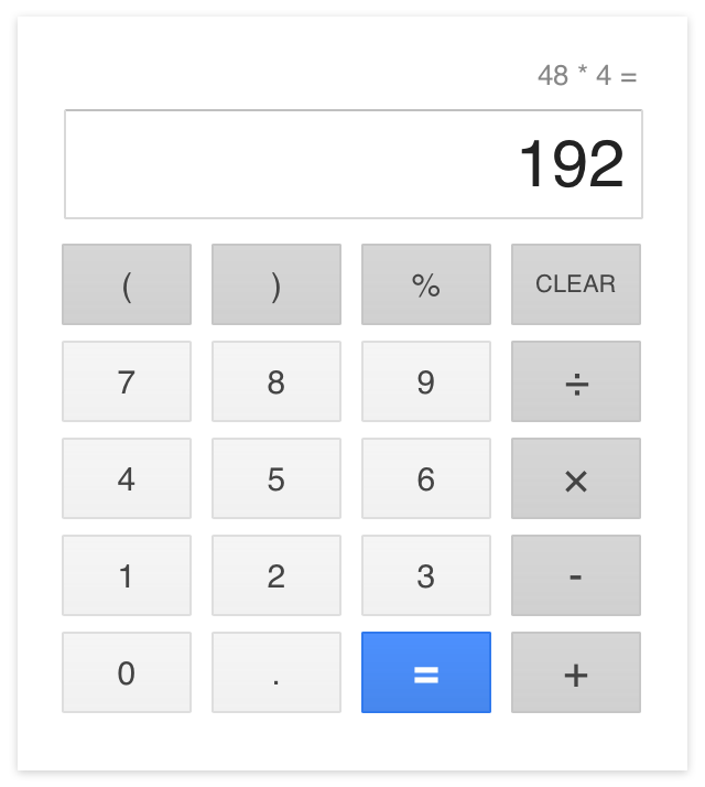
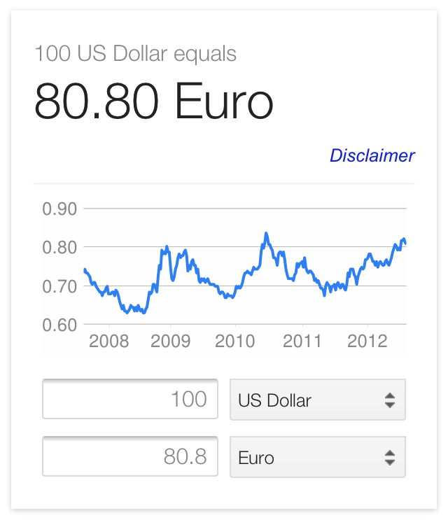
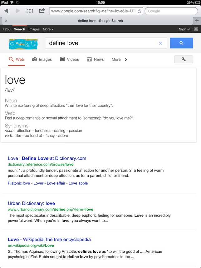
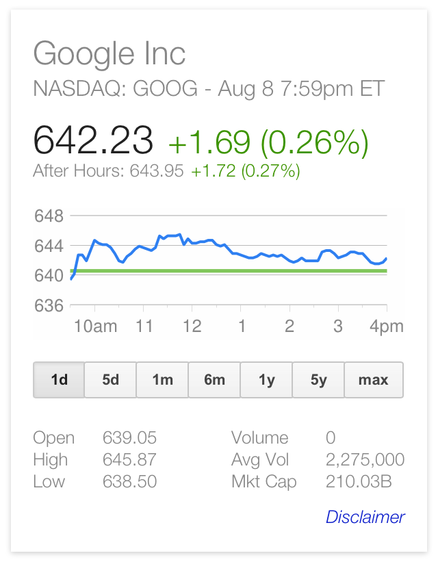
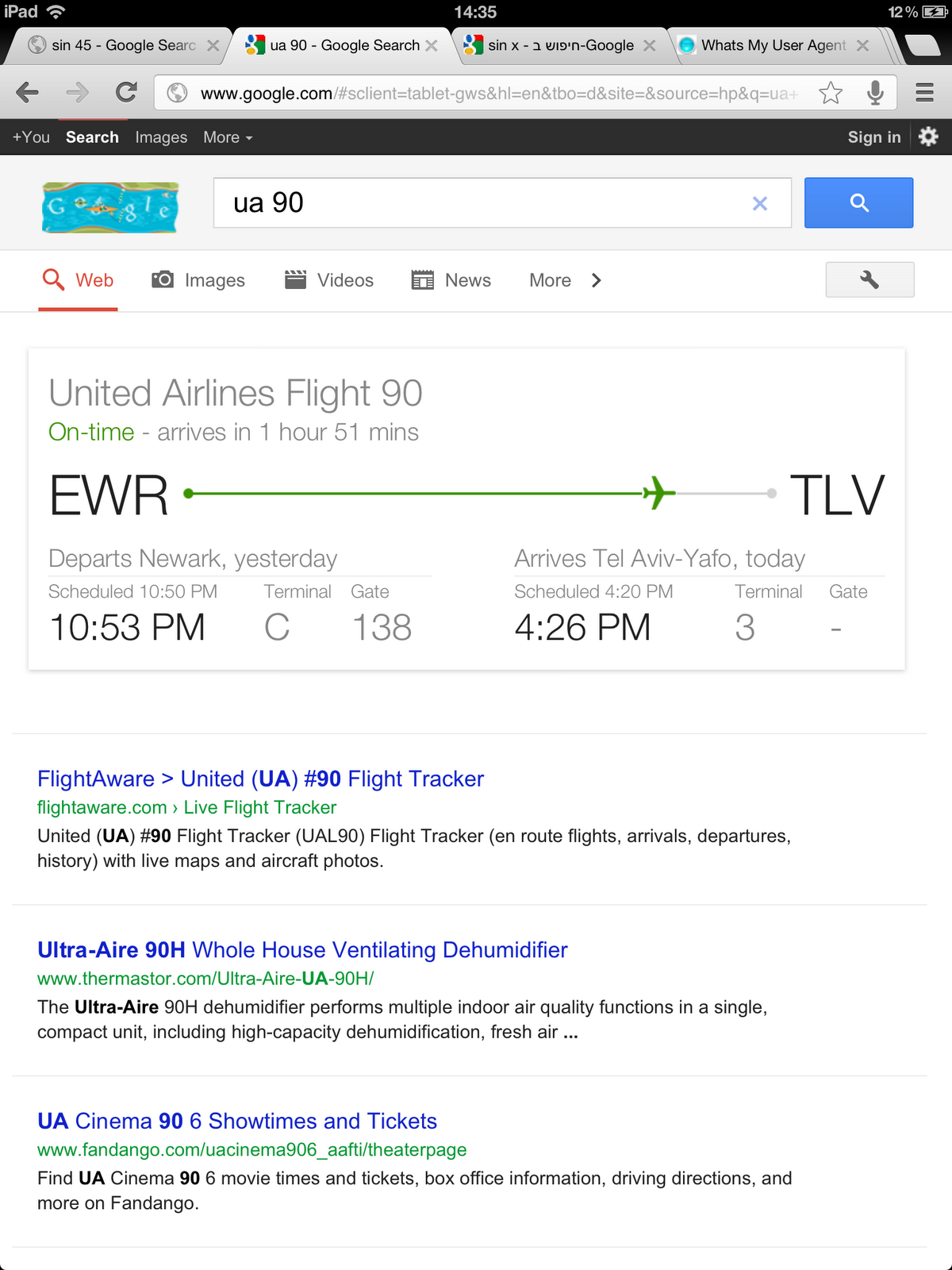
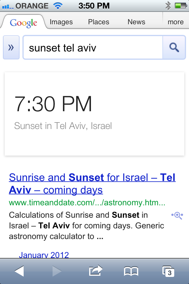
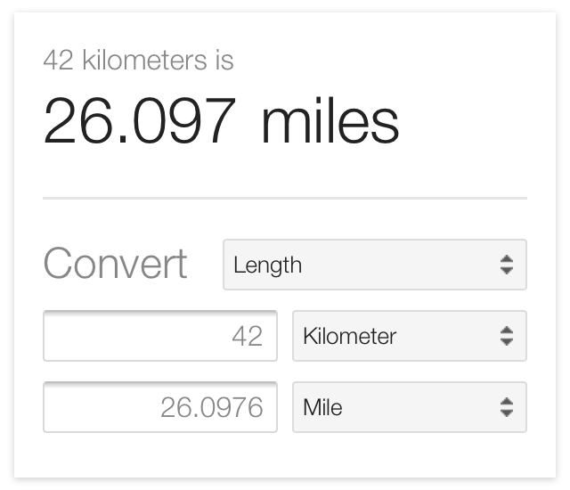
Case in point are some of the new universal search boxes for smartphones and tablets. Google has these for weather, its calculator, flights, currency, even unit conversion. And in their latest incarnations, they look great.
Their design is very much inspired by the gorgeous Google Now search app for Android Jelly Bean, or the other way around.
Google isn't losing its trademark minimalism, far from it, but minimalism works in the mobile space maybe even better than on the main search site.
All of the features are nothing more than several gray borders on a white background and large, good-looking fonts. Most of the information is conveyed via text.
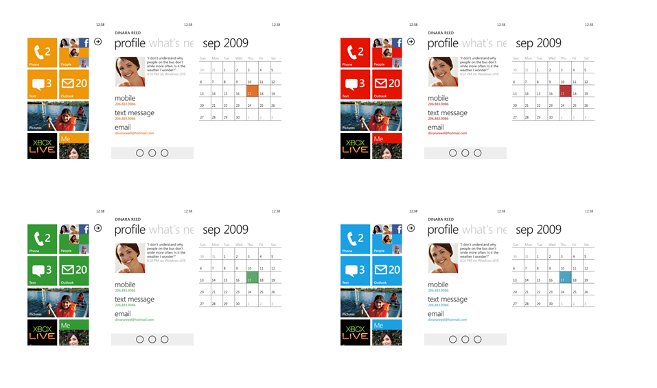
If that sounds familiar, it's because that's what Microsoft has been doing in the mobile space since Windows Phone 7. In fact, it started before that even, with the latest incarnations of the rather good but underloved Zune.
Windows Phone apps are text-heavy and graphical elements are reduced to borders and background colors. Since WP7 was introduced, Microsoft has taken this look to the desktop as it's plainly visible in Windows 8.
That's not to say Google just ripped off the Windows Phone look. But, like Microsoft before it, it realized that text works much better on small screens that any sort of graphics.